Ranked! The 20 best kits of the 2019 Women’s World Cup
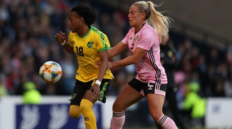
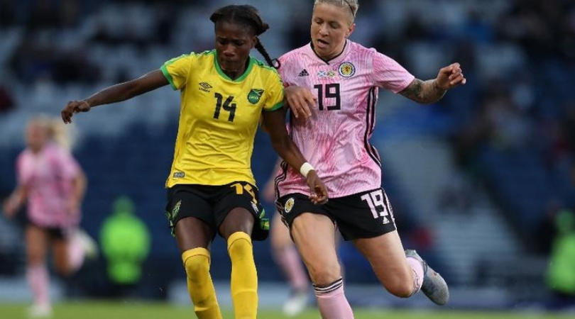
20. Scotland, away
We charge into our top 20 with Scotland’s bright pink kit which, rather than being a result of stereotypical gendered colours, is in fact a traditional choice – the men’s away kit has the same rose hue.
It looks very pleasant but comes at the end of our ranking because of the divisive nature of the colour. Sorry, pink.

18. South Korea, away
Designed to symbolise the South Korea flag, this white kit also has a unique pattern on the front representing Hanryu, which Nike describes as “a cultural trend receiving high attention around the world”.
Our friends at FourFourTwo Korea might need to enlighten us about that; to us it looks more like a map of the UK during a general election.
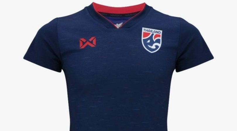
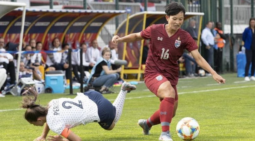
12. Thailand, home
Oh hey it’s Warrix (checks No.17), that unforgettable Thai manufacturer who produce the national kits!
They’ve done a great job, in fairness, with home and away kits for the Thai women.
This one, dark navy with light flecks of blue, is superb, although we’re not quite sure what to make of the badge.

11. China, home
Let’s call this one ‘tequila sunrise’.
It’s probably the lairiest kit at the World Cup, which is suitable given how we get after: 1) Too much tequila; 2) Watching the sunrise after a big night out and; 3) Having too many tequila sunrises.
What were we talking about again? It’s a lovely number and China will be hoping to do it justice on the pitch…or else.

10. USA, home
Not too garish, quite low key, but very nice nonetheless.
We like the simple detailing on the sleeves representing the colours of the American flag and, after all, who doesn’t love a white kit?
It isn’t anything too over the top and…hang on, what’s this? A back panel that has a grey print of all 50 states? U-S-A!
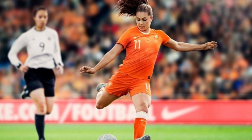
8. Netherlands, home
Some countries arrived early when talking about what colours represent them – and the Dutch were right at the front of the queue.
That oranje brings all sorts of nostalgia with it: Johan Cruyff, Shanice van de Sanden and Nigel de Jong flying-kicking a man in the chest.
If you thought that was a lion on the badge, try again. It’s a lioness.

5. Norway, home
If you put a red kit through a blue Instagram, you’d get this. And we mean that in the nicest possible way.
It also looks a bit like one of those enormous slushies you’d get at the cinema, drink within 10 minutes and then spend the following two hours with a headache and a desperate urge to go to the toilet.
But, anyway: in the nicest possible way.
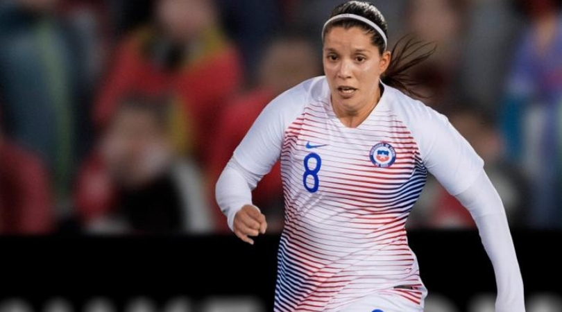
4. Chile, away
Surely you mean the home kit? We all love Chile home kits: especially that one from the ‘90s with the huge Reebok logo splashed across Marcelo Salas’s chest like a motorway sign.
But no, get this in your head – we love the away kit. Imagine someone sprinting towards you in this, you’d have no idea if they’re going right or left.
The pattern makes them look skilful. They’re already past you, you’re on your arse feeling dizzy and ashamed. And that’s in your head. You may as well give up now.

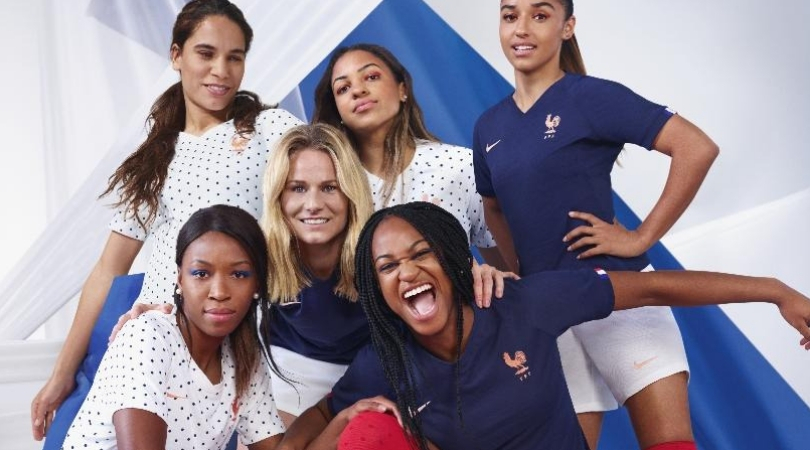
3. France, home
What do we love most about this? The matt-blue effect? Possibly.
The tiny French flag detail on the sleeve? The bronze/rose emblem and swoosh? We’re not totally sure.
What we know by now is that France always seem to get the best kits from Nike. Someone at the FA should have a quiet word.
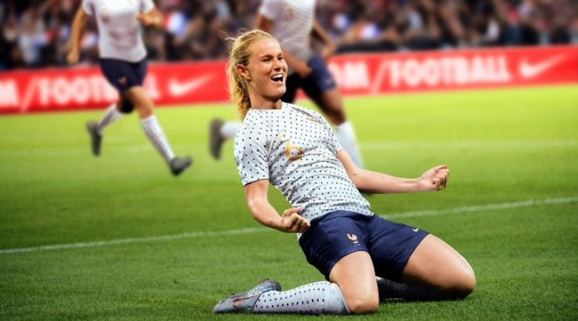
1. France, away
Polka dots shouldn’t work. They aren’t cool, are they? But leave those Timmy Mallett thoughts at the door, because this is superb.
It feels like this kit has been around forever. Why has no one thought of doing this before?
A genuine classic that will stick in the memory for years to come – and is sure to be replicated in various forms. Allez les Polkas!
Alasdair Mackenzie is a freelance journalist based in Rome, and a FourFourTwo contributor since 2015. When not pulling on the FFT shirt, he can be found at Reuters, The Times and the i. An Italophile since growing up on a diet of Football Italia on Channel 4, he now counts himself among thousands of fans sharing a passion for Ross County and Lazio.

 Join The Club


