The 8 worst football kits of this season
Art it is not. An explosion of colour and bad shirt design incoming!

The best features, fun and footballing quizzes, straight to your inbox every week.
You are now subscribed
Your newsletter sign-up was successful
Want to add more newsletters?
Join the club
Get full access to premium articles, exclusive features and a growing list of member rewards.
Here's the definitive list of the most garish football kits of 2015/16. Read on, but maybe keep a bucket close to hand...
1) Borussia Mönchengladbach (away)
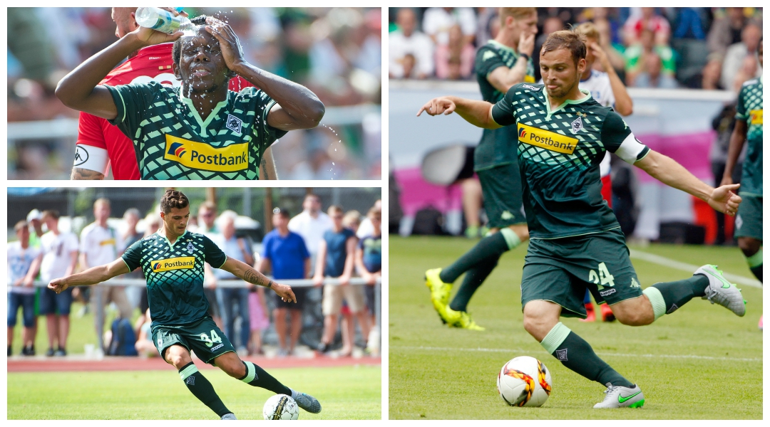
Last season German outfit Borussia Mönchengladbach recorded their highest league finish since 2008, and thus there is plenty for Foals fans to look forward to this time out. However, watching their side play away from home isn't one of them.
Fohlen players will be clad in olive and mint green from top to toe, sporting horrible fragmented light-green diagonal line pattern features across the chest. It seems they've at least tried to cover it up a bit by plastering a glaring yellow sponsor on the front.
2) Wolfsburg (home)
After winning last season’s German Cup, Wolfsburg kit designers Kappa have taken inspiration from the kit the Wolves last donned during a cup final back in 1995.
Vertical stripes appear again, but there's simply too much going on with strips of green, blue and white, not to mention the chuffing great Volkswagen logo in the centre.
The best features, fun and footballing quizzes, straight to your inbox every week.
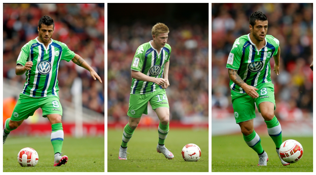
It goes from bad to worse thanks to Kappa's customary slapping of their logo on each shoulder. Then there's the third kit too...
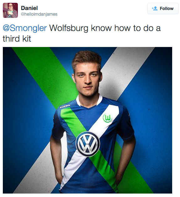
Read on: a hat-trick of horrors...
3) Sturm Graz (away)
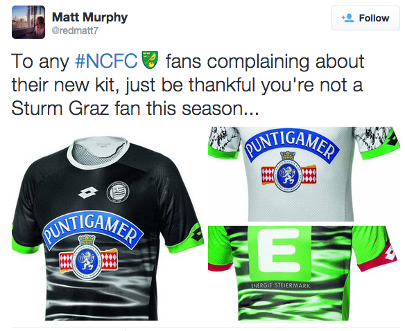
Austrian side Sturm Graz need to have a sit-down with kit designers Lotto and sort out how such a horrible collection of shirts could ever have been concocted.
The away kit features a supposed marble design that seems to better resemble a two-year-old’s scribbles. Lotto obviously decided that a white shirt with black scribbles was too plain so tacked unnecessary luminous green trim to the end of the sleeves.
Although the away kit is bad, you'll have a tricky job finding one worse than the goalkeeper’s. The designers have tried to implement a water-themed print in luminous green but it looks more like a collection of toxic waste smears. Again, an unnecessary sleeve is present, this time in red, adding to the revulsion. Then there's the sponsor, which is hardly quiet. Opposition players beware.

4) Swansea (away)
Swansea’s white and gold home kit is classy and suave, but the same can't be said about their away strip.
The 2014/15 away number was a bit of a car crash with its black and red mix, but this term’s brings a whole new level of ugly. Adidas’s bright green and dark blue stripes, together with the luminous green shorts, makes for an eyesore.
Poor Andre Ayew.

Read on: tuxedos and atomic bombs...
5) Porto (away)
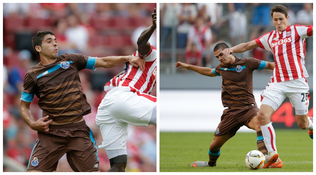
FC Porto have received worldwide press coverage for their new kit - but for all the wrong reasons. Little has to be done to pooh-pooh New Balance’s attempt at the away strip, a revolting brown that needs little more explaining. Someone sat down and thought this one up, and then someone - nay, more likely numerous folk - agreed it was a good idea.
A dark and chocolate stripe pattern has been selected for the Portuguese club, seemingly for no reason whatsoever. The turquoise chest strap and sleeve trim only add to the horror show. A true monstrosity.
6) V-Varen Nagasaki
J. League Division 2 side V-Varen Nagasaki aren't the first side to don a tuxedo strip - lower-league Spaniards Cultural Leonesa beat them to that one last season - which makes it all the more baffling as to why the Japanese side would bother doing it all over again. But they have, to mark their 10th anniversary, with Hummel producing black and white versions for outfield players and goalkeepers respectively.
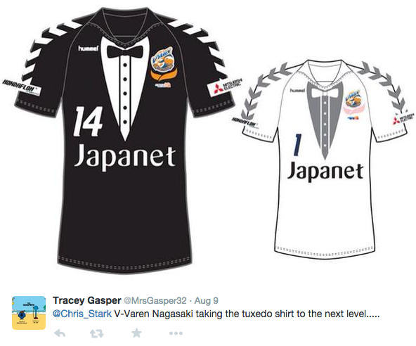
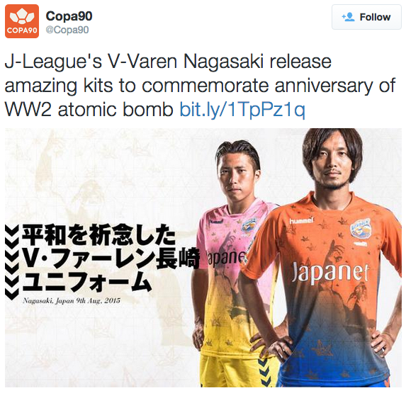
If only that was all. Not content with simply marking their own birthday, the second tier side have also commemorated the 70th anniversary of the devastating atomic bomb that struck Nagasaki in 1940. "The peaceful pray statue in Nagasaki and the folded paper crane are part of the design of this jersey," said V-Varen coach Takuya Takagi. Their hearts are in the right place, at least.
Read on: when one sponsor just isn't enough...
7) Montpellier (home)
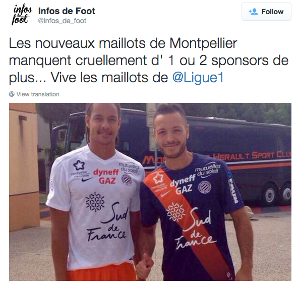
French side Montpellier’s home kit colour scheme isn’t too offensive, but its design leaves a lot to be desired. There's just too much going on.
A whole host of sponsor logos jostle for position and ruin an otherwise effective design. The navy blue jersey and orange sash are tolerable - nice, even - but the companies plastered on the front make it... well, rubbish. The club might be making plenty of money from sponsorship, but they probably won't from shirt sales.
8) Boavista (home)
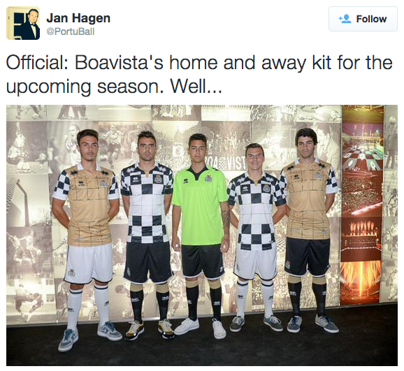
Chess fans are we, Errea? Apparently so - enough to see the game's chequered pattern plastered on Boavista shirts this season, anyway.
Although this design is traditional for the club, surely something has to change. After all, fans turn up to watch a thrilling, heart-pumping 90 minutes of football, not a calm, sophisticated game played by bespectacled blokes in smoke-filled rooms (at least in FFT's imagination). Argh, our eyes.
 Join The Club


