What makes a great shirt?
Unfortunately the answer isn't just 'anything that's not Norwich 1992-94'.
Is it what it looks like? Who wore it? Whether a team won stuff in it? Whether it makes you smile? Misty-eyed? Well, it's all of those things and yet maybe even none of them; for football shirts are a completely subjective entity, and difficult to evaluate. And yet, we can still all agree on many of the beauties out there.
In 'The Football Shirts Book', Neal Heard sets out to rejoice about more than mere design. "I find it's more about sharing memories with people," he says. "I like the fact that around the globe you can wear a shirt and someone will stop you to ask the immortal question: 'Where'd you get that?'..."
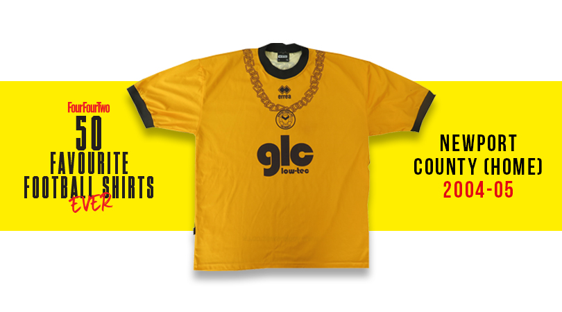
43. Newport County, home (2004-05)
The golden years of Welsh comedy rap. Buoyed by their international hits Guns Don’t Kill People, Rappers Do and the searing social commentary of Your Mother’s Got a Penis, Newport-based Goldie Lookin Chain became sponsors for their team’s FAW Premier Cup run and whacked a giant GLC on the actual shirt.
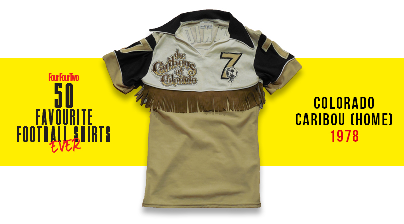
41. Colorado Caribou, home (1978)
The NASL always played with the boundaries of acceptability – it’s the American way – and never more than with this Caribou shirt. It featured a tassled ‘rodeo fringe’ around its midriff, making the Denver side – founded and disbanded in the same year – look like ludicrous line dancers. Coyote ugly but somehow fantastic.
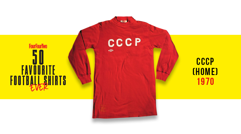
33. CCCP (1970)
The Soviet Union's big red machine trampled its way to the last eight of Mexico '70, where they were eventually beaten by the Uruguayans. Still, at least they did it while looking menacingly sharp in this simplistic number, complemented by the terrifying all-black goalkeeper kit of Lev Yashin.
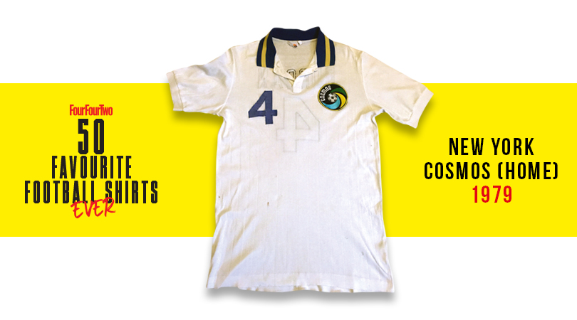
32. New York Cosmos (1979)
Designed by Ralph Lauren, this shirt was further proof that the Cosmos weren't really about football; more peacocking around Studio 54 with Warhol and Bowie. Nevertheless, the logo was brilliant, and with Carlos Alberto, Franz Beckenbauer and Johan Neeskens all in the side, the Cosmos could play a bit too.
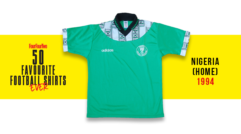
28. Nigeria, home (1994)
The Super Eagles topped their group at the 1994 World Cup with this African print-patterned adidas number, only to deny us a fifth game in it by losing to eventual runners-up Italy in the round of 16. It's a shame more teams don't incorporate local influences into their kits like this.
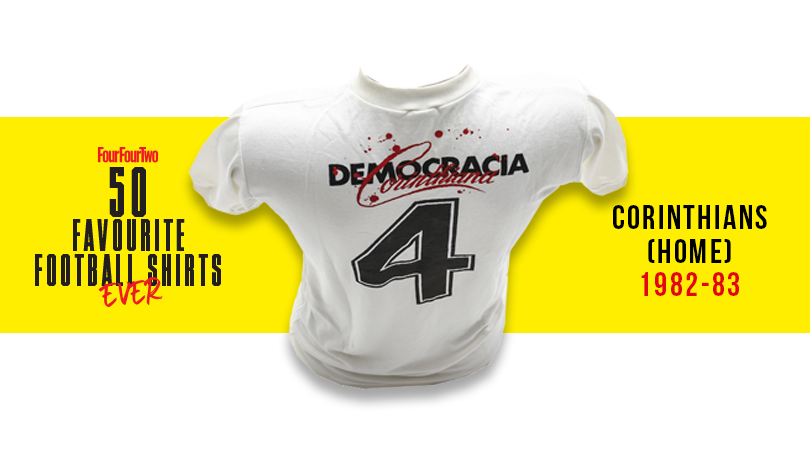
24. Corinthians, home (1982-83)
This one's charged with political significance: in ’82 the players of the crisis-torn Sao Paulo side – including cigarette-mad Seleção God Socrates – took control of day-to-day operations, with employees, players and managers each receiving an equal vote. Oh, and it looks incredibly gorgeous, too.
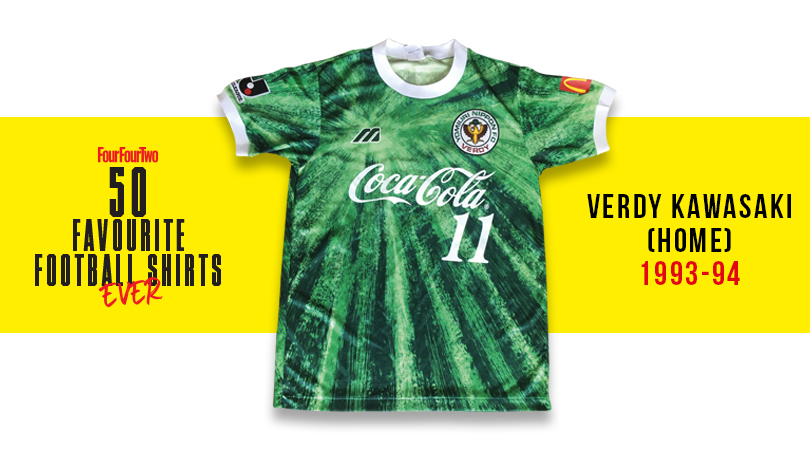
17. Verdy Kawasaki, home (1993-94)
Presumably after passing the bong around Mizuno HQ and wigging out to Anthem of the Sun by the Grateful Dead, the designers got on with creating this wonderfully psychedelic shirt for the Tokyo-based outfit. Far out, おとこ (that’s Japanese for 'man', if you didn't know).
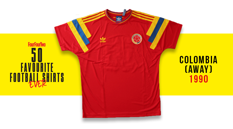
16. Colombia, away (1990)
Higuita! Valderrama! Escobar! Rincon! Iconic side they may have been, but Colombia were actually rather pants at the 1990 World Cup in Italy, limping out of the group stage in third spot then suffering elimination at the hands of Cameroon. Still, at least they looked smart while getting their arses handed to them by Roger Milla & Co. in this deep red number, complete with jazzy symmetrical shoulder bars.
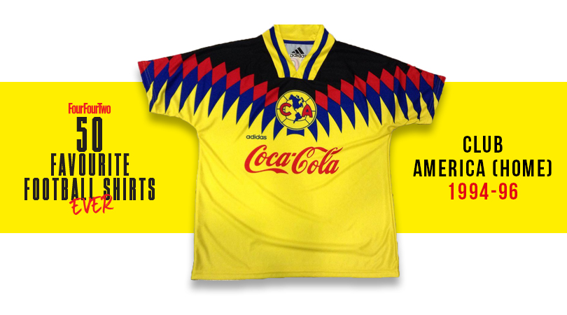
14. Club America, home (1994-96)
A shirt which invokes both Colombia’s ‘birdman’ super-fan and the Rio carnival, this was a jersey that could easily have gone awry. The primary colours' ambition on display makes it more brilliant than bonkers, though, while the continental badge provides the ideal flourish.
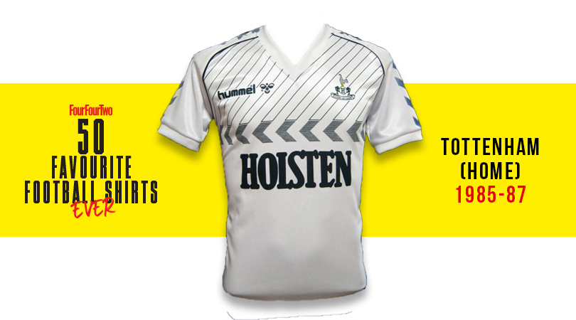
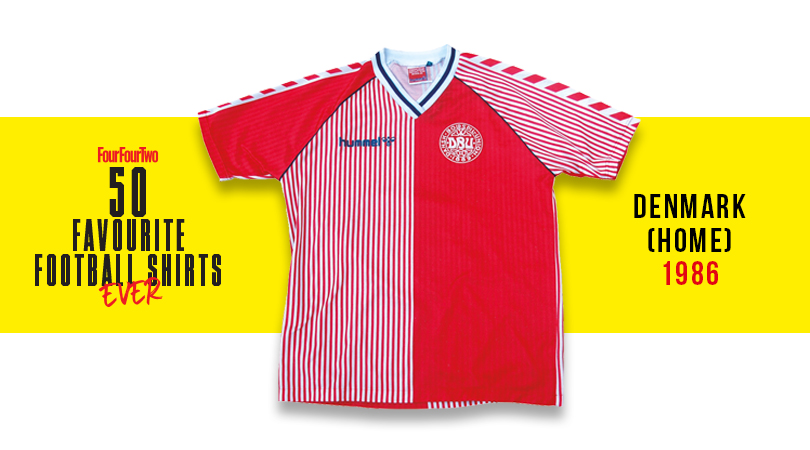
12. Tottenham, home (1985-87)
Good on hummel, who were strong in their belief that slanted pinstripes above chevrons would work. And by Jove, they really do: this super-snazzy Spurs outfit from the mid-to-late '80s was brilliant design, featuring yet more chevrons on the sleeves and neatly fitting all of its components into a compact area. Ossie Ardiles never looked so good.
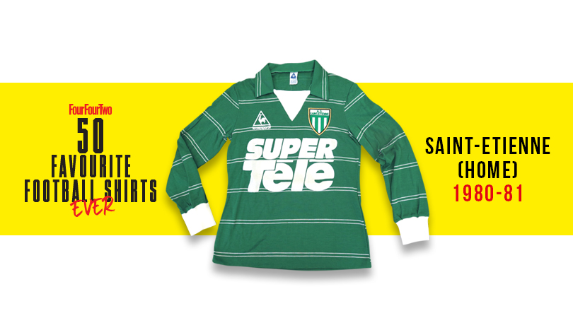
7. Saint-Etienne, home (1980-81)
No team has ever had such a sexy je ne sais quoi as Saint-Etienne; this is a top so Gallic it should be having an affair with your next-door neighbour. The green number - replete with massive SUPER TELE sponsors, because why not? – looked magnifique on the French kings, who called upon Jacques Santini and Michel Platini in those heady days. Allez les Verts!
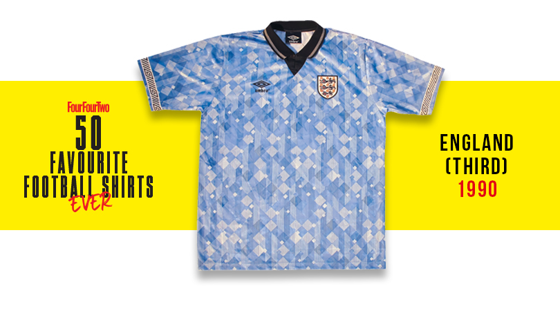
5. England, third (1990)
A shirt which, truthfully, shouldn’t be admirable: the overlaid diamonds that Umbro went bananas for were often nausea-inducing, but this one somehow worked. Worn with effortless chic by Barney Sumner in the World In Motion video, it neatly encapsulates the good vibes of that summer.
Greg Lea is a freelance football journalist who's filled in wherever FourFourTwo needs him since 2014. He became a Crystal Palace fan after watching a 1-0 loss to Port Vale in 1998, and once got on the scoresheet in a primary school game against Wilfried Zaha's Whitehorse Manor (an own goal in an 8-0 defeat).

 Join The Club


