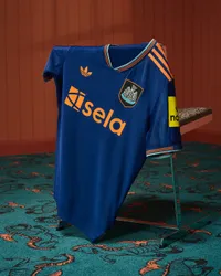
The Newcastle United 2025/26 third kit is out - and this is one of the Magpies' greatest-ever efforts
The Newcastle United 2025/26 third kit may go down in history for its simplicity and regalness - fit for Champions League football
The best features, fun and footballing quizzes, straight to your inbox every week.
You are now subscribed
Your newsletter sign-up was successful
Want to add more newsletters?
Join the club
Get full access to premium articles, exclusive features and a growing list of member rewards.
The Newcastle United 2025/26 home kit has dropped, and this might just be an all-timer.
The home kit was released before the end of last term, with the Toon qualifying for the Champions League in a nervy end to the season – so fittingly, they're going to be impeccably dressed for their return to the big-time.
One of the best 2025/26 Premier League kits released so far? Oh, you bet.
Article continues belowThe Newcastle United 2025/26 third kit pays tribute to a forgotten classic – without making the same mistakes
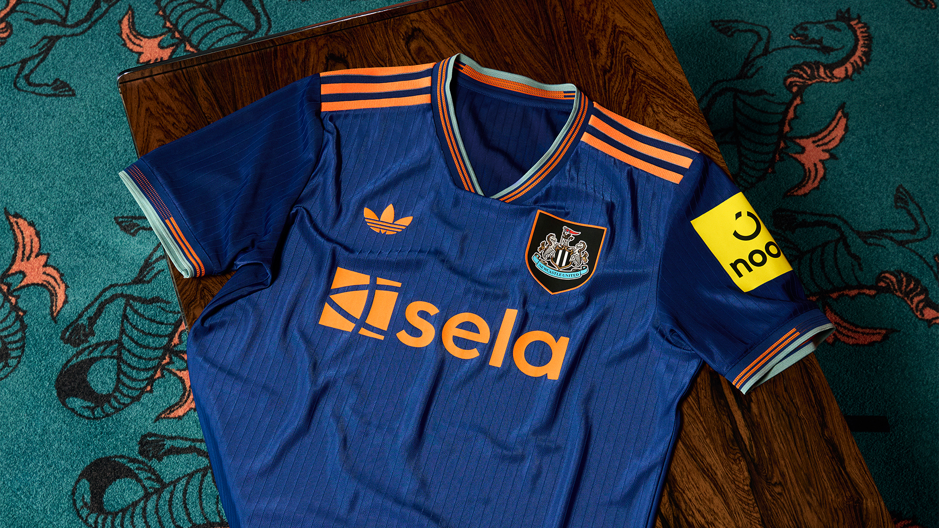
Just as with last season, Adidas have designed Newcastle's shirts this season with classics in mind – and the 1997/98 vintage has been re-worked for this term.
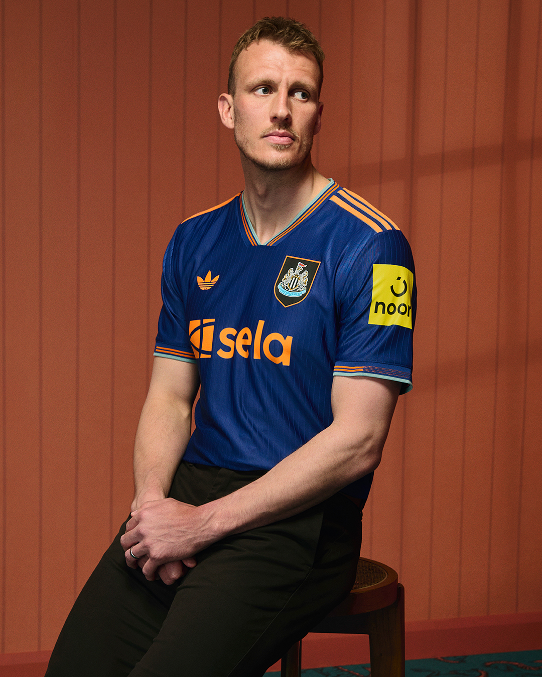
No, we didn't know that navy, green and orange could go together either, and yet, the German manufacturer have managed to combine this colour scheme together to create something that obviously harks back to the original without having the same dated feel.
In a list of all-time Newcastle change strips, this immediately jumps into the top five, with a stunning take on a somewhat forgotten classic of the past.
That stripe on the right-hand side of the '98 top looked oh-so 90s – as if someone had designed the shirt on Windows 97 and accidentally aligned everything to the left. But this one has a much simplistic feel to it.
The best features, fun and footballing quizzes, straight to your inbox every week.
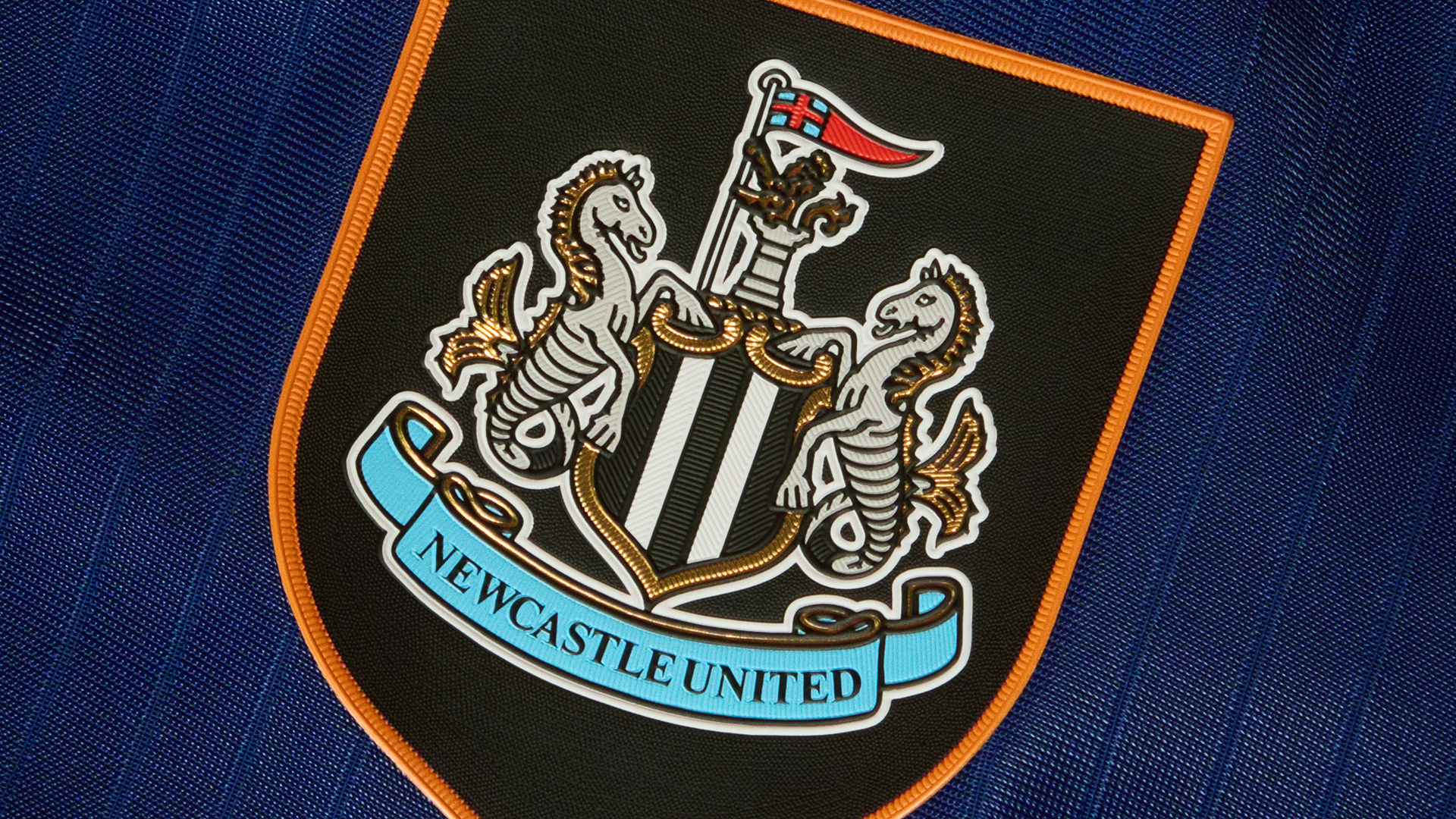
Adi have taken the same shielded badge idea and the colours in the right place. Given that the shades speak for themselves, there's no need to overcomplicate it any more, right?
There are touches of green on the cuffs and collar to hark back to the original, the patterning across both is excellent, while the subtle pinstriping gives this one the feel of the classic without the baggage – bravo for the bright orange Trefoil Adidas logo and three stripes, too.
The only thing preventing this one from full marks? The 'Noon' sleeve sponsor doesn't match in colour. Boo.
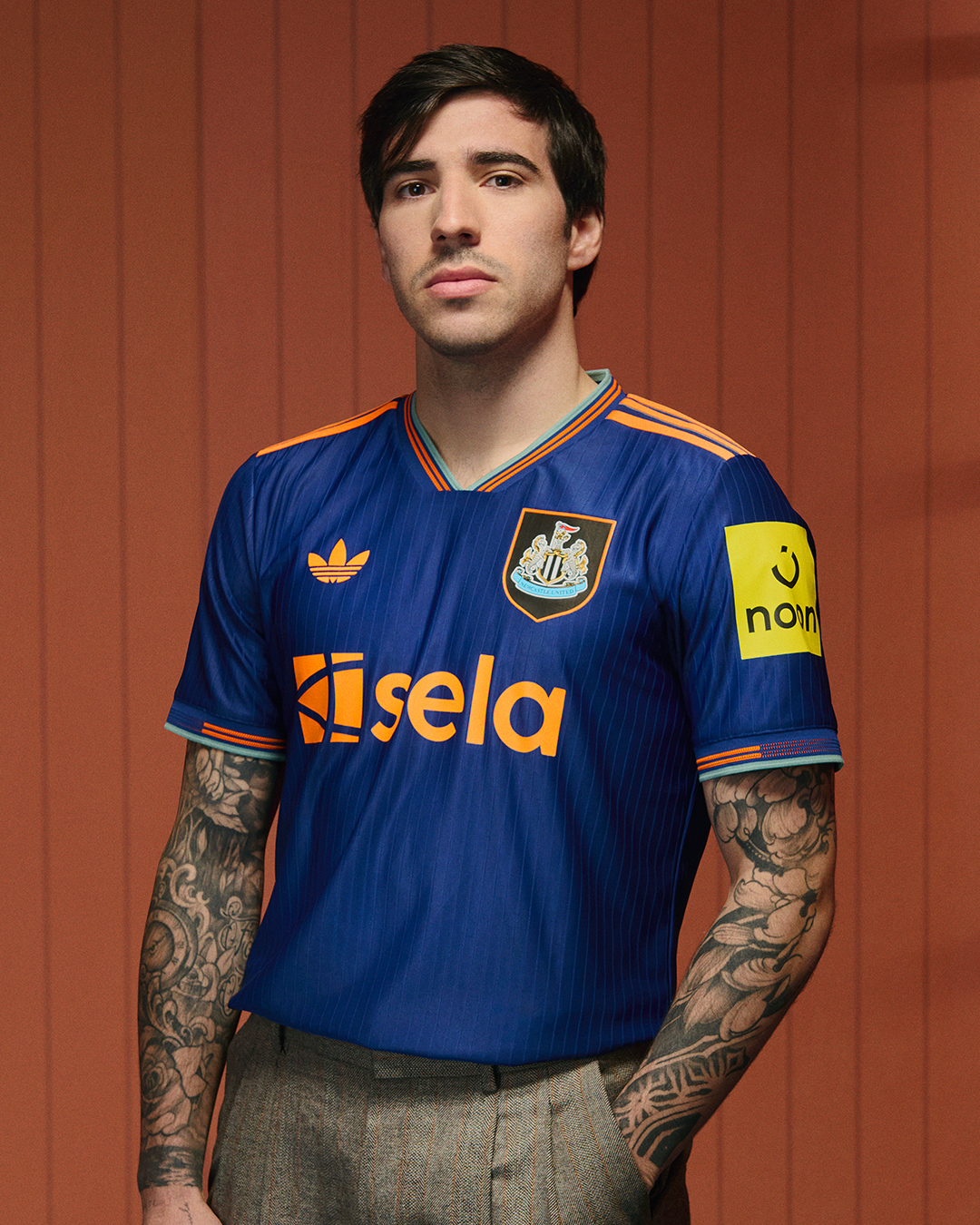
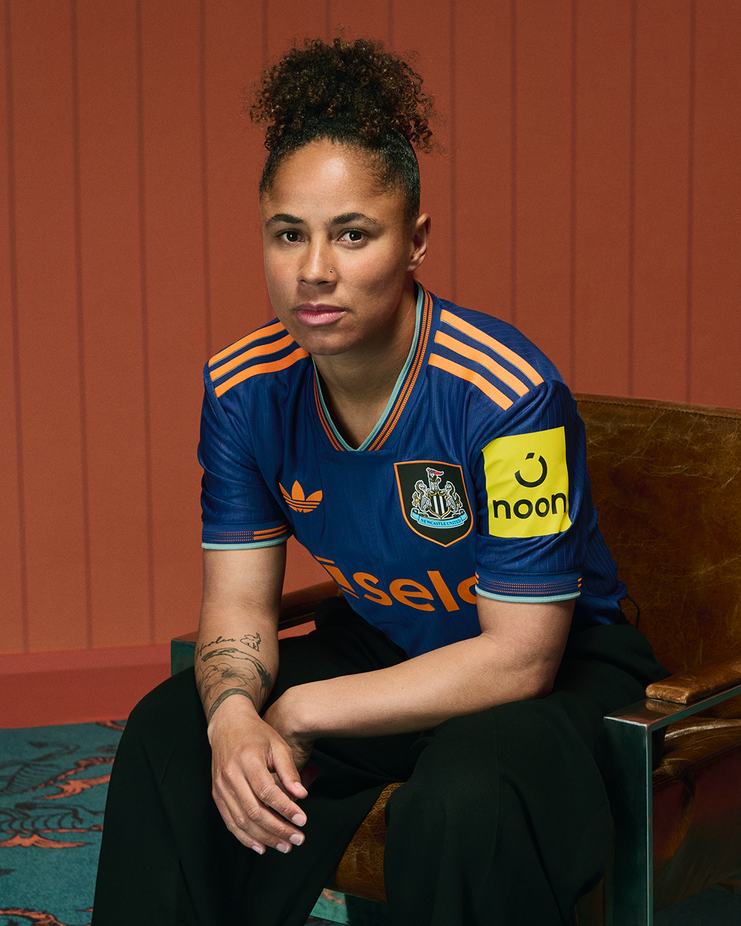
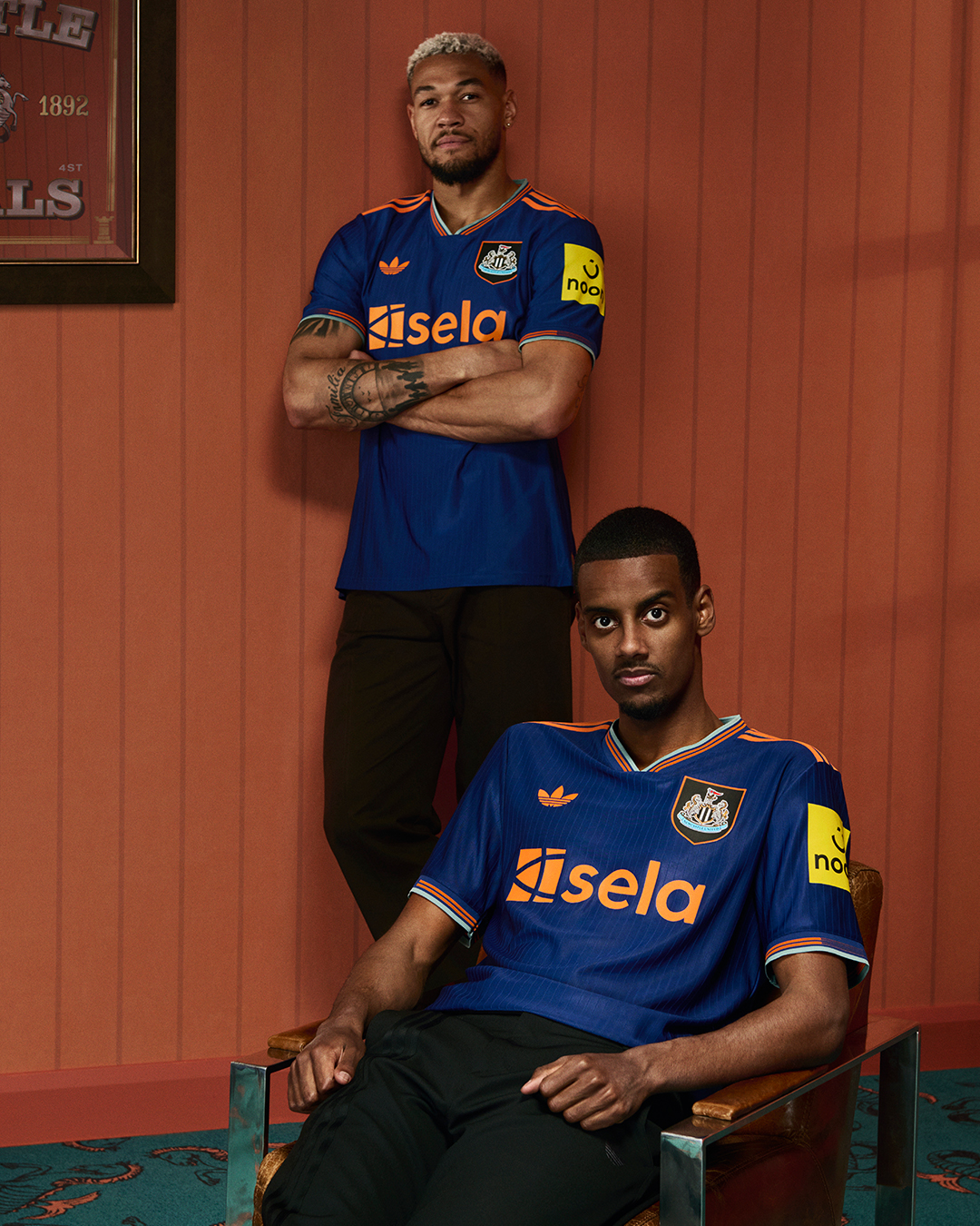
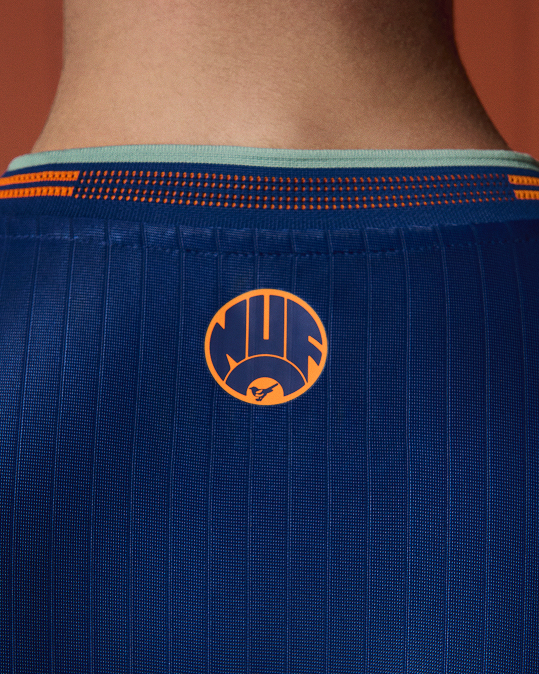
“For this season’s third kit, we wanted to bring the fans an added level of connection by combining our favourite elements of the iconic 97/98 kit, told through a modern and stylish lens.” Adias says. “The intersection between football and fashion is continuously evolving, and this kit celebrates the colliding of these two worlds in a way that honours the club’s identity and togetherness, both in the past and for years to come.”
They've knocked it out the park. Way to start Newcastle's life as an elite Adidas club.

Mark White is the Digital Content Editor at FourFourTwo. During his time on the brand, Mark has written three cover features on Mikel Arteta, Martin Odegaard and the Invincibles, and has written pieces on subjects ranging from Sir Bobby Robson’s time at Barcelona to the career of Robinho. An encyclopedia of football trivia and collector of shirts, he first joined the team back in 2020 as a staff writer.
You must confirm your public display name before commenting
Please logout and then login again, you will then be prompted to enter your display name.
 Join The Club


