Ranked! The 20 best kits of the 2018/19 season

19. Liverpool, home
Liverpool’s darker red home top last season was a triumph and they’ve made the right choice by sticking with that winning formula once again. You could argue there’s not much difference between this kit and the 2017/18 version, but the Reds and New Balance should be credited for refusing to tamper too much. The improved collar arguably makes this jersey a slight upgrade.
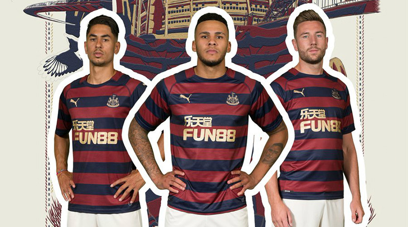
15. Newcastle, away
This kit immediately produces flashbacks of David Ginola flying down the wing or Les Ferdinand smashing in a shot. Inspired by the iconic 1995/96 side, the only thing this retro offering is missing is a Newcastle Brown Ale badge on the front. Fun88 just doesn’t have the same ring to it – and doesn’t taste as good either.
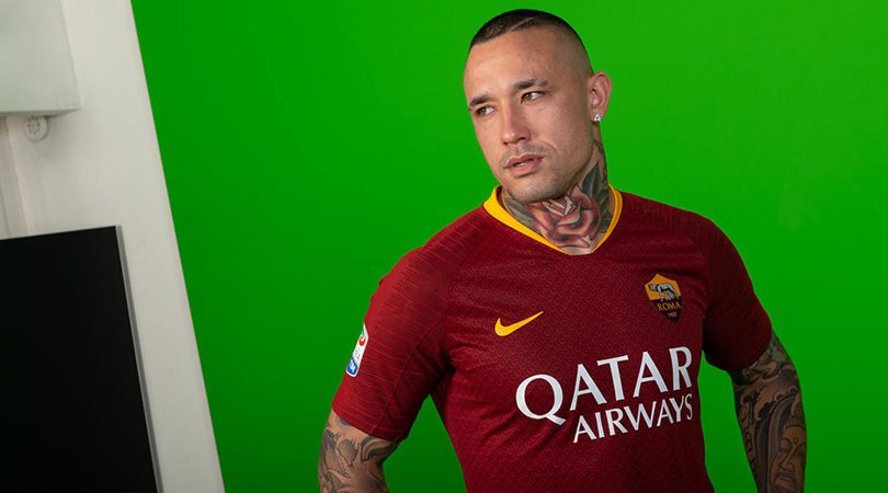
12. Roma, home
The Giallorossi have taken a leaf from the book of their Champions League conquerors Liverpool by adopting a darker shade of red. The yellow collar and Nike swoosh are nice flourishes and the graphic design – a nod to the chainmail that ancient Roman soldiers wore, of course – complements the outfit rather than being overbearing.

9. Tigres, home
You need to look closely at this shirt to really understand it; it’s a cluttered kit featuring too many logos (is that a London tube badge stitched on the right breast?) and a zig-zag pattern – bizarrely inspired by Russia’s 2017 Confederations Cup jersey of all things – which gives you a headache after a while. But just look at this and try to tell us it’s not a beauty.
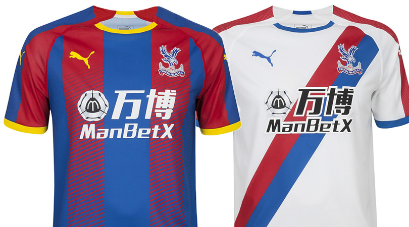
8. Crystal Palace, home and away
A fade effect is not an easy thing to get right – just ask any Spurs fan. Palace have pulled it off, though, ensuring their home kit still looks complete without the accompanying shorts. The return of the sash on their away strip is another pleasing development, although the ugly sponsor logo stops this from finishing higher up the list.
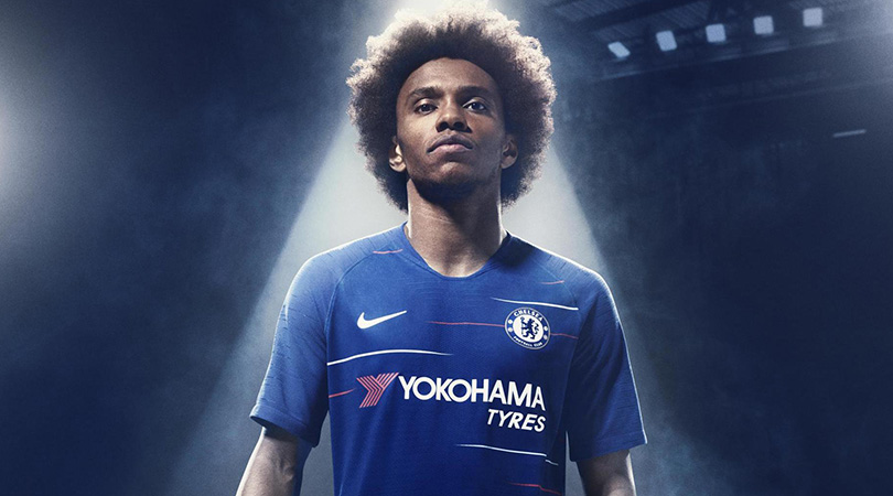
7. Chelsea, home
It can be hard to keep producing distinctive designs every year if you’ve only got one colour to work with. But Chelsea’s new kit is a great example of how to mix things up while remaining true to your identity; the subtle red and white lines are a unique feature among English top-flight sides.
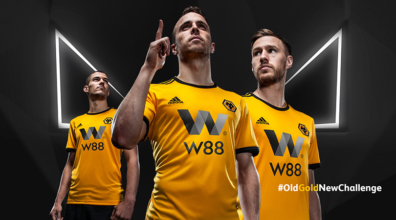
6. Wolves, home
Wolves haven’t exactly been keeping quiet about their return to the Premier League, having spent most of the summer signing half of the pro footballers in Portugal. But the most pleasing thing about their off-season has nothing to do with the transfer market and everything to do with the return of a classic English kit. The West Midlanders have returned to a lighter shade of gold, but if we’re being picky the shades of grey in the sponsor logo are a bit of a turn-off.
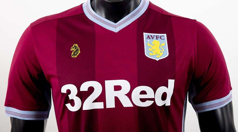
4. Aston Villa, home
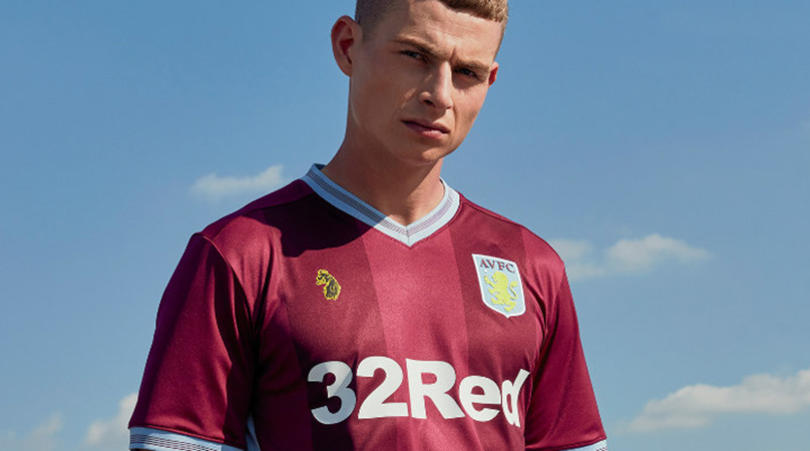
We may well see more lifestyle/football crossovers in the future after this effort. Villa have joined forces with British clothing brand Luke 1977 this year and the results have been a delight. The two shades of claret coexist in beautiful harmony, while both the sleeves and the collar are elegantly classic. No wonder Villa reported an increase of 180% + in pre-order sales over last term.
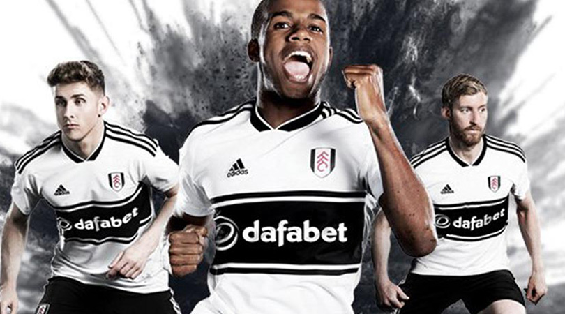
3. Fulham, home
The Cottagers have marked their return to the top-flight in style, bringing out the best Premier League kit of the 2018/19 campaign. Inspired by some of their 1990s tops, this shirt has the optimum balance of black and white, and the horizontal strip down the centre is a thing of beauty.
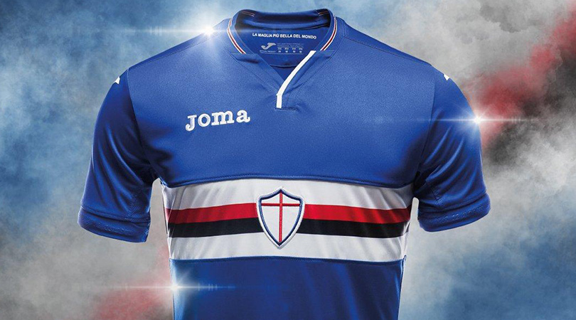
2. Sampdoria, home
Sampdoria are well established as a major player in the shirt stakes by now, but the iconic design of their home kit never fails to impress; a predominantly blue top with a white, red and black band running through the centre. The badge is another standout feature of Samp’s kit, a shield placed in the middle of the top with no words or reference to the fact it is symbolic of a football club.
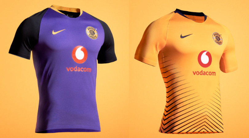
1. Kaizer Chiefs, home and away
Oh yes. Kaizer Chiefs have produced two belters for the current campaign: a golden home kit with black strips representing “traditional spears rising together to create a sense of motion and unity on the field”. The other is a beautiful change top with a purple body, black sleeves and splashes of gold on the collar, crest and Nike badge. Where can we get one… or 10?
Alasdair Mackenzie is a freelance journalist based in Rome, and a FourFourTwo contributor since 2015. When not pulling on the FFT shirt, he can be found at Reuters, The Times and the i. An Italophile since growing up on a diet of Football Italia on Channel 4, he now counts himself among thousands of fans sharing a passion for Ross County and Lazio.

 Join The Club


