Ranked! Every Euro 2024 kit, from worst to best
We rank every Euro 2024 kit set to be worn in Germany this summer - from the repulsive and rancid to the pieces of literal art...
12. Germany Away
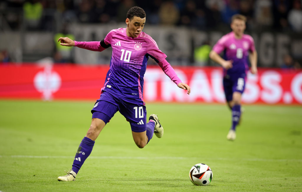
Now, pulling this off around the pool while on holiday definitely won't work for the vast majority of the population, but on the football pitch the pink and purple gradient is a real fashion statement. It's not too garish, with the pink quickly shifting to purple in that classic Adidas pattern, while the white accent
As bold efforts go, it's certainly tasteful, and the FFT judges were certainly fans - all except one, who offered a measly one out of ten for this kit. Ah well, can't win them all.
11. Scotland Home
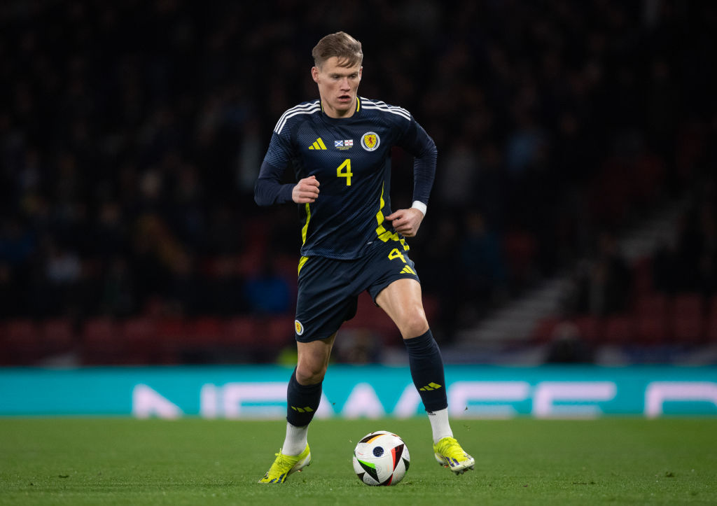
The Tartan Army will be adorning this shirt on the streeets of Germany this summer, such is the masterpiece Adidas has created here.
Article continues belowIt's not just the tartan print; it's not just the geometric shapes; it's not just the touches of yellow and white interspersed with the deep dark blue base - it's all of those aspects combined.
Whether Scotland finally reach the knockout stages of an international tournament is a different matter, but one thing is for sure: this is a kit that'll go down in history.
10. Turkey Home

Taking the decision to swap the colours of the home and away kits is certainly a brave one, but Nike has succeeded with their latest effort for Turkey. A centralised badge and Swoosh always has a certain air of traditional elegance to it, and is something FFT is enamoured by if executed correctly.
Adding a red, horizontal sash on the chest is where this kit truly comes to life, though. Breaking up the white base of the shirt is a phenomenal decision, while the two colours just work in perfect harmony together.
The best features, fun and footballing quizzes, straight to your inbox every week.
9. Italy Away

While Adidas creating kits for Italy just feels wrong, this new shirt is a simplistic masterpiece. Utilising the template design is a risk, especially for a nation as fanatic as Italy, but on this occasion it's certainly paid off.
With the red and green colours taking up the accents on just one half of the shirt, and the white base, the Italian flag is subtly represented. Of course, so is the classic blue that has become synonymous with the Azzurri, creating a clean, fashionable aesthetic that is no less than expected from the nation.
8. Portugal Away
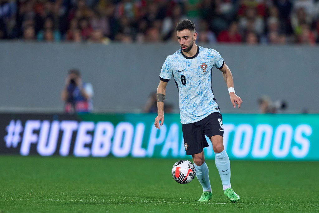
Away kits offer teams and manufacturers to expirement, the freedom to create a design that is truly different to the essential need for traditionalism on the home offering. For Portugal, that freedom has been exploited expertly by Nike.
While the same sail shade from 2022 returns this time around, the shirt has more of an off-white finish, with an Azulejo-style pattern - a major aspect of Portuguese architecture - giving this kit a real flourish. Still, we're sure Cristiano Ronaldo will find a way to moan about it...
7. France Home

After years of dark navy, France have reverted back to a brighter, bolder blue that feels truly French - and we mean that as a compliment. As much as France should look oh-so-cool in deeper shades, there's something nostalgic about this shirt that we just adore.
The tricolour piping and yellow cockerel look fantastic, too. With Kylian Mbappe the posterboy of the national team, this is a kit that is truly worthy of success this summer.
6. Belgium Home
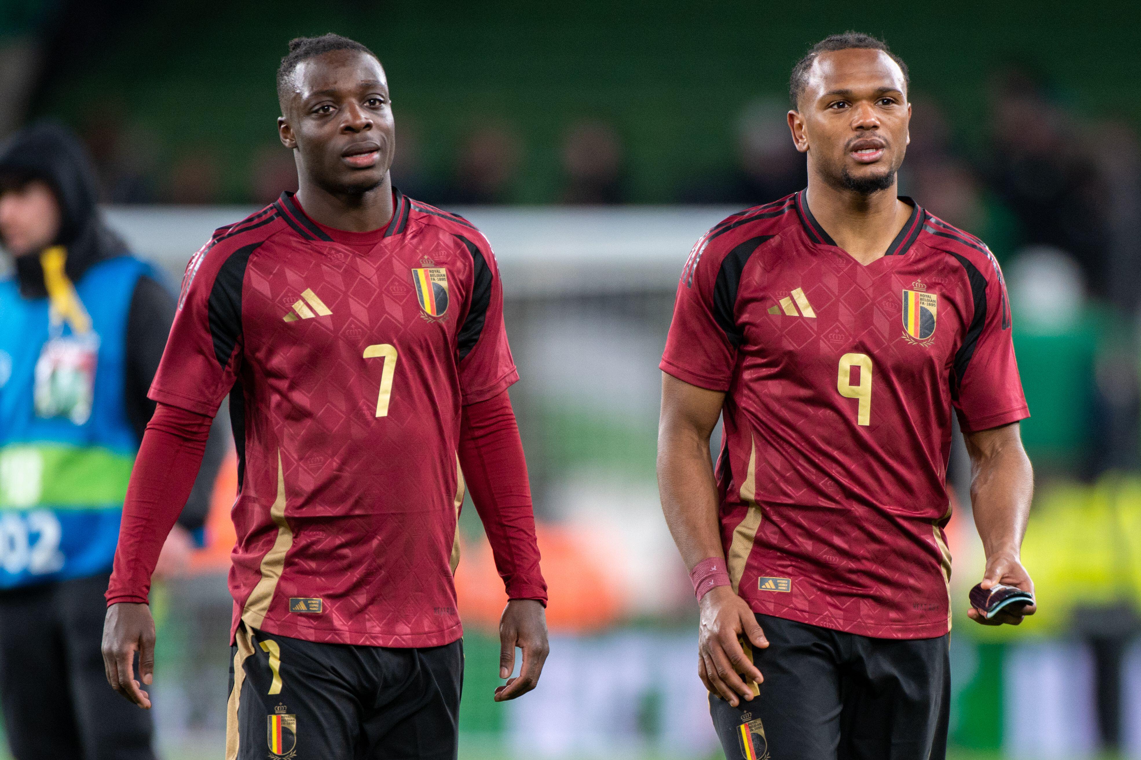
Classy, regal,
Regal and elegant, the latest Belgium home shirt is perhaps the nation's classiest ever kit. Similar to when Arsenal signed off from Highbury in 2006, Belgium have gone for a deeper red at Euro 2024 - is this in tribute to the final tournament featuring the last of their Golden Generation? Perhaps not, but we're here for it nonetheless.
The golden touches are simply stunning, while the base pattern really helps to eleveate an already beautiful-looking shirt. It seems harsh this hasn't quite managed to make the top five.
5. Denmark Home

After deciding to implement a monochramatic design on World Cup 2022 kit, in protest against the tournament being held in Qatar, Hummel has decided to opt for a unique square design in varying shades of red that look absolutely fantastic.
It has a slightly old-school feel to it, too, what with the polyester look, earning a couple of 10/10 ratings from our critical judges. Those Hummel logos on the shoulder also add a couple of extra marks, that's for sure.
4. Netherlands Away
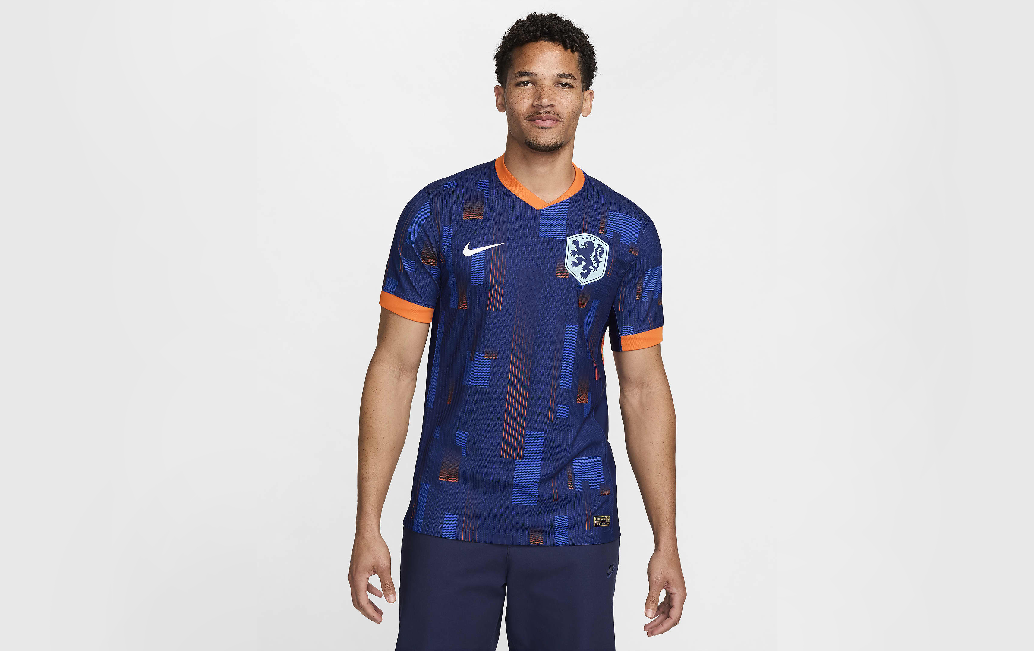
At first glance, the Netherlands away kit simply looks navy with hints of orange accents. Upon closer inspection is where to get to marvel at the true beauty, however.
Inspired by the block shapes of De Stijl – the 20th-century movement of Dutch artwork in which the likes of Piet Mondrian created minimalistic artwork consisting mostly of rectangles of colour – Nike have gone polygonal with this effort, covering a navy blue jersey in different tones of blue and orange for something modern, sleek and quintessentially Dutch.
A cross between Mondrian and modern shirt graphics, the Oranje potentially have a new iconic shirt to worship on the streets of Amsterdam, alongside their 1988 beauty.
3. Austria Home
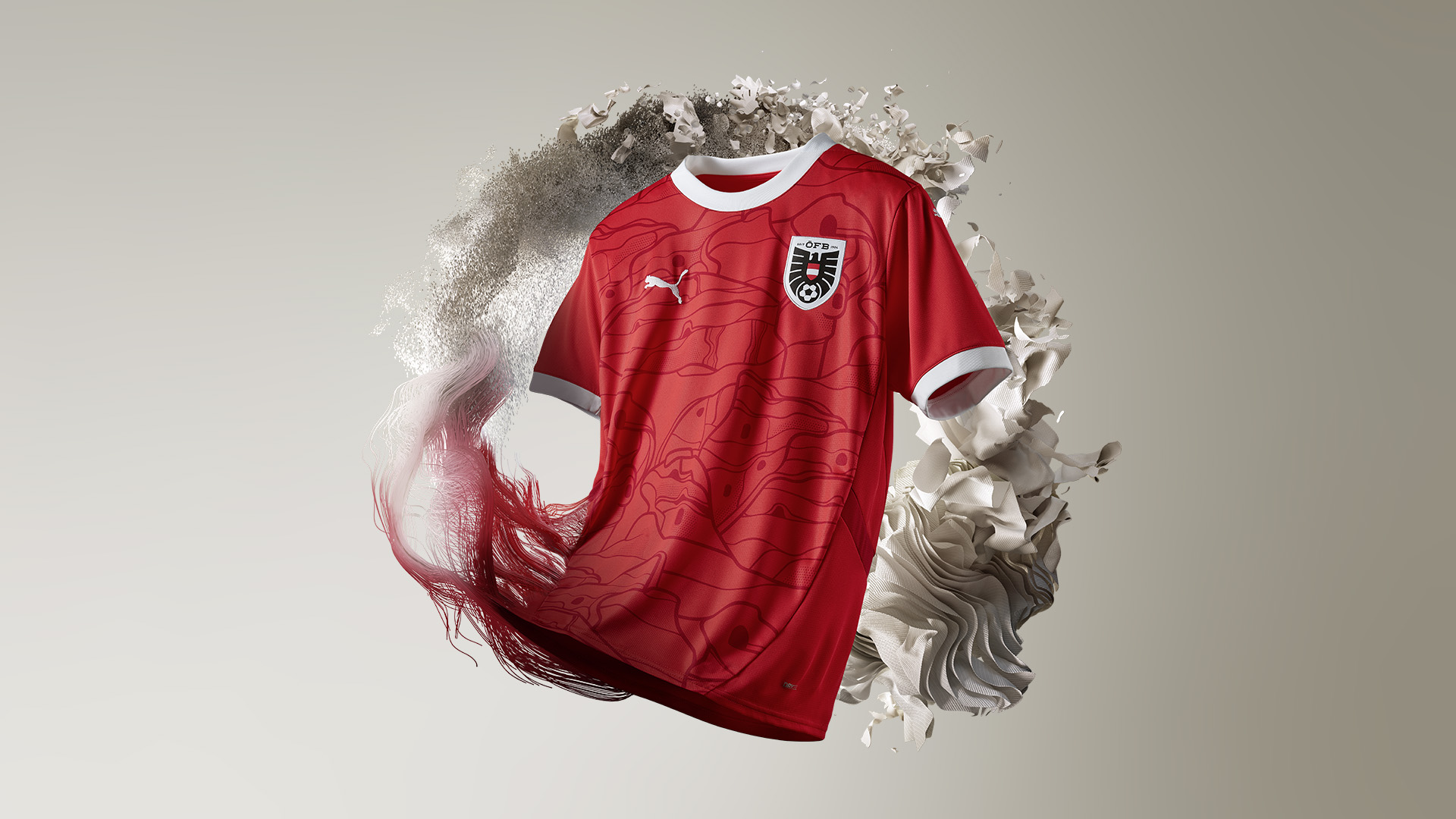
Sprucing up a red jersey can often prove problematic for some brands, but Puma have absolutely smashed it out of the park with Austria's latest kit. The round-neck collar and white accents are stunning, while the bespoke graphics meant all of our judges rated this effort highly.
Those bespoke graphics are inspired by a Jugendstil architectural design - an artistic movement that came to prominence towards the end of the 19th century. So, not only does it look cool, but there's a relevancy and meaning behind the design, too.
It's just a shame David Alaba won't be captaining the nation in the kit this summer, with the Real Madrid man missing the tournament through injury.
2. Germany Home

Alright, we know what you're thinking: 'How have they ranked a kit resembling those flame shirts kids used to wear in Year 6 discos second out of all 48 kits set to be worn at Euro 2024?' Well, to be honest, it's for exactly that reason. Reminding FourFourTwo of a simpler time, when England hoped but never really believed in success. This summer is different, and that's a scary concept.
Germany's new shirt utilises the iconic geometric patterns on the shoulders, while there's plenty of subtle detailing: at the base, there's a pattern resembling the logo of the old DFB – the German football governing body, making this one ornate without being over the top.
Plus, it's the penultimate Germany kit manufactured by Adidas we're going to see for a while before Die Mannschaft switch, uncharacteristically, to Nike in 2027, so enjoy the Three Stripes on their shirt while you can.
1. France Away

Euro 2024's pièce de résistance. A nation forever linked to luxury and artisanal creation, their change strip sees Kylian Mbappe and Co. earn their stripes with a beautifully traditional, ultra sophisticated get-up.
Harking back to the days of Michel Platini and pals, when pinstripes ruled supreme in the 80s on France away shirts, there's a modern twist this time around that really elevates its stardom. With the lines converging from one side to the other to form the French flag, it's this subtle detailing which will see festival goes inevitably adorn in 20 years time with 'MBAPPE 10' emblazoned on the back.
The golden, oversized Gallic rooster really helps the French tricolour pop, too - c'est très belle.
Current page: Ranked! Every Euro 2024 kit: 12-1
Prev Page Ranked! Every Euro 2024 kit: 24-13
Ryan is a staff writer for FourFourTwo, joining the team full-time in October 2022. He first joined Future in December 2020, working across FourFourTwo, Golf Monthly, Rugby World and Advnture's websites, before eventually earning himself a position with FourFourTwo permanently. After graduating from Cardiff University with a degree in Journalism and Communications, Ryan earned a NCTJ qualification to further develop as a writer while a Trainee News Writer at Future.
- Adam Clery
- Mark WhiteContent Editor
- James AndrewEditor
- Ed McCambridgeStaff Writer

 Join The Club


