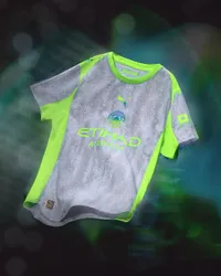
Is the Manchester City 2025/26 third kit the WORST Premier League shirt ever… or an instant classic?
Is the Manchester City 2025/26 third kit so bad it's good? Or just absolutely honking?
The best features, fun and footballing quizzes, straight to your inbox every week.
You are now subscribed
Your newsletter sign-up was successful
Want to add more newsletters?
Join the club
Get full access to premium articles, exclusive features and a growing list of member rewards.
The Manchester City 2025/26 third kit has dropped – and this one is… a choice.
With most Premier League kits released now, Manchester City have dropped two well-received shirts so far, with the home top lauded for its simplicity and sash and the away earning similar plaudits for its moody, all-black look.
Well, now for something completely different…
Article continues belowThe Manchester City 2025/26 third kit combines a rain graphic with fluorescent hues for something unbelievably divisive
We get it: football manufacturers are running out of inspiration. Just take City, with Puma in recent seasons mining Noel Gallagher's handwriting, Manchester's phone area code and knock-off shirts from Matalan for kit inspo.
Now, the German manufacturer have looked to *checks notes* the rain, while recreating the vibe of the 2000-2002 away shirt, in which the Cityzens were relegated and subsequently promoted.
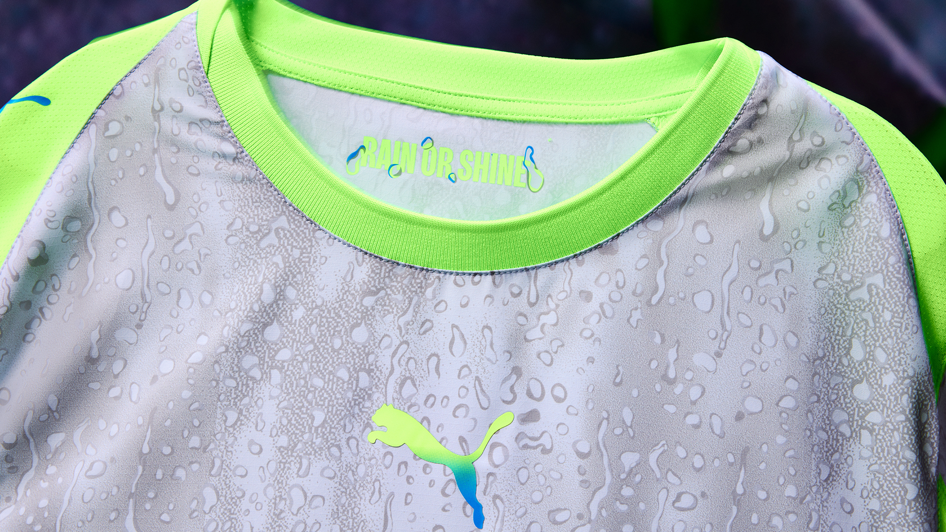
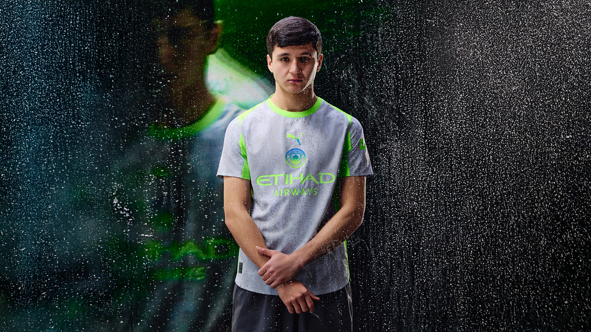
Raindrops on a grey base, with fluorescent green detailing: Puma have gone bold with the Manchester City third kit, and it will certainly divide fans.
There's an obvious raindrop graphic, while Puma note, “A green-to-blue gradient runs down the centralised cat and club crest and into the socks to create a cohesive full-kit look, resembling the iridescent nature of water,” noting, too, that, “The kit carries a message from Manchester: even when it rains, we shine.”
It's a hard sell, yes: any one of a) raindrops on a football shirt b) a colourless kit or c) that shade or green would be enough to turn off some fans. The combination of all three make this one quite the choice.
The best features, fun and footballing quizzes, straight to your inbox every week.
While detractors will say that there's a reason that football clubs don't wear grey and green, there's certainly a case that the worst-looking kits actually make classics.
The Arsenal away shirt of 2023/24, for example, combined steward colours with an obnoxious pattern, only for the Gunners to look virtually unstoppable in the get-up: it's now regarded far more fairly by fans and it's safe to say it'll become a collectable in years to come.
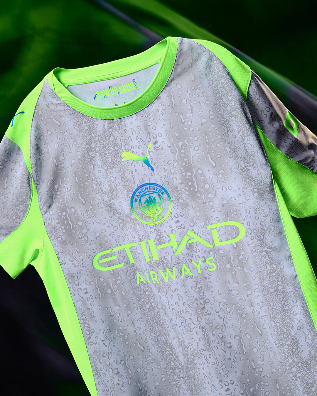
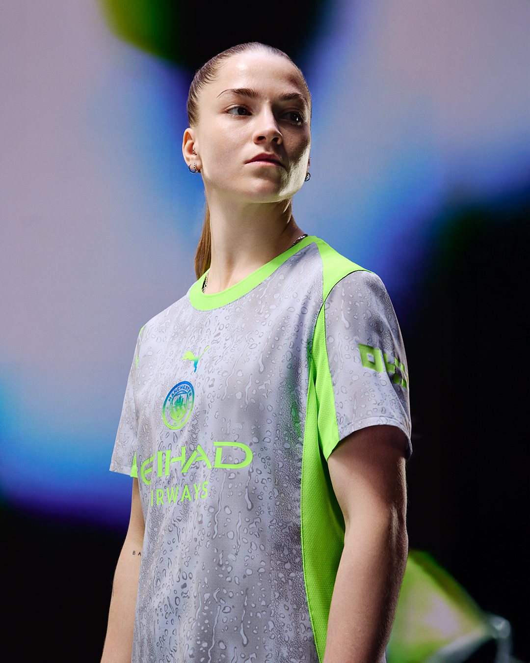
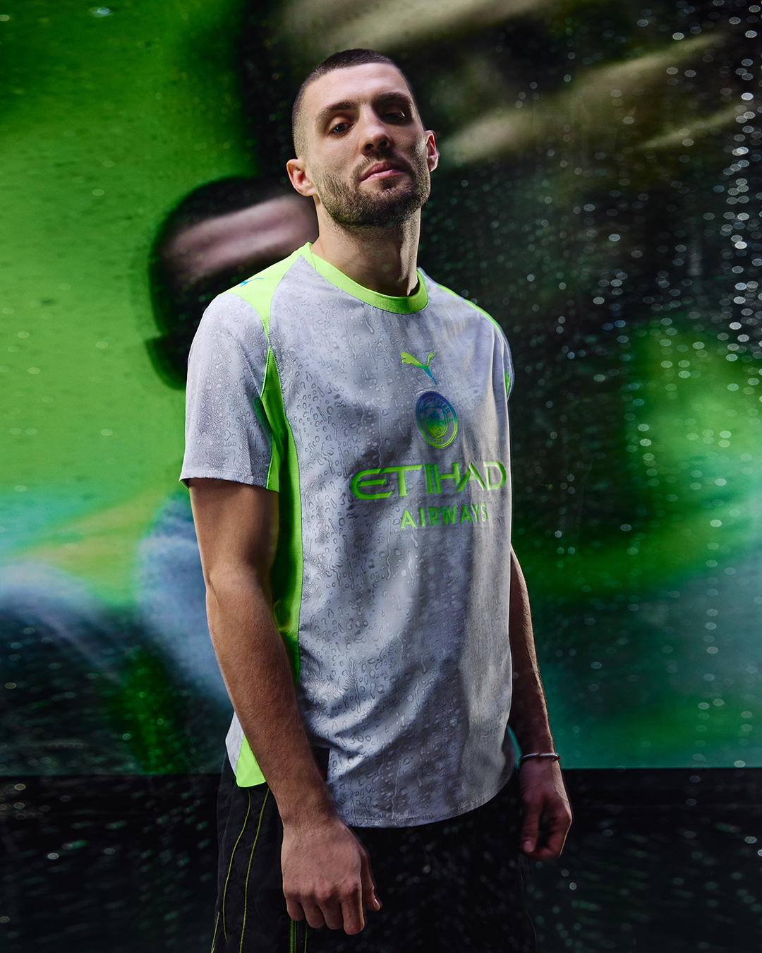
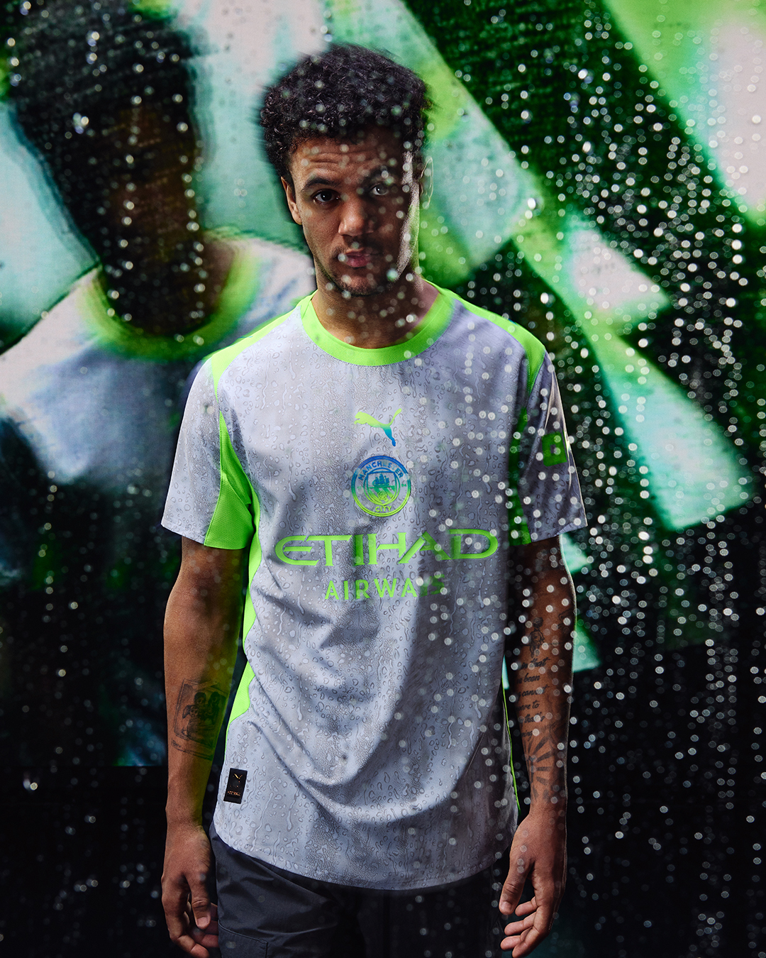
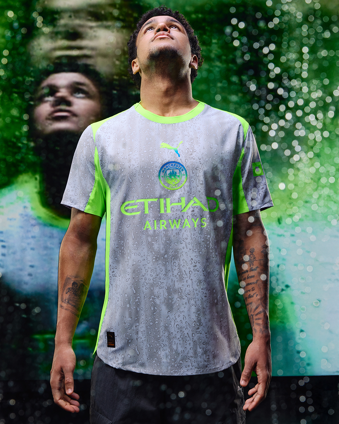
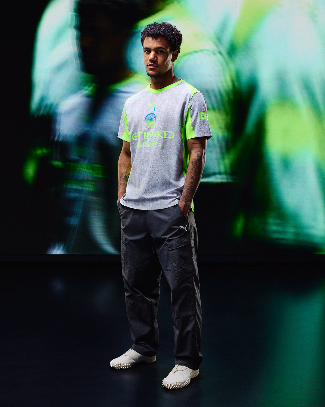
Puma certainly aren't afraid to upset when it comes to kits – and though this one has split City's fanbase since it leaked, it may well “look better on”, as the cliche goes.
But for others, there's simply no saving this one. City, once again, are unignorable in the fashion stakes.

Mark White is the Digital Content Editor at FourFourTwo. During his time on the brand, Mark has written three cover features on Mikel Arteta, Martin Odegaard and the Invincibles, and has written pieces on subjects ranging from Sir Bobby Robson’s time at Barcelona to the career of Robinho. An encyclopedia of football trivia and collector of shirts, he first joined the team back in 2020 as a staff writer.
You must confirm your public display name before commenting
Please logout and then login again, you will then be prompted to enter your display name.
 Join The Club


