


The Premier League badge and font are symbolic. You'll always remember the particular numbers and letters that you got on your first football shirt, after all.
There's far more in a number than just the digits being a signifier of role and position – so having a regal style of lettering is just as important. Once upon a time, there was no default style but sure enough, most other leagues sought to copy the Prem with their own tournament typeface.
It all began in the 1990s…
Every Premier League badge and font
1992/93: No rules… at all

In 1992, the Premier League was born. There was no standard font across teams, with each club having a typeface supplied from their kit manufacturer. But no names on shirts… yet.
One of the key proponents for a breakaway competition from the Football League, David Dein, wanted to bring in squad numbers like American sports had, rather than the 1-11 that we were all used to. After all, Dein's Arsenal had fielded defender Steve Bould as their No.10 in 1989 when they won the league at Anfield.
And so for the 1993 League Cup final, the Gunners took on Sheffield Wednesday with both sides having squad numbers. This would come into play in the Premier League the following season.
1993: Squad numbers – but still not uniform

From 1993 onwards, clubs were required to register specific players alongside a designated number. But still, kit suppliers gave clubs different fonts.
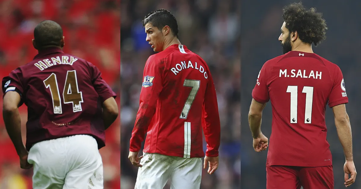
The fonts were all serif in style, inspired by the blocky American football fonts of the 90s. 1994/95 title winners Blackburn Rovers had this effort from Asics but Manchester United had similar from Umbro, Liverpool similar from Adidas and Arsenal similar from Nike.
The competition badge patch – a square combined with an upside rectangle, with the Premier League logo – was given a slight tweak in 1993 with the introduction of player names on shirts. Reigning champions got a special golden version of the patch.
1997: A brand new font

A serif font appeared in 1997, available in a range of colours to teams in the Premier League. It had a defined shadow and the Premier League logo at the base of the logo. If you had it in certain shades, the shadow and logo would simply be inverted.
Available in white, black, navy, yellow, red, royal blue and gold over the years, this became the classic style that dominated the Arsenal/United duopoly, as the sleeve patch remained largely unchanged. While Manchester United conquered Europe in custom Umbro letters in 1999, however, not every club had an alternate choice for other competitions, using the standard Prem typeface without the competition's lion logo on it.
Arsenal were playing with that font in the Champions League as recently as 2006 when they made the final – though bizarrely, only for their yellow away shirt – while Leeds United and Newcastle United used the iconic Prem typeface on the continent, too.
2003: A new sleeve patch

For the 2003/04 season, there was a new sleeve patch for the competition, with a very subtle update.
For the first time, the official sponsor of the division, Barclaycard, adorned the patch, in a sort of comet shape across the standard upside-down triangle. Still, champions got a golden version. Nice.
2007: The first big Premier League font switch

Sticking on same theme as the iconic 1997-2007 Premier League typeface, the top tier of English football had a brand new look with a fresh logo and a more streamlined font to match.
This font was also serif – it had pointy bits on the letters, basically – though it was a little thinner than the last one and omitted the shadow this time around in favour of outlining the letters themselves.
Like the old font, this one was available in a variety of colours for clubs depending on what colour the shirt was that it was printed on.

The new Premier League sleeve patch is a slight variation from the last, featuring a two-tone lion, based on the outline of the lion from last time around. Rather than a profile shot, we see him face on.
But champions no longer got the lion in gold itself but the badge in gold.
2016: A new logo is introduced… but the font remains the same

The 2010s brought the simplification of logos and fonts across industries. Look at Google, Uber, Spotify, Starbucks… even football clubs within the Premier League itself like Manchester City and Liverpool, who went with more basic badges on their shirts (and dominated the competition, while they were at it).
The Prem followed with a bold new reinvention. DesignStudio, who worked on the likes of Airbnb's rebrand, reshaped the iconic lion within a circle, simplified his crown and gave the league neon shades of green, purple, pink and cyan. Zig-zags were used across the branding, too, to reflect the flame-like mane of the mascot, while the "Premier League" text went sans-serif for the first time.
Accompanying this rebrand, clubs got a new, round patch for their arms – navy for 19 sides, gold for the champions – but not a new font. Curiously, the 2016/17 utilised the old font with the old logo at the bottom of the numbers – though a radical typeface for the competition leaked just before the season began…

Taking its cues from the Football League typeface, this particular font would have been the boldest look yet, with the six in this instance coming in two separate shapes. We make that four separate pieces that you'd need to get printed onto your top if you wanted Trent Alexander-Arnold's custom No.66 – plus 17 whole characters for the name.
Was this font real? Just a fake that spread on the Internet with no proof? Perhaps in the immortal words of Marty McFly, we weren't ready for it just yet…
2017: A new font follows

A year after the logo rebrand, the league introduced a new shirt font, too. This was still a drastic change from the last two – so perhaps it came a year later because the Premier League still hadn't decided upon it yet.
Rounder, chunkier and clearer than ever, this became the first sans-serif typeface of the competition's history. The outline slightly within the letters was replaced with a thicker outline to make the text stand out more, while the lion sat on the bottom of the numbers, as ever.
This font was available in fewer colours than ever before though, in order to help with legibility. This font has never come out in gold, with a bright yellow used instead, while white, black, navy and red are all standard.
2023: A subtle evolution

The Premier League briefed manufacturer Avery Dennison that a 2023 design of the letters had to be even clearer than before, while subtly tweaking the current style rather than making a big shift.
The result means that the last typeface for the Prem was the shortest-lived but also that this new reworking is easily the least drastic, with the Premier League brand perhaps far too established now for the league to think about changing it as much as they have previously.
The letters on this one are scalable to the shortest or longest names, while the numbers have been increased in size by 10%. From a distance, it doesn't look like much change… at all.

The big change for 2023/24 actually comes from the sleeve badge. That cat can't be contained in a shape anymore.
The purple lion logo for the Premier League is now enlarged on the sleeves of the clubs for next season, with the title winners getting a gold version. Simple is best, right?

