Ranked! Every Premier League club’s new home kit from worst to best
We’re ready for Premier League sides to strut their stuff in 2018/19 – but who’s going to be the best turned out? Nick Miller gets his claws out
The best features, fun and footballing quizzes, straight to your inbox every week.
You are now subscribed
Your newsletter sign-up was successful
Want to add more newsletters?
Join the club
Get full access to premium articles, exclusive features and a growing list of member rewards.
Remember, kids, this is subjective nonsense and the opinion of one writer. We've got separate Best and Worst kits of the season lists too. Let's not take it too seriously, eh?
20. Tottenham
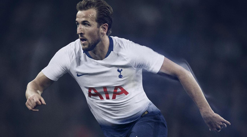
You wonder what exactly were they thinking of with this. Were they going for the ‘shorts are leaking into the shirts’ look? Did they mean for their players to look like they’re wearing massively high-waisted trousers? Did they think about how stupid it’s going to look when they wear white shorts in the Champions League? Never mind a ropey transfer window: this is Tottenham’s downfall.
Article continues below19. Manchester City
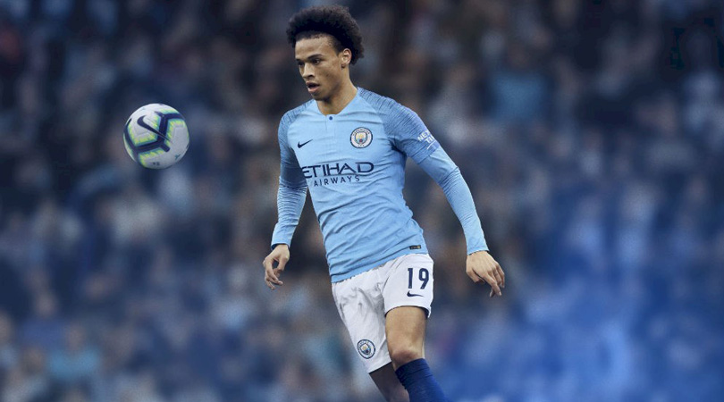
Oh dear no. The tragedy here is that Nike have dressed up a team who play such beautiful football in a top that looks like a plain T-shirt with radio static on the arms. It’s like putting Monica Bellucci in a shell suit, or making Aidan Turner wear Crocs. Concentrate on David Silva’s feet, not his torso.
18. Arsenal
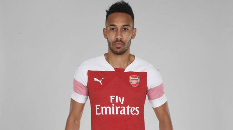
Nope. This looks like someone has lumped about four designs onto one shirt, tried to sketch something taking all that in, left for the evening with it half-finished and then someone took the drawing off their desk and sent it to the factory. There might be a good shirt in there somewhere, but this isn’t it.
The best features, fun and footballing quizzes, straight to your inbox every week.
17. Crystal Palace
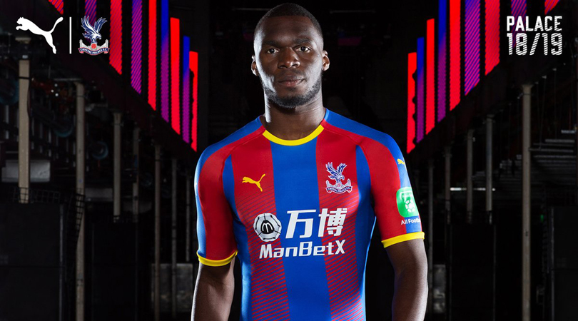
A similar problem to Arsenal’s: the predilection for the fade towards the waist is a problem even with a block colour kit, but with stripes? You’ve already got your variation there, guys. You don’t need to complicate things further. A few points gained for the yellow trim, but overall: no.
16. Manchester United
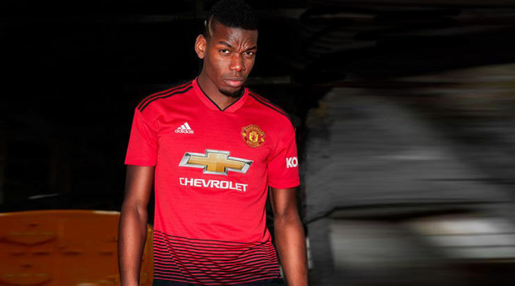
Is change inherently bad? No, but Manchester United switching from white to black shorts might be. You’re tempted to think it just reflects Jose Mourinho’s mood, but at least the gradient makes a little sense. That said, it is still a gradient. Stop it!
15. Bournemouth
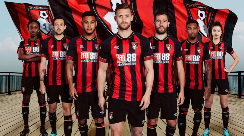
Something’s not right here. A bit too busy? Maybe it’s the collar? Perhaps the sleeve detail? The sponsor’s logo? Is the badge too big? We're not entirely sure what the problem is, but there is a problem. Maybe it’s nothing. Maybe it’s a grower. Maybe it’s just rubbish. Not sure.
14. Burnley
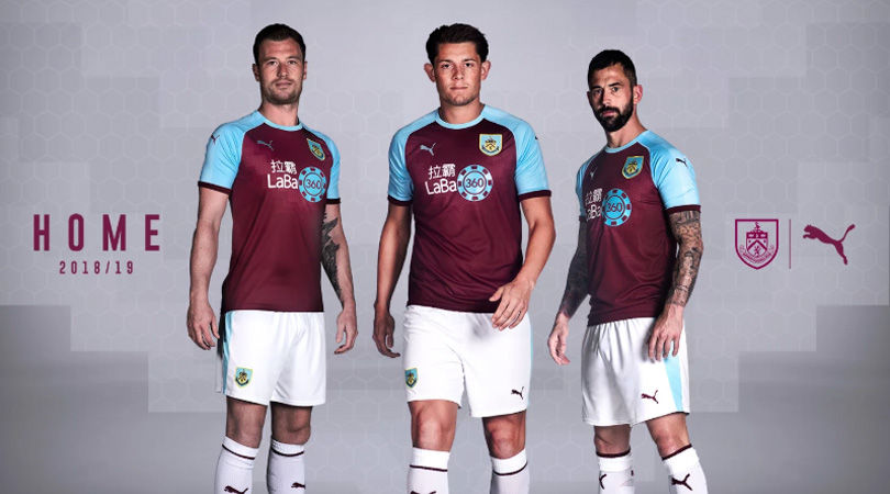
Not bad. Not that good either. And certainly not with that absolute honker of a sponsor splashed all over the ribs. Look, we know clubs inevitably just pick the sponsor that will pay the most money, but can’t they for once just think of the aesthetics? You have to run around with that on your tops all season, lads. Come on. Have some dignity.
13. Southampton
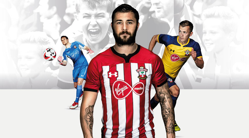
Nothing really to say here. Isn’t this just the same as last season’s? Or some season before? It’s just a bit dull, isn’t it. The sort of thing nobody would notice. Apt, considering the season ahead for Southampton? You said that, not us.
12. Newcastle
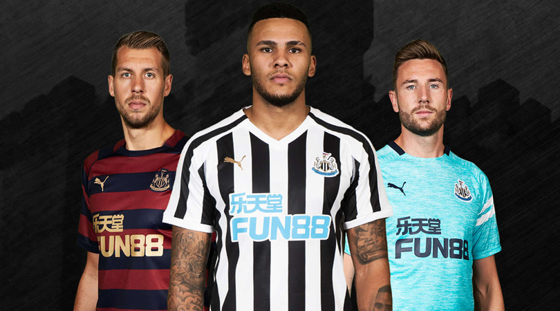
Again, a bit nothingy. Just a black-and-white-striped shirt, churned out; the equivalent of vanilla ice cream. Sorry for banging on about the sponsor, but mercy this is a bad example. Just slapped onto the front, no thought to integrating with the rest of the design. No.
11. Huddersfield
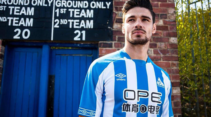
Just... fine - nothing special, looks OK with a sort of ‘less is more’ vibe - but the real star here comes just north of the left nipple. Huddersfield’s terrier badge hasn’t been a feature on their shirts since the early 1970s, but here it is again. One season in the Premier League gives you a dash of confidence, it seems.
10. Brighton
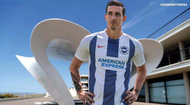
There’s a fine line between simple, clean design and boring, and this kit tippy-toes all over that line like the most delicate gymnast. In its favour, the white sleeves look better than last year’s fuzzy blue, but on the other hand there isn’t a huge amount going on here. Looks very template-y: up to you whether that’s a good or bad thing.
9. Everton
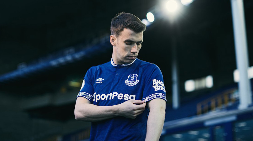
This probably shouldn’t be this far up the list, because the kit itself is merely fine, but it’s such an improvement on last season’s that it deserves a decent spot. Their 2017/18 effort looked like it had been fished out of a PE lost property box, whereas at least this actually resembles a top someone would wear out of choice, rather than as the only alternative to vest and pants. Nifty sleeves.
8. Cardiff
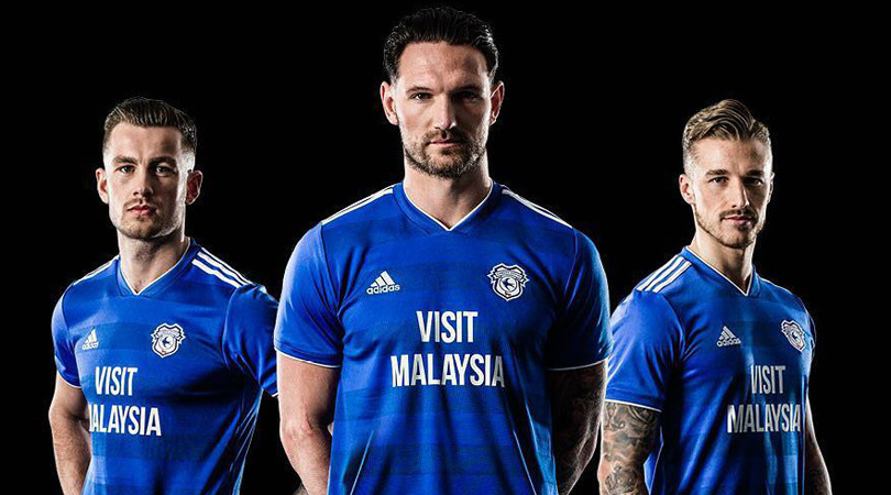
Yes. Good. Not entirely sold on the V-neck, but you can’t have everything. And the sponsor’s logo works too: this time it’s big, sure, but the font is nice and clear, and it tells you exactly what they want you to do. ‘Visit Malaysia, you say? Quite possibly - I’ll jump on Expedia just as soon as I’ve finished watching Junior Hoilett shank a cross into the stands.’
7. Chelsea
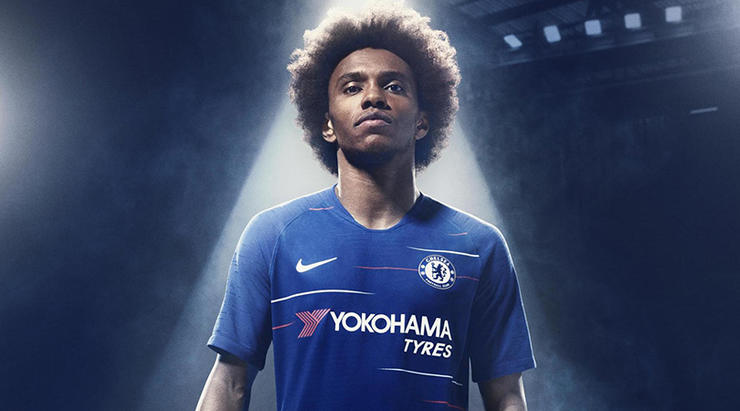
This should in theory be awful: it looks like the start of TV interference. Or a crap t-shirt from the reduced rail in Topman. But you know what? We like it. Not something you’d necessarily wear to dinner, but at least it looks a little bit different to the usual templates. A low bar, perhaps, but we’ve all got to make it through the night somehow.
6. Leicester
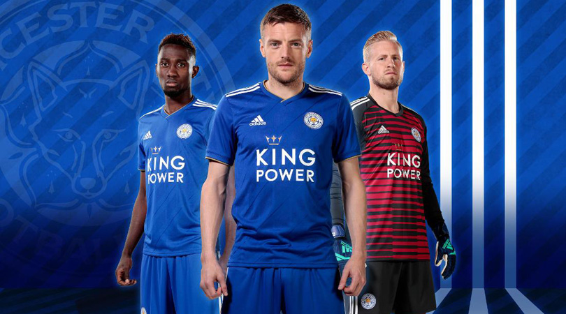
Fair play to Adidas for not going too formulaic with their kits: there’s a nice theme, without them all looking the same, subtle variations in each. A case in point here: the nice diagonal lines differentiate it just enough without being too showy. And lord forbid a football shirt is too showy.
5. Liverpool
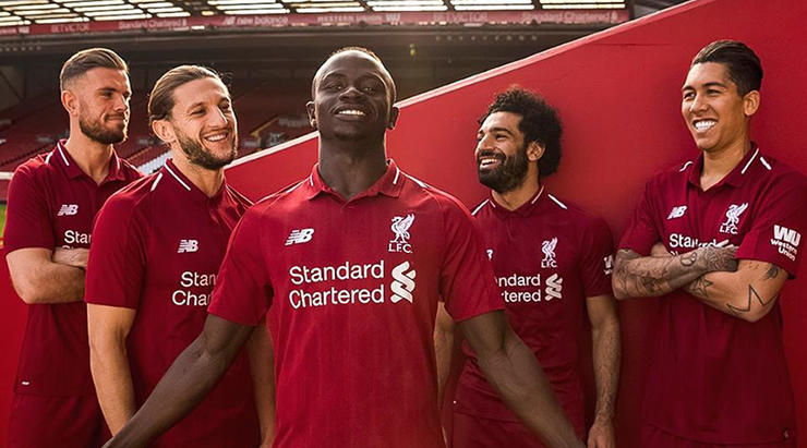
This loses a couple of points for not having any gold on it, because everyone knows the best Liverpool kits have some gold on them. But it’s still very good; proof that you can do some decent things with what is essentially just a plain red shirt. Nice subtle detail, and being New Balance, it has the added benefit of not being exactly the same as five other kits in the division.
4. Fulham
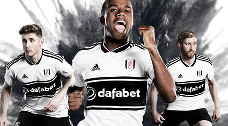
Yes please. The idea of the late 1990s being retro is a troubling one for people of a particular age, but if you’ve visited an Urban Outfitters over the last year or so, you must have made your peace with that by now. This is very nicely done, and has the added benefit of making the sponsor’s logo look like part of the design.
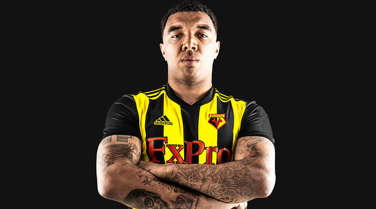
3. Watford
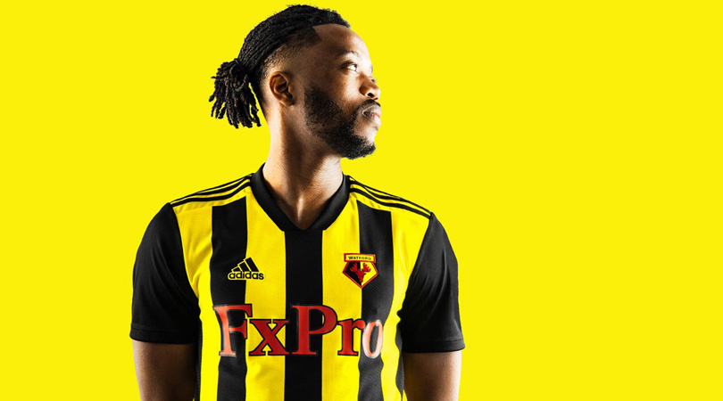
We like it. Sue us. This may well have got a little stick on popular internet social media microblogging platforms, probably because it doesn’t actually look much like a Watford kit. Where did the black stripes come from? Still, tradition can go hang with this one – and extra credit for making a virtue of the sponsor’s name, the red adding a dash more colour.
2. West Ham
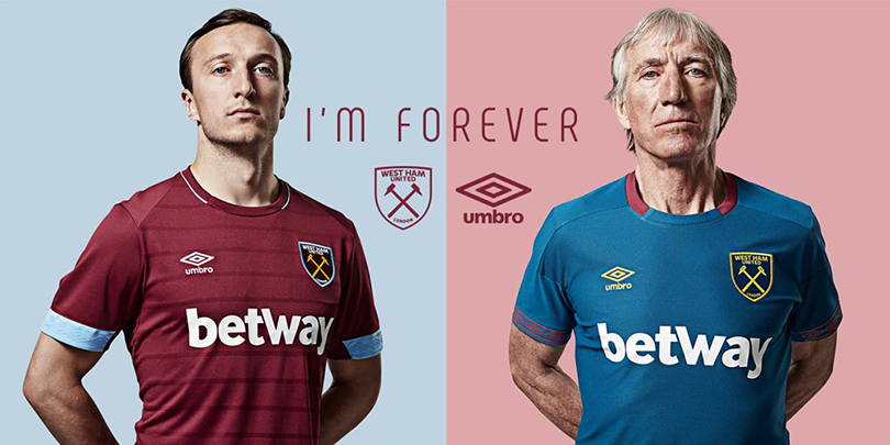
Yes. Absolutely. All the way in here. Lovely blue hoops on the arms, nice clean design, some subtle horizontal stripes. It’s a shame Aston Villa aren’t in the Premier League because their kit is delicious, but this is the closest we have to it in the top flight. Ideally the whole sleeves of West Ham shirts should be that blue colour, but we’re nit-picking.
1. Wolves
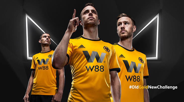
Congratulations Wolves, you have won the 2018/19 Premier League (’s best kit award as decided by FourFourTwo)! A beauty for sure. Wolves’s kit last season was one of those nasty numbers with the odd fuzzy bits on the arms, but if in doubt, go simple: black sleeve stripes and gold. Deservingly top of the podium.
Now read...
THE GOOD The 20 best kits of the 2018/19 season
THE BAD The 17 worst kits of the 2018/19 season
 Join The Club


