Ranked! 20 Premier League 2017/18 away kits from worst to best
The shirts that Premier League clubs will be wearing next year when there's a kit clash – or, let's be honest, just when they need to sell a few – rated in order of excellence
The best features, fun and footballing quizzes, straight to your inbox every week.
You are now subscribed
Your newsletter sign-up was successful
Want to add more newsletters?
Join the club
Get full access to premium articles, exclusive features and a growing list of member rewards.
If you haven't read Nick Miller's ranking of this season's Premier League home kits, you can do so here.
20. Watford
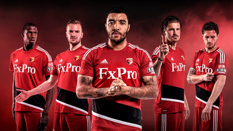
Come on, adidas. At least look like you're trying. This is just the Middlesbrough kit from last season but with a white bit filled in black. There's a difference between a template and just someone's sloppy seconds. Honestly: nobody buy this shirt in protest. That'll show 'em.
Article continues below19. Everton
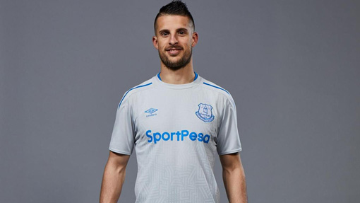
Eeesh. If the home kit looked like a blue '90s training top that someone has found in lost property, the away number looks like a white '90s training top that someone has found in lost property, then put in the wash with a pair of black socks. At the risk of sounding like someone's mum, it just looks grubby.
18. Huddersfield
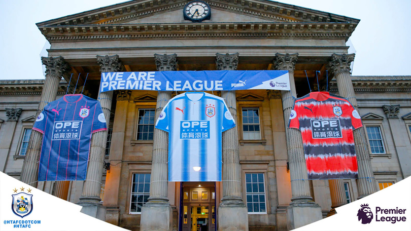
Now, Huddersfield are being obtuse, like one of those parents who say they don't have a favourite child, even though they obviously do: they don't have a designated away kit, just two different 'alternates' that they will wear equally. Not that it matters much, because they're both horrible: one blue with pink pinstripes, the other a horror show that doesn't so much reference but actually copies one of their kits from the '90s. Like Babylon Zoo and Hooch, some things should be left there.
The best features, fun and footballing quizzes, straight to your inbox every week.
17. Liverpool
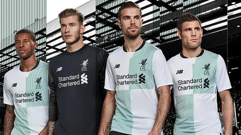
Hmmm. Erm... not keen. The home jersey is a delight, but the pale green and white quarters of the away number don't work at all. They look more like a T-shirt you might find in the bargain bin at Next than a football shirt. The third strip is at least bold, a bright orange that you wouldn't get knocked off your bike in, but this is very bland.
16. Manchester United
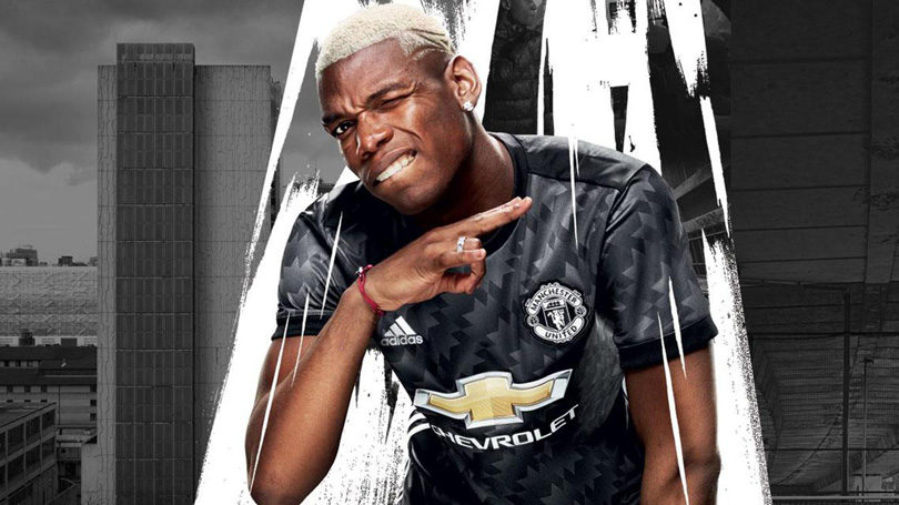
Again, the '90s revival goes too far. This looks like the tracksuits that clubs used to crank out 20-odd years ago, the sort that crop up in old photographs when mum wants to embarrass you in front of a new partner. Paul Pogba looks good in it, but Paul Pogba would probably look good in a binbag. Which is just as well, as this does rather resemble something you'd stick in the swing-top.
15. West Ham
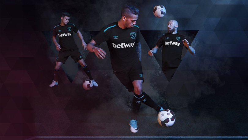
At first glance, it looks like a training top. Then at second glance... it still looks a bit like a training top. Still, it's quite a nice training top, with the addition of some pleasant electric blue/turquoisey piping. But... it does like a training top.
14. Southampton
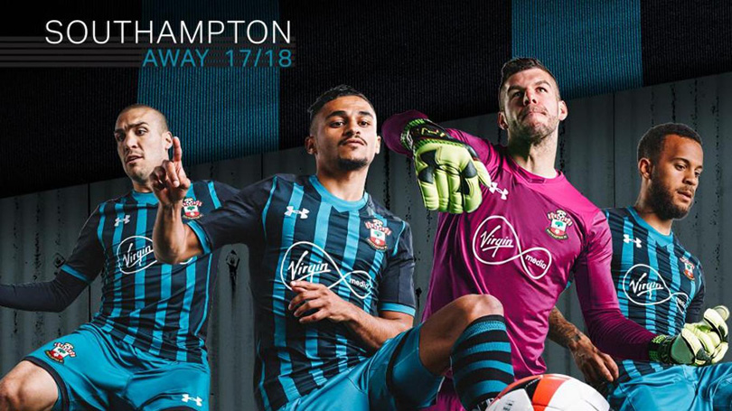
This kit seems to reflect the club rather neatly: nice, admirable in a fashion, but you struggle to find anything to say about it beyond a small shrug and a 'S'alright, I suppose'. And, erm, yeah. That's about it.
13. Brighton
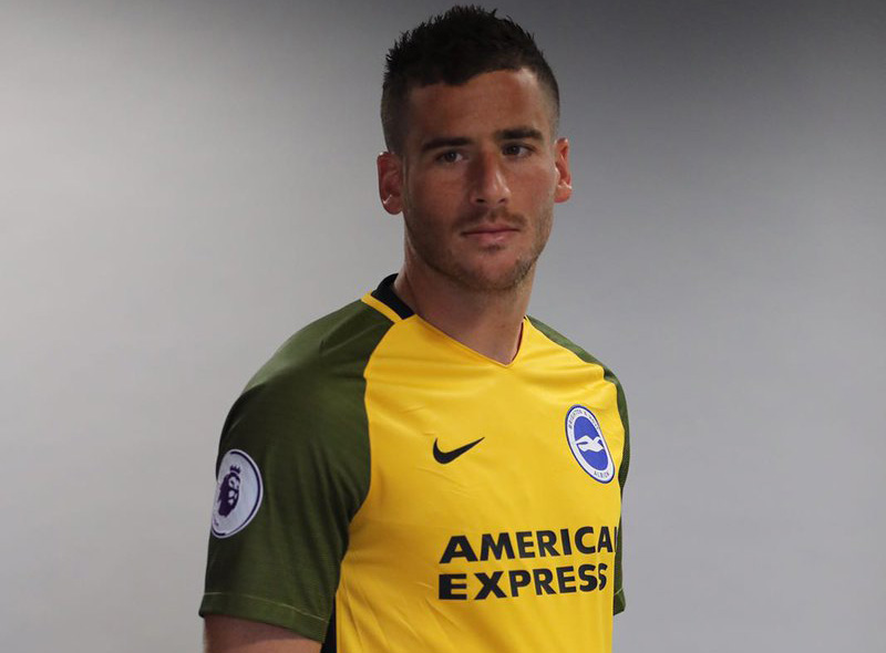
Isn't this Claudio Bravo's kit from last season? While the other Nike clubs have got their nice, clean, if rather homogenous design, Brighton seem to have been lumbered with a bunch of shirts from last season. Still, it's OK, even if the sleeves do slightly resemble the mud after a wet Glastonbury.
12. Leicester
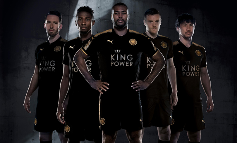
While Puma's troubling aversion to the straight line continues, and Leicester's home kit is ropey to say the least, this one actually works. Black and gold goes together reasonably well, at least to the extent they can get away with it, unlike with the gold bits on the blue home top.
11. Newcastle
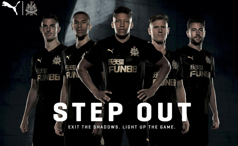
Two of the themes with Premier League kits this year seem to be black away kits and simplicity. It's like someone has collectively realised, about 25 years late, that referees don't wear black anymore, and that black is cool. This works quite nicely, but as the home shirt is half black too, you do slightly wonder what the point is.
10. Stoke
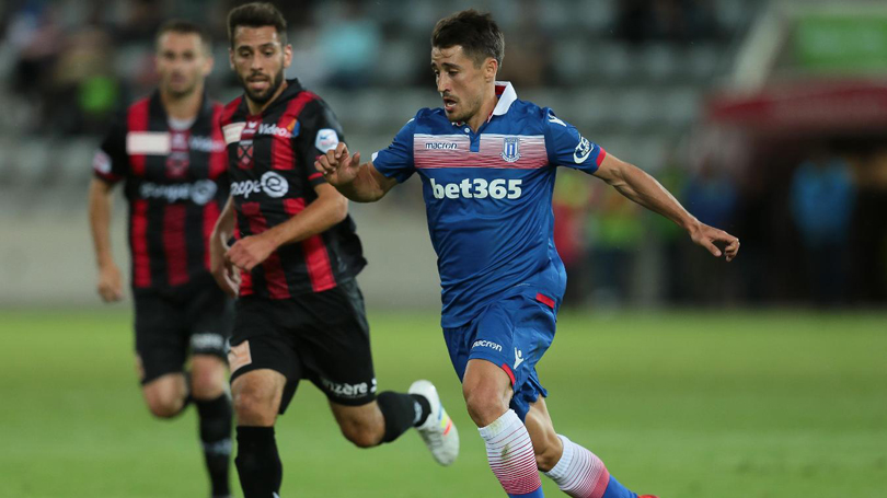
Bit difficult what to make of this. The component parts independently are a bit naff: the iffy collar, the sash across the chest that looks a bit like wallpaper in a jazzy chain hotel, the fact it's made by Macron. But oddly, all put together, it sort of somehow works. Like Stoke, in fact.
9. Bournemouth
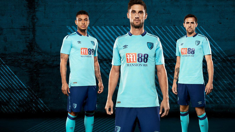
Umbro, who a couple of years ago were actively getting out of the kit-making game, have served up some stinkers this season (see: Everton). But Bournemouth's change strip is rather pleasant, from a distance at least. Get a bit closer and you'll see among the turquoise a blended in design – think that old Manchester United shirt that had a picture of Old Trafford stitched in – that looks a bit weird, but as you can't really see it unless you're about a yard away, it doesn't make much difference.
8. Arsenal
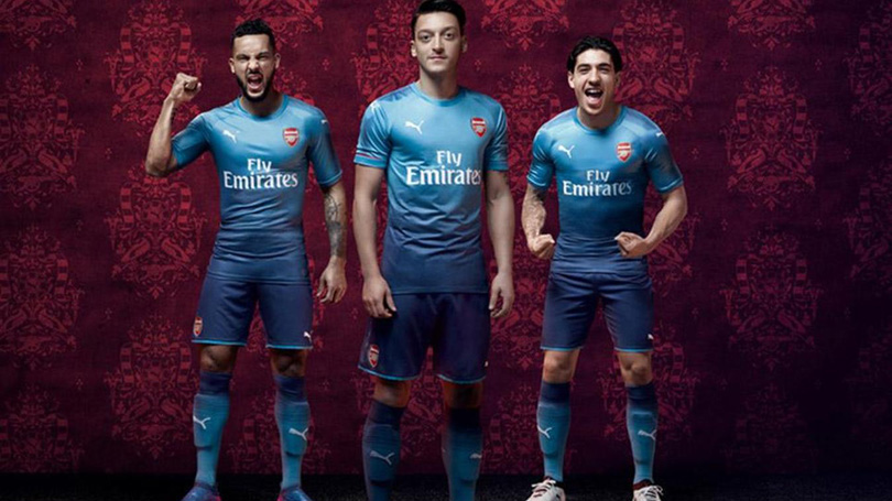
The fading light to dark effect can be an error, not least because it can look like the wearer has quite flamboyantly wet themselves, but this Arsenal number is actually quite nice. Even though the two-tone era was one we thought we'd escaped: a) When Global Hypercolour T-shirts went out of style and b) When Barcelona had that one which looked like an ice lolly.
7. Swansea
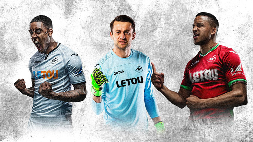
That's 'chili red' on the right, apparently. Whatever you call the colour, the shirt is lovely, the green trim working very nicely and the white bits on the collar certainly adding a nice subtle touch. Fernando Llorente is, as he does in most things, going to look very smart in this. Plus: shrewd choice for the patriotic Welsh scene.
6. Burnley
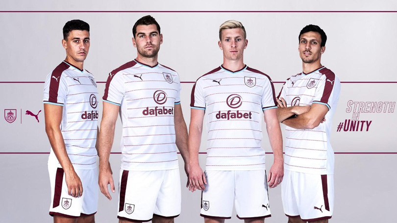
The award for biggest contrast in quality between home and away shirts goes to... Burnley! The first-choice number ranked a lowly 19, but this one fares much better. Unusually for their current trend Puma have managed to stick with a clean, solid line on the sleeves, and a white away kit always feels right. One slight issue, not necessarily their fault: the horizontal pinstripes are, on closer inspection, the word 'Clarets' in very small print, which is rather reminiscent of that suit Conor McGregor wore with 'F*** you' written on it (minus any asterisks) dozens of times. Shame.
5. Chelsea

Like the home shirt, less is more for Chelsea here. Nothing complicated, just a white shirt with blue trim and blue bits under the arms. It is a bit plain, and if you were in charge of these designers you might wonder why you're paying them to just design a plain white shirt, but it works so who cares?
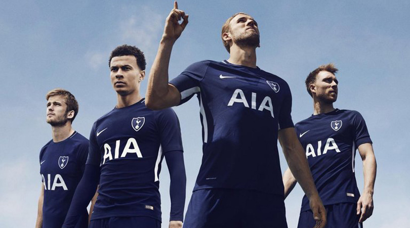
4. Tottenham Hotspur
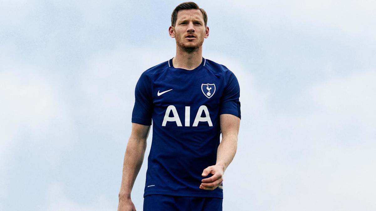
You'd think that Spurs got all of their nostalgia out of the way last season, but this is a nod to the away strip worn during the Double-winning season in 1960/61. And very nice it is too, if rather plain and – if you want to be uncharitable – unimaginative. But like those people who say 'I could've painted that' when faced with an ostensibly simple artwork, naysayers should be ignored.
3. Manchester City
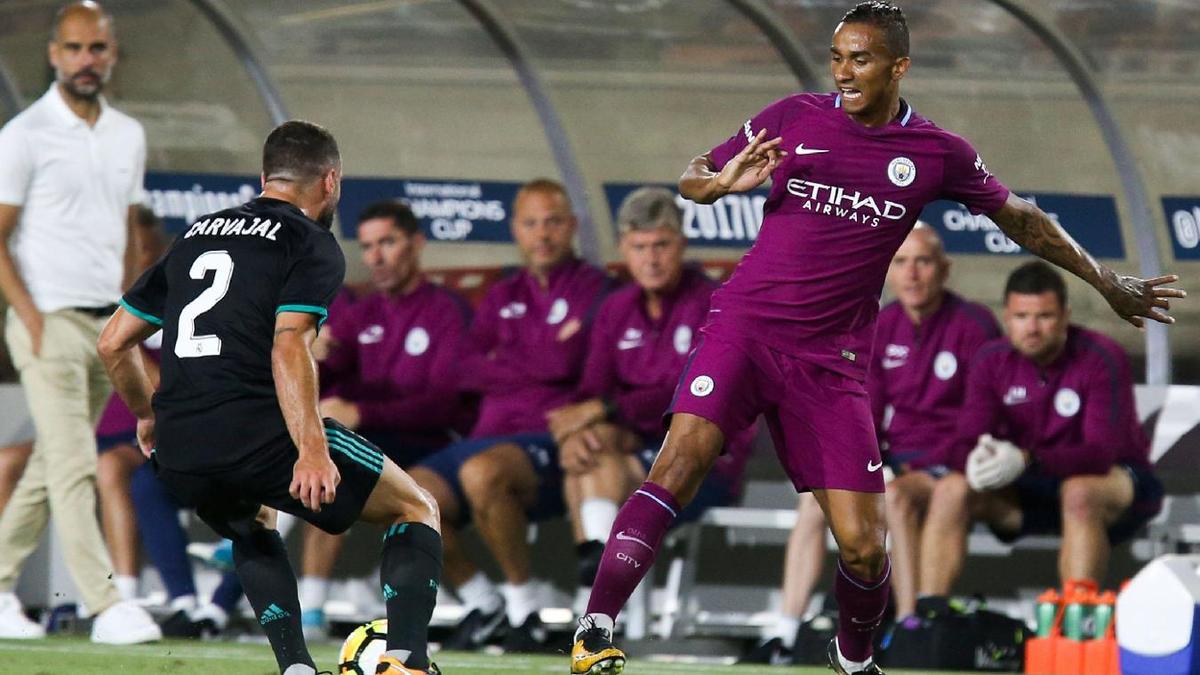
The Nike template strikes again, but this is rather stylish. Adding to the clean simplicity of these shirts, this maroon number does at least give a nod to the club's history. You can picture 'Brother' being written across this one, and anything that reminds anyone of Uwe Rosler is a good thing.
2. Crystal Palace
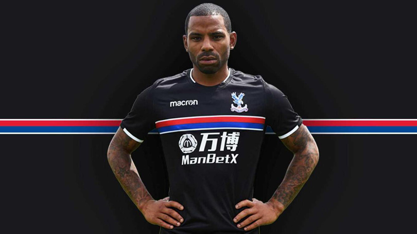
Yes! Very strong, with whiffs of the iconic Sampdoria kit, that horizontal bar across the chest adds a certain flair to proceedings. That sponsor's logo is hideous and, again, black football kits can be a tricky business, but this one gets away with it nicely.
1. West Bromwich Albion
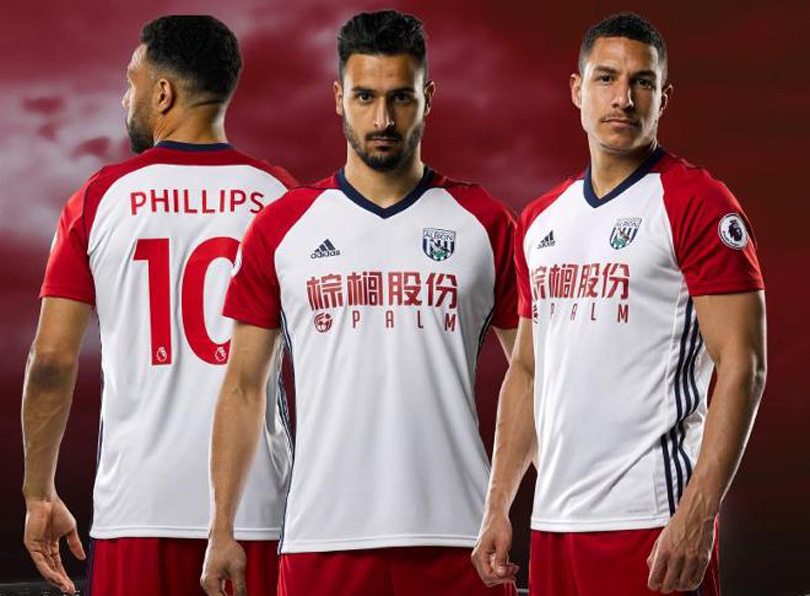
It's a weird thing to purr about a football shirt, but: purrrrrrrrrrrrr. What a lovely thing this is, the bold contrast between the always excellent combination of red and white, the tastefully used blue detail, the nicely proportioned block colour sleeves. Well done adidas, well done West Bromwich Albion, well done to us all.
 Join The Club


