Man City 'dashing', Spurs 'sharp and stylish' - Fashion writer Hadley Freeman on the Premier League's new kits
The dawn of the new Premier League season brings with it a selection of new kits. FFT asked Guardian fashion writer Hadley Freeman to share her honest opinion of the latest line of top-flight finery...
Arsenal
Here’s a fascinating story for all FourFourTwo readers: I recently moved down the road from the Emirates Stadium. And here’s an even more fascinating story: it was months before I figured out why there seemed to be so many fans of Emirates airlines in my neighbourhood. There’s a fun little insight for all of you into the head of an American person who knows nothing about football. I’m presumably like an exotic species to you lot. A very annoying, stupid exotic species.
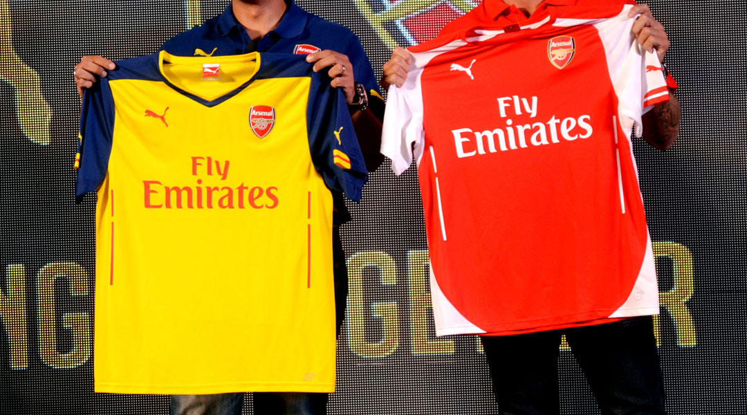
Obviously, I am now a MASSIVE supporter of my local team but I can’t say I’m much of a fan of their red and white colours. It’s all a bit Where’s Waldo on my local high street every Saturday, except Waldo is EVERYWHERE. The team has switched to Puma this season (hold the front page!) but my favourite thing about the kit is the rather retro yellow and blue away uniform, especially the sharp blue shorts. Sadly, because I live next to the bloody stadium, I’ll only ever see the Where’s Waldo one. Good to see everyone’s still loving Emirates airlines. I wouldn’t know I was at my Tube stop if I didn’t see protestations of love for the Emirates.

Aston Villa
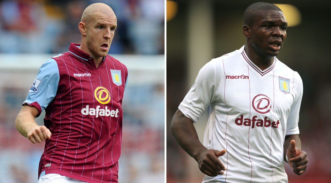
See, this is a bit more interesting. Red and blue – or, as Aston Villa fans seem to insist, claret and blue – is a more flattering combination than bald white and red, and I like how they’ve broken up the red on the shirts with some blue pin stripes. Someone, somewhere has thought about what looks flattering close up as well as far away. The away kit is a bit grimmer – it’s looks a bit Barmy Army to me, or maybe I shouldn’t say such things on a football website – and the ugliness of the Dafabet logo is put into sharper focus against the white. But hey, you can’t have everything. And seeing as Aston Villa fans mainly come from Birmingham, according to Google, they presumably are used to looking on the bright side of things.
Burnley
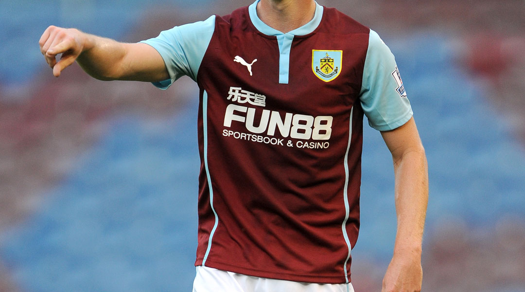
Well, obviously the sponsorship logo across the front is disgusting, but moving on from that atrocity, the rest of the kit isn’t a disaster. The collar is rather fetching with its little v-neck cut and the colours, while a wee bit boring, are perfectly flattering. The shorts are so freaking dull I’m not sure why they’re even bothering with them. The team might as well run around in their pants, quite frankly, because these shorts do absolutely nothing. Still, the home kit is much preferable to the away kit which is shapeless, tedious and looks more like a referee’s outfit than that of a player. B for Burnley, C for effort.
The best features, fun and footballing quizzes, straight to your inbox every week.
Chelsea
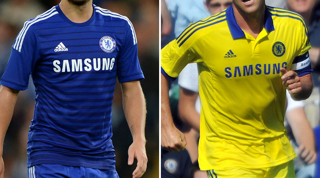
Come on, Abramovich - you got the roubles - I want to see something that makes me think: Ahh, St Petersburg at dusk, the Bolshoi, Red Square. This just makes me think, Hmm, Fulham Broadway Tube stop, Saturday night. The blue shorts are fine, but the top is horrible with all those weird stripes, like a TV test pattern gone wrong. The away kit is a bit jazzier – yellow and blue is pleasingly retro – although it is rather bafflingly similar to the old Brazil kit, isn’t it? Seriously, Abramovich, could you really not afford to pay someone to come up with something original?
Crystal Palace
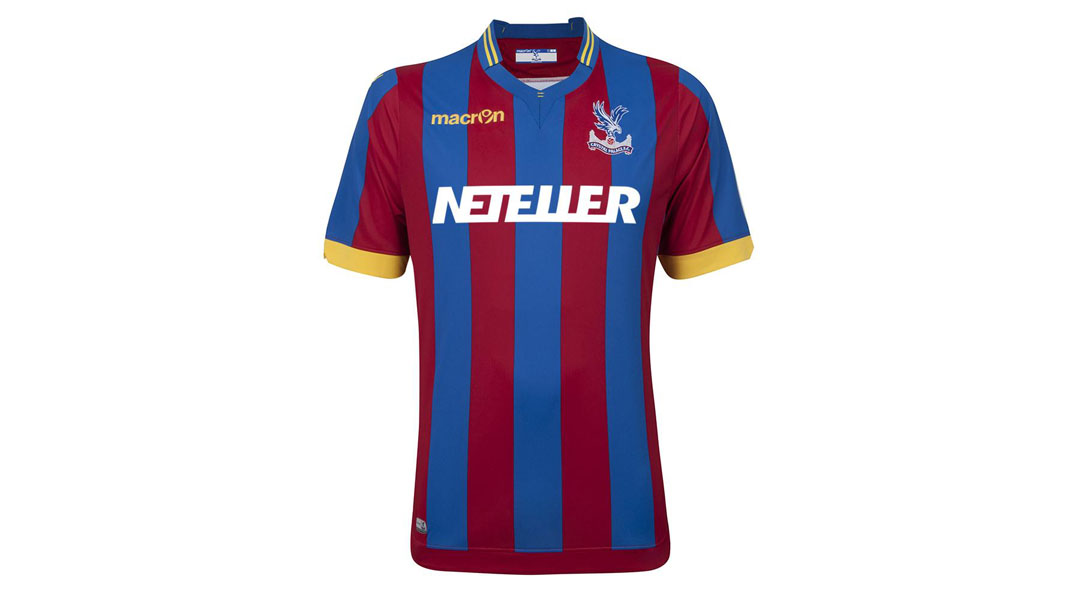
This is what we in the fashion business call 'A Bold Look' or, if anyone really hates it, 'A Strong Look'. I’m trying to think of a single person I know who would suit a tight top with wide red and blue stripes, let alone a tight yellow top, and am failing, sadly. But then, I must confess to being ignorant of who plays for Crystal Palace, so perhaps those south Londoners are possessed of a magical complexion that somehow works with these hideous shirts.
Everton
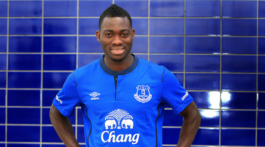
Now THIS, this I like. How can anyone NOT like a top that features the pleasingly elephantine logo for Chang beer? The only logo that would make me happier would be one for Andrex loo roll with the Golden Labrador puppies, but I guess that would probably get the Everton players less cred. The blue is a nice rich shade and the collar in a darker tone is an excellent style touch. And while I’m in a good mood here, can we have a moment of appreciation for the length of football shorts these days? It’s just perfect, flattering to both players and fans alike. And can we now have a moment of silence as we all offer up a silent prayer of thanks that footballers’ shorts aren’t as short as they were in the 70s, or even 80s?
Hull City
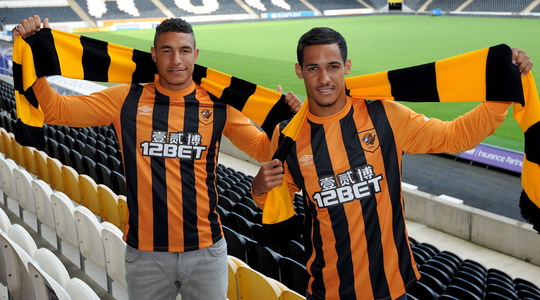
What do you get if you cross a character from the Beano with Halloween? The Hull City kit! Yes, that’s right, it IS hilarious because this kit is so ugly it actually made me laugh out loud at my computer. Shapeless top, meh neckline, mofo HIDEOUS orange and black stripes all down the front. But unlike some kits, which are just plain 'meh', Hull City is full-on ugly, and this makes me actually like it. It’s like a dog that is so ugly that it passes the point of repulsion and becomes actually endearing. So what I’m saying is, Hull City is the pug of football kits. And look how popular pugs are now! Hull City, this is your year.
Leicester City
“King Power”, eh? Bold claim there, Leicester, for a team that’s only just moved up to the Premier League. I have to admit that my only association with Leicester is Adrian Mole and King Power sounds very much like the porn name Adrian would coin for himself and, I’m not going to lie to you, this pleases me enormously. Anyway, the home kit is fine, if slightly odd. I’m not sure what’s going on with the extra seams across and down the shoulders, that collar is bafflingly high and tight around the neck, and all those sponsorship logos are giving me a headache. But the rich blue colour is nice and I rather like the gold accents. The away kit looks like something bad guys in an 80s film would wear and, the more I think about it that way, the less I dislike it.

Liverpool
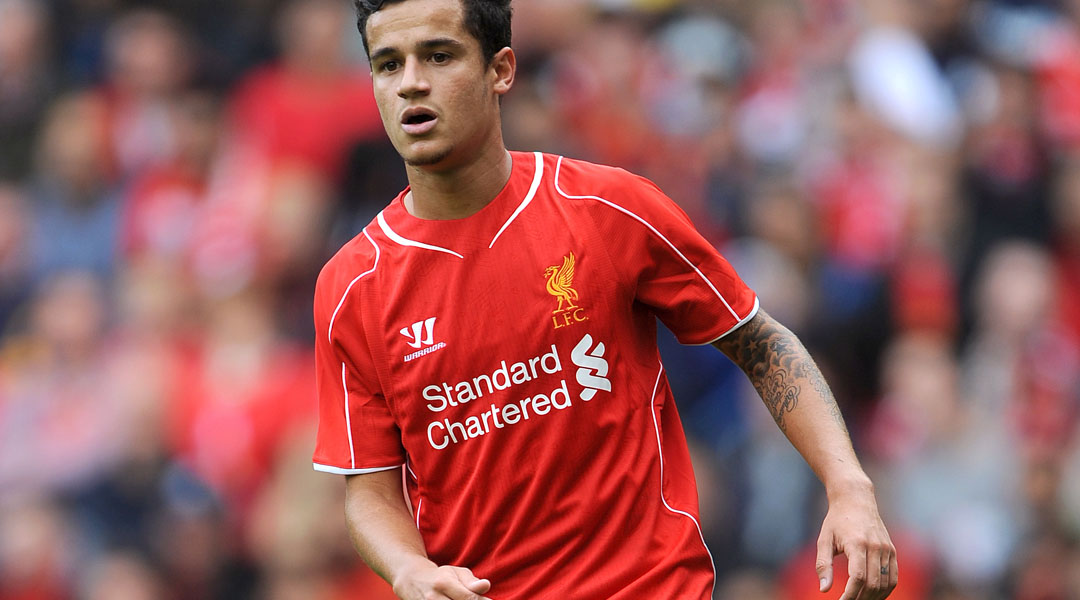
I’m totally fine with this, and it’s certainly an improvement on the previous kit, which was, to use the American fashionista term, fugly. I’m intrigued by the wavy body-shaping side seams which give the illusion of smaller waists. This sort of body-shaping was very popular in womenswear last year after Stella McCartney included them in her show. Are Liverpool players as sensitive about their bodyshape as McCartney’s customers? Perhaps this sensitivity was behind Luis Suarez’s anger problems? Frankly, the potential readings here are endless.
Manchester City
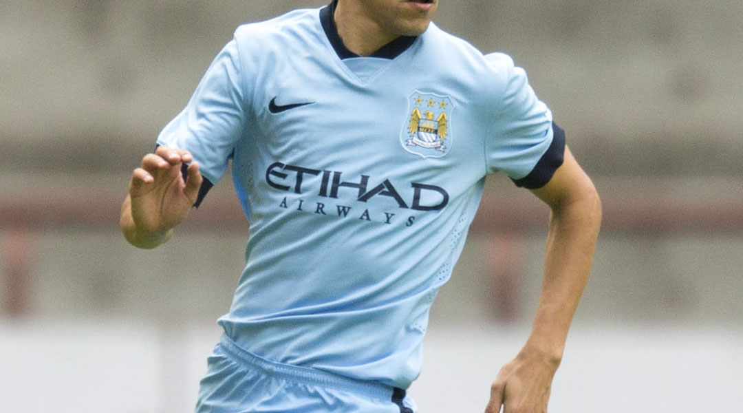
Now this is rather dashing, isn’t it? You can’t really go wrong with sky blue on a man, and the dark blue contrast on the sleeves and collar is even more flattering. Even the logo across the front manages to not be too offensive, seeing as it stays in the same blue colourway. The away kit is a bit more full-on: it rather reminds me of something from Iron Man, with its layers and vague sense of menace, and that’s probably no bad thing in a football team. The little pennant inside the shirt announcing “We are City” has to be the last word in pointless naff, but, hey, what’s football for if not to allow men to indulge in misplaced displays of emotion?
Manchester United
Hmm, Manchester United. I think I’ve heard of them. They’re quite a big team, aren’t they? Well, they’re certainly big in the fashion stakes (see what I did there? Hashtag bantz!) because this kit is rather smart. I’m just going to ignore the hideous Chevrolet logo slapped in the middle of the shirts because it’s upsetting (and pointless, surely. Don’t Manchester United make enough money without having to prostrate themselves to Chevrolet? Apparently not) and focus instead on the good things. The black and white piping around the little collar and cuffs is positively Gallic – no, it really is, being decidedly reminiscent of France’s kit at the last World Cup, and that is no bad thing. I love the single button at the neck, too. Very hipster. Who knew Manchester United was full of hipsters? I don’t really understand why they got rid of all those cool details for the away kit, but then there’s a lot about football I don’t understand.

Newcastle United
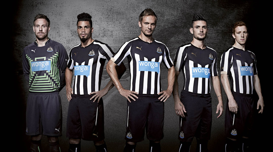
Jesus H Christ, what can you say about this? That it’s horrible? Offensive? Morally and aesthetically reprehensible? Yes, yes and yes. First and foremost there’s the whacking great Wonga advert slapped across the chest. Is Newcastle United really so in need of money that they’ve had to sell out to this kind of high-interest pay day loan company? I don’t know anything about football, but I’ve been following Wonga for a few years now and I remember when it was announced back in 2012 that Newcastle had signed a four year deal with Wonga for £24 million, various people spoke of their disgust, people such as Newcastle MPs and the Football Supporters Federation. And did Newcastle United listen to them? Did they heck. As one Newcastle MP put it at the time, “Some of the richest young men in Newcastle [will] wear shirts calling on the poorest to go to a legal loan shark.” It’s just gross. Even grosser than the horrible black and white stripes on the home kit and miserable grey on the away one. With all that Wonga money you’d have thought Newcastle United could have hired Karl bleeding Lagerfeld to design better kits. All in all, grim.
Queens Park Rangers
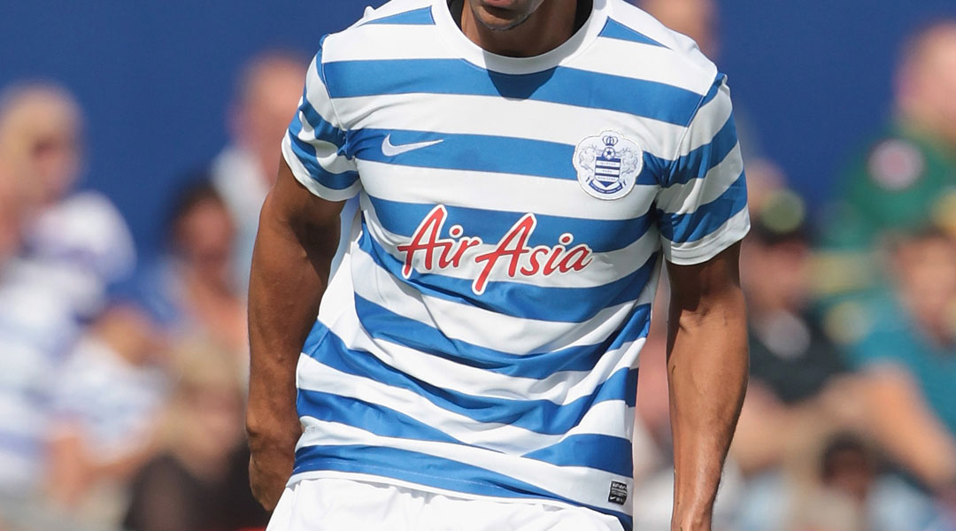
Ooh la la, this is 10 tonnes of awesome! I love a Breton top and now I really love a football team that has Breton tops for their kit. So Frrrrrrench, so camp, so very, very pleasing. The only things that would make it even better is if they all had to wear little berets and sport necklaces of garlic about their person. Surely Francophile Joey Barton would back me up on that one? I lived down the road from QPR for most of my adult life and it’s only now that I’ve moved closer to Arsenal that I learn I was living in spitting distance from the best clad football team on the planet. As Des'ree would say, 'oh life'.
The away kit, however, is hideous and depressing and should be burned at the stake.
Southampton
I’m not sure who in Football Kit Land thinks that fat garish stripes are a good idea, but they should be disabused of this notion, pronto. In all honesty, I mind these stripes a lot less than I’ve minded some of the others (side eye Newcastle United) but, let’s be honest, they do make all the players look like giant candy canes. Which is sweet, and all, but is that really the look those rough and tough Southampton players want to go for? The away kit, unusually, is actually much nicer. In fact, I’d go so far as to call it “properly nice.” Here the stripes are done much more subtly, which is how stripes should be done, and the dark blue with yellow piping is far more flattering that any red and white nonsense. The nice blue shorts in the away kit are also much better than the boring-as-mud black ones for the home kit. Maybe the two kits were designed by two entirely different people? Like, a proper designer did the away one and a blond one did the home one? Ahh, the mysteries of football.

Stoke City
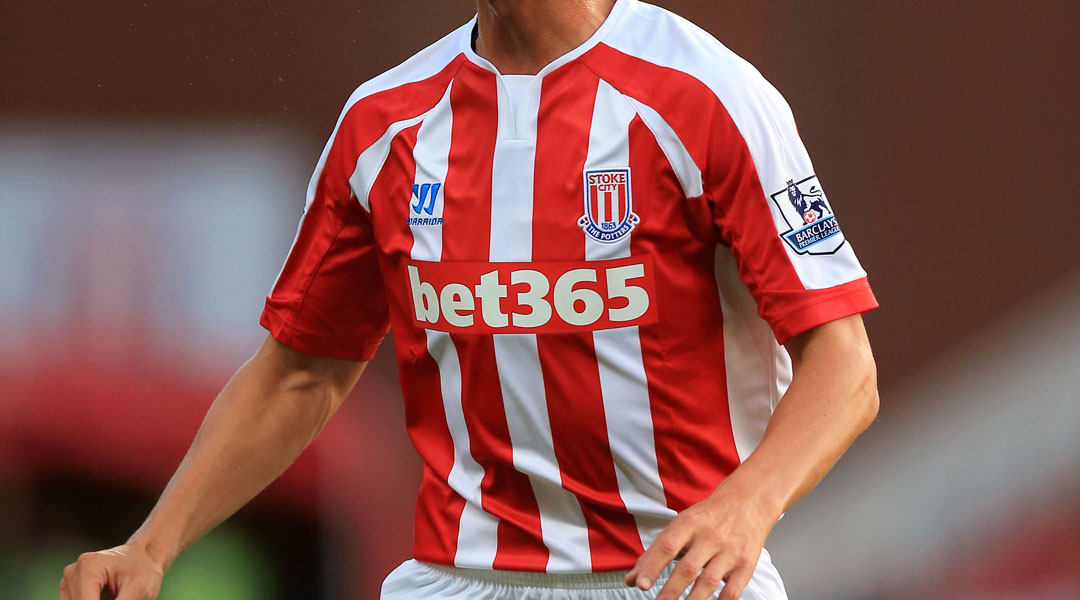
God, what is there to say, really? Maybe just “hideous”? Will that do? Apparently not. Well, this is like a mix of some of my most hated things about the most recently described kits. Here we have the red and white stripes of Southampton, but even worse (that swooping around the shoulders and arms is like one of those annoying Magic Eye drawings) along with an advert for a company I personally dislike. The away kit is marginally better, if only in terms of colour, but it still looks like it was designed by a 14-year-old with a design app on his phone. Sorry Stoke. I don’t know you, but I feel certain you deserve better than this.
Sunderland
God, more red and white stripes! Is this a thing in football? Or is it just that football kit designers only possess about three ideas at a time. This one’s probably the best of the lot, mind, as the stripes aren’t too wide (like at Southampton) or swoopy (like at Stoke), and there does seem to have been some actual thought that went into the design, with the nice contrast with the adidas stripes on the shoulders. The away kit is undoubtedly nicer, having wisely jettisoned the big stripes. Look, I know I’m probably insulting loads of football fans with my anti-stripes prejudice, and for all I know there’s some beautiful football/stripes tradition. But I’m here to provide the style commentary so I can only be honest because, quite frankly, I’m a fashion bitch.

Swansea City
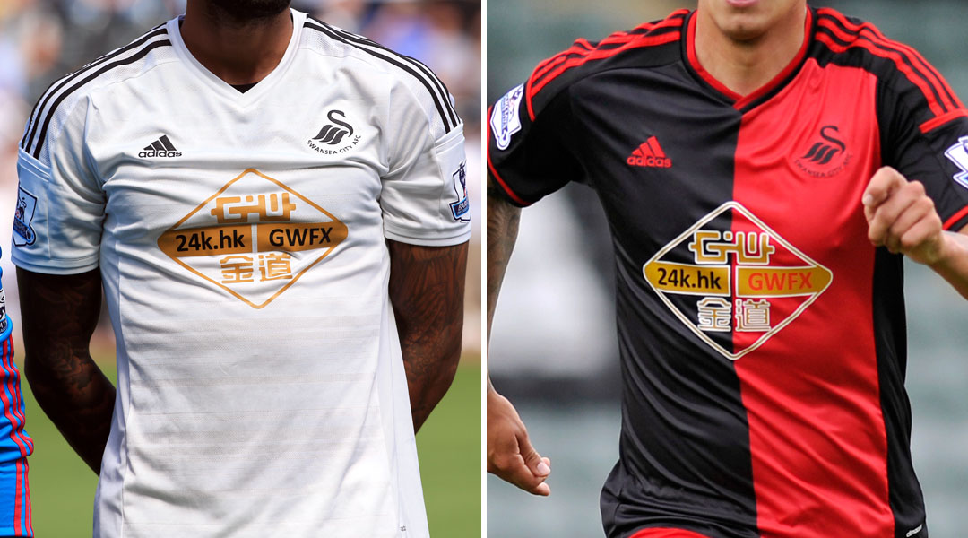
What a very bizarre looking kit. I admire the low-key style of it, sticking just to the club’s black and white colours. But it’s hard to know what to make of the giant gold logo for GWFX slapped across the front. It’s sort of like hanging up a massive chandelier in a minimalist Swedish apartment. It just doesn’t quite gel. But fine, I’m glad that Swansea is getting some money, and not from Wonga or an online betting company, so I’ll try not to snipe too much about corporate sponsorship. I’m not a communist, you know (although I do work at the Guardian so, really, I am). The away kit is just strange, with the bifurication of the shirt between the red and the black. But the red and black do go better with the gold logo. In fact, there is something downright Chinese in the mix of the three colours, which might not have been what Swansea were going for, but it’s what they got.
Tottenham Hotspur
Whoa, Tottenham’s kit is kind of awesome! I love the yellow piping around the collar and cuffs, and the way it continues down over the collarbones. The blue stripe is nicely understated and the logos aren’t too hideous and in your face. In fact, if someone told me that one of these kits was designed by a proper fashion designer, I would guess it to be this one. This kit rocks, and the dark blue shorts with yellow trim will look good on even the weediest of Tottenham fans. The away kit is a lot less interesting, but I can’t really snipe at it, seeing as it is in commemoration of the 10th anniversary of Bill Nicholson’s death. I have to admit, I don’t actually know who Bill Nicholson was, but I bet he was a lovely bloke. So, a sharp and stylish home kit and a respectful away kit. Well played, Tottenham. Well played.

West Bromwich Albion
You know, this isn’t too bad, really. This is quite a clever way to do stripes – limiting the big ones to the sleeves, working in the adidas ones on the shoulders and then keeping them pin narrow down the front – without looking too, you know, stripey. Too “Hey! I’m wearing STRIPES.” So well done to West Brom there. Admittedly, West Brom do have an advantage with me because I really love their little birdie logo, and I’m also rather charmed that they’re all advertising accounting software across their shirts. How sweetly wholesome, how charmingly English. The goalkeeper’s kit is, admittedly, atrocious, but even that has a sweetness to it. It’s hard not to smile indulgently at a club that thought mustard yellow and purple would make a good combination. Bless you, West Brom. Bless you and your sweet birdie and possibly colour blind ways.

West Ham United
These are fine. That’s sort of all that can be said about them: the claret red is fine, the sky blue details are fine, the blue shorts with red adidas stripes are fine in a retro sort of way, I’m not sure what the point is of the stripes on the shirt but they’re not too offensive.
I’m rather more taken with the away kit, which makes the wearer look like he’s wearing a Miss America-style sash across his chest, plus the dark blue shorts are infinitely more satisfying. I don’t know anything about football (have I mentioned that already?) but I get the impression that this kit reflects the team: inoffensive, perfectly acceptable, fine. And really, that’s pretty much the most anyone can ask of a Premier League team these days.


 Join The Club


