Ranked! The 17 worst kits of the 2018/19 season
Call the fashion police
There’s been a crime. Well, a fair few in fact. Yes, it's time for the fashionistas at FFT towers to call out kit designers worldwide for some of the atrocities inflicted upon the football community this season.
From garish colour clashes to stomach-churning design quirks, some of the following efforts will leave you wondering: how hard can it be?
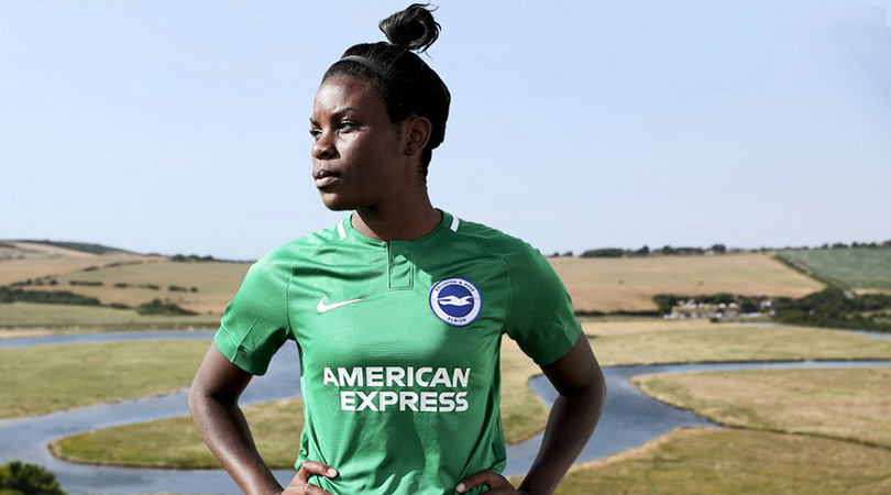
16. Brighton, away
There’s a reason green isn't often seen in football kits. Brighton have regrettably elected to replace last season’s yellow jersey with this pitch-friendly camouflage top.
On the plus side, it should at least allow Lewis Dunk to hide more easily when he’s conceded another own goal. (Sorry, Lewis.)
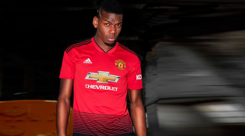
7. Manchester United, home
Who said modern-day super-clubs are too willing to disregard their local roots? United’s home top for the new season gives a nod to their original name of Newton Heath Railway Cricket FC by using a graphic of a train track on the front. A #classytouch, we expect you’ll agree. The only problem is that it looks awful.
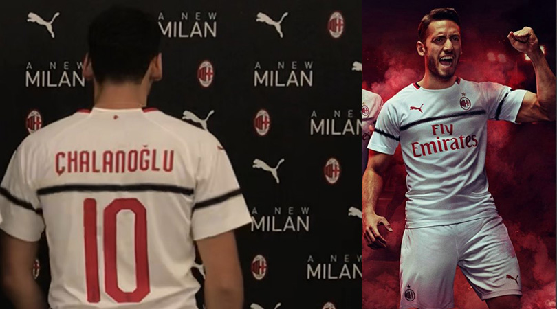
6. Milan, away
We know that Milan spent much of their summer focusing on overturning a ban from European football, but surely they could have produced a better away shirt than this. The single black horizontal stripe is bizarre, and spelling Hakan Calhanoglu’s name wrong at the official launch wasn’t great either.
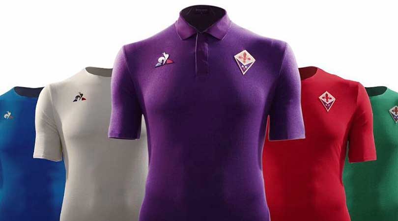
4. Fiorentina, aways
The formula is simple: release a home strip in your traditional colours, choose a suitably different alternative kit, and maybe produce a third option for those infrequent occasions where the other two aren’t enough.
Yet the cocky Viola have torn up the rulebook for the second consecutive year, unveiling no fewer than four (!) away kits – one white, one red, one green, one blue – to represent the four historic districts of Florence. At least the purple home shirt remains sacred.
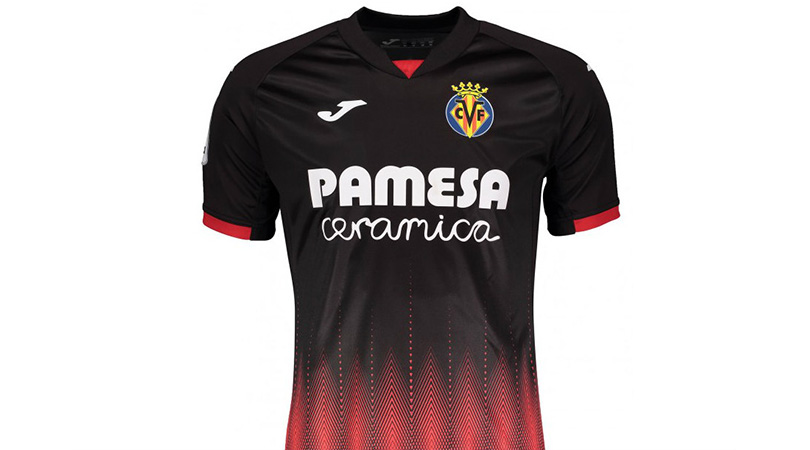
3. Villarreal, third
The top portion of this shirt is quite slick, with the red dashes on the sleeves and white of the sponsor and manufacturers’ logos complementing the black background.
But things fall apart at the bottom, with a perfectly respectable kit soon descending into a mess of dots and lines. Stare into the centre of the diamonds for long enough and you may well be hypnotised.
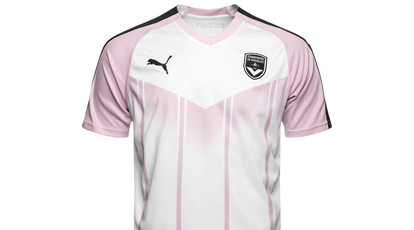
2. Bordeaux, away
Many kits fail because of poor design, while others fail to impress due to a questionable use of colour. Unfortunately for Bordeaux, they’ve managed to botch both tests with their alternative strip for the new campaign.
The thin, wobbly-looking vertical lines look like they’ve been drawn on by a toddler with a felt tip pen, and the downward-pointing arrow and sponsor’s scrawl don’t do the shirt any favours either. It manages to be made even worse by the decision to choose an extremely pale purple hue on a white background; a combination which is unlikely to catch on.
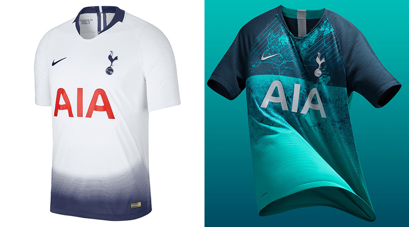
1. Tottenham, home and third
If you think the worst thing about Spurs’ summer was the lack of signings, think again. The gradient, fade design at the bottom of the home top is fine until you see the shirt without the shorts.
The (leaked, unconfirmed) third kit is a puzzling concoction of murky green and turquoise. The away shirt isn’t the best either, but it looks like Peru ’78 when lined up alongside its stablemates.
Alasdair Mackenzie is a freelance journalist based in Rome, and a FourFourTwo contributor since 2015. When not pulling on the FFT shirt, he can be found at Reuters, The Times and the i. An Italophile since growing up on a diet of Football Italia on Channel 4, he now counts himself among thousands of fans sharing a passion for Ross County and Lazio.

 Join The Club


