The 100 best club football badges ever
From lions to Latin, symbols to ships, this is the definitive century of best-ever football badges
The best features, fun and footballing quizzes, straight to your inbox every week.
You are now subscribed
Your newsletter sign-up was successful
Want to add more newsletters?
Join the club
Get full access to premium articles, exclusive features and a growing list of member rewards.
A club's badge is everything. Its identity. Its signifier. The logo that's blown up 100ft tall onto Tifos and draped over the shoulders of strangers. And there are some blooming beautiful designs out there.
From the minimal badges that capture your intrigue to the overblown coats of arms that really shouldn't work, we've listed out our 100 favourite-ever crests to adorn kits in club football. We've included some of your favourite discontinued badges, logos that are super-modern and insignias from all across the globe.
And no - we didn't include the much-maligned new Juventus logo, you'll be very pleased to know. We have written the list in alphabetical order because choosing between beautiful badges is a crime. If they're glorious enough to make this list, they've done enough already.
1. 1860 Munich
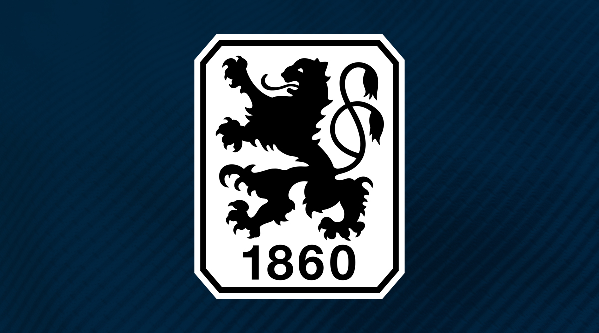
One of the founding fathers of the Bundesliga, and a dominant force in the early days of Germany’s top flight, 1860 Munich have since fallen on hard times. The third division is no place for a team with their illustrious origins, but they remain one of the most iconic and instantly recognisable clubs in the south. This crest wouldn’t look out of place on a beer bottle or an old vintage car. Simple and classy.
2. Aberdeen
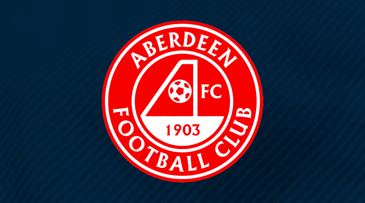
Surely the world’s best example of a goal being incorporated into an acronym? The ‘A’ in ‘AFC’ has been masterfully replaced by the posts of a side-on goal, with (yes, that’s right!) a football forming the cross-stroke. Great font, gorgeous shade of red and just an all round classic.
3. AC Milan
You can blame the English for AC Milan. Expats Alfred Edwards and Herbert Kilpin started the organisation as a cricket and football club - that’s why the spelling of the city remains anglicised to this day. Fitting, then, that the cross of St. George finds its way into the emblem of the team.
The red cross is the Milanese flag, the stripes represent the team’s shirts and the “ACM” stands for… well, you know. It’s the most famous oval in the world - along with the cricket ground, of course.
The best features, fun and footballing quizzes, straight to your inbox every week.
4. Ajax
Considered one of the coolest clubs in Europe due to their Cruyffian philosophies and constant promotion of young talent, Ajax also have a pretty swish badge to match their beliefs. The gentleman featured on the crest of the Dutch giants is Ajax, a Greek hero and fabled warrior in Homer’s Iliad. He is drawn using just 11 lines, the number of players on a football team. Ajax can’t help but be cool, can they?
5. Al Ahly
Any team which dares to write “Club of the Century” on their own badge deserves a place on this list.
Al Ahly have a whopping great black bird, more stars than you could shake a stick out and plenty of gold. This is regal. They think a lot of their club and it’s a big, bold design that catches the attention.
6. Arsenal (1936-49)

The only Arsenal badge that doesn’t feature a cannon, the Gunners’ art deco effort of the 1930s is a design still synonymous with the club to this day. The “A” stands for Arsenal, the “C” for Club, with a football in the middle. Get it?
This club logo was part of legendary manager Herbert Chapman’s vision to “rebrand” his team, tying in with the beautiful art deco East Stand that still stands today. This was the badge that dragged Arsenal out of the Victorian era and into the modern club that they became.
7. AS Bari (2011-13)
Yes. That’s a cockerel, made from a parallelogram (thank you SATS-level Maths) with a lower-case font below.
There are so many reasons why the AS Bari crest is utterly naff as hell - but we love it. It’s so silly that it’s actually really cool, like anything Italian and en vogue in the 90s, including Roberto Baggio’s haircut, Luciano Pavarotti or spending upwards of £20m on players that you’re only going to flog to your neighbours in two seasons’ time. Grandissimo!
8. AS Roma
Few crests manage to weave mythology and style together as beautifully as AS Roma’s. The legend of the she-wolf, who nurtured demigods Romulus and Remus from naked whelps into mighty conquerors, can be seen across the sprawling Italian capital to this day. AS Roma’s crest honours that tale, while the red and yellow colours are adopted from the city’s flag. See, we told you: mythology and style, done perfectly.
9. Atalanta
Italian clubs are often entrenched in legend and Atalanta don’t disappoint on that front.
The Bergamo-based club are named after a character from Greek mythology who took an oath of virginity which she vowed only to break when a man could beat her in a footrace. If the boys lost, however, they would be executed. How’s that for romance?
Poseidon’s grandson - who may or may not be a distant relative of Harvey Barnes - eventually beat her with some help from Aphrodite. She has adorned the crest of the club named in her honour since the 1960s.
10. Atlanta United
The club founded in 2014 allowed their fans to choose their name and badge. Red and black colouring was chosen to match the city's other sporting teams, including NFL team the Atlanta Falcons. Gold was incorporated as a nod to the city’s hosting of the Olympics in 1996.
It’s a smart, bold and memorable ensemble and we salute it.
11. Atletico Madrid
A bear looking for strawberries up a tree isn’t exactly the icon you’d associate with Diego Simeone. Still, Atletico Madrid’s badge has a quiet elegance about it.
The seven stars and bear are both taken from the Madrid city coat of arms, with each point of the star representing the five neighbouring provinces of the city. The stars are for the Ursa Major constellation. Interestingly, Alfonso XI even described Madrid as “a good place for pork and bear”. Correction, Alfie: pork, bear and a ferocious deep block from El Cholo.
12. Barcelona
It’s hard to know if the Barcelona badge has gone into folklore because it’s a beautiful design. Perhaps it’s just that it’s an ordinary design - but the logo of beautiful football sides of history. Either way, it’s become as much an icon as the Nike swoosh on the opposite side of Lionel Messi’s chest.
The St. George’s cross is for the patron saint of Catalonia, while the four red stripes on the yellow background are for the Catalan flag. The blue and claret stripes are the blaugrana, the colours of every Barca shirt since 1900. And it’s all tied together in a unique shape, adorned with the club’s initials and a ball. It’s so famous you’d recognise any aspect of it alone.
13. Basel
Leather footballs are commonplace on club badges. But Basel’s looks like the ball is actually orbiting the shield itself. It’s super cool, unique and the typeface used is beautiful.
The ball has often been on the left of the shield but it’s not always overlapped it. The similarities with Barcelona’s badge isn’t coincidental either: the clubs were both formed by Joan Gamper.
14. Bayern Munich
Bayern went through a series of weird and less-than-wonderful crests before settling on near enough the modern-day design back in 1954. Its beauty lies in its simplicity, with the Bavarian flag (the blue and white diamonds) enclosed by a red ring embossed with the club’s name. It has come to stand for quality, efficiency and dominance in the decades since.
15. Benfica
Such is the ostentatious golden eagle in the background of Benfica’s crest that for years, no one has noticed the sodding bicycle wheel behind the crest. Well, did you see it?
The cursed Lisbonites have sported this badge since 2000, though the combination of all these parts goes back as far as 1906. What’s unusual is that blue, green and white heavily feature in the design - colours of Porto and Sporting, Benfica’s biggest rivals. Somehow despite the weird bike wheel, it doesn’t feel anything other than stately and majestic.
16. Birmingham City
In 1972, the Sports Argus newspaper ran a competition to design the Birmingham City badge. It wasn’t until four years later that the club actually used this winning design - but it’s fantastic, all the same.
The best thing about the globe-ball-and-ribbon of Birmingham’s badge is that it’s totally recognisable as a silhouette and, as far as FFT can make out, completely unique. No one has ever come up with a badge like this before. It’s marvellous.
17. Blackburn Rovers
Blackburn's badge has remained more or less unchanged for over 30 years now. Replacing a simple Lancashire rose, the current crest is detailed without being busy, and adds a pleasing splash of colours – green leaves, yellow print, and a cyan ring – that you wouldn't otherwise find on a Rovers' home kit, which tends to err towards simple designs.
Keeping the county's rose, the town's 'Arte et Labore' motto (the inelegant 'Through skill and hard work' in English) and the club's 1875 founding date adds a nice historical quality to it.
18. Boca Juniors
The Argentine big boys have had many great variations of their iconic badge down the years but this version, employed since 1996, is perhaps the coolest of all. A shield of blue and gold, peppered with stars and branded with that US-college-style CABJ (Club Atletico Boca Juniors, FYI). It’s a badge worthy of association with the great El Diego.
19. Bohemians
If you didn’t know that Bohemians were based in Prague, you’d no doubt guess that this was an Aussie club by the mental green kangaroo as the centrepiece. Well, did they even know about kangaroos when this club was set up in 1905?
In 1927, Australian football officials searched for a European football club to come and tour the land, with Slavia Prague among those declining. AFK Vrsovice, however, said yes - but rather kindly changed their name to Bohemians so that the folk Down Under could pronounce them. The name stuck - and so did the newly-designed badge for the trip - featuring the ‘roo.
20. Bolton Wanderers
Back in the olden days, Bolton used to have an elephant on their crest - after all, nothing says Lancashire mill town quite like a giant, hulking, non-native elephant, carrying a tiny castle on its back for good measure.
Things changed in 1975, presumably when the town's last elephant packed its trunk and said goodbye to the circus. A simpler but clever new crest was introduced, fitting the letters BWFC into a circle.
The club tweaked the badge again in 2001, losing the red rose of Lancashire and introducing some pretty ribbons for reasons unknown. That design proved divisive with fans, so the rose returned for the crest's most recent iteration in 2013.
21. Borussia Dortmund
Borussia Dortmund’s yellow and black colour scheme is among world football’s most beloved and recognizable. It has gone through a small number of alterations since the original 1945 design, but the yellow disc with bold black lettering has been a constant. The “09” represents the year the club was founded, 1909. Simple, yet eye-catching - Dortmund in a nutshell.
22. Borussia Monchengladbach
FFT has nothing against circles and shields, but there’s something about different shaped crests that we appreciate. The diamond is a particularly rare choice with football clubs and, in the case of Borussia Monchengladbach, it elevates a pretty simple design in every other way into a different stratosphere.
23. Bristol City
Bristol City had a couple of unicorns on their old badge. Honestly though, the 2019 badge might look a little like everyone else’s but it’s a superb piece of design.
It’s simple, effective, the curves are excellent and the red of the bird’s chest makes it very clear that this is the badge of the Robins. A very subtle “1894” in there, too. Very nicely done.
24. Buriram United
This club from Northern Thailand have an awesome crest which reflects their local history while also appearing modern at the same time.
The structure at the top of the badge is actually Phanom Rung stone castle, an ancient building located in Buriram’s national park. The castle bleeds into a shield design streaked with navy blue and black - a combo we can all appreciate. Lightning bolts (because, why not?) shoot down from the banner. It’s like a 10-year-old teamed up with an historian and we love every inch of the result.
Also, and this should not affect our decision making in any way, but their kits are genuinely amazing and their stadium is fire too. Check them out.
25. Caen
Caen’s 2016 badge takes influence from the viking presence in Normandy with this superb design. The club’s colours are clear and present and the more you look at this badge, the more you notice that the viking has a goatee.
This is another superb example of what can be achieved with negative space.
26. Celta Vigo
Celta Vigo’s badge is very pretty indeed. A red cross, sky-blue shield and a crown, reflecting when the club was granted patronage. Did you ever notice the “CC”? That’s part of the shield - it stands for Club Celta. Lovely stuff.
27. Celtic
Celtic’s original badge was simply a celtic cross. Their first usage of that famous four-leaf clover, however, goes back as far as the 1920s. So is it a four-leaf clover for good luck? Apparently not. The theory among fans is that the clover was first brought in during 1927/28 - a season in which the Bhoys won four trophies - hence the four leaves.
Over the years, the club have released a number of beautiful anniversary badges - many remembering their 1967 European Cup triumph - but for our money, the 1888-2013 with the celtic pattern embellishment is their nicest.
28. Chapecoence
Chapecoence were the Brazilian club who suffered one of the greatest tragedies in sporting history when a plane carrying players and staff crashed in 2016. The club were thrust into global spotlight, as clubs around the world reached out and mourned the loss of 71 people connected to the club.
In the wake of such a dreadful event, the club added another star to their badge - this one in the F of the “ACF”, in memory of those lives lost. It was a lovely badge before and it's a lovely badge after, reminiscent of the Saint-Etienne crest, with an instantly recognisable typeface for the initials.
29. Chicago Fire
Named after a great blaze which consumed the Windy City for more than two days in October 1871, Chicago Fire have always featured symbols of fire and flames on their crest.
The old design, which was used until 2019, was derived from the Cross of Saint Florian, a symbol often associated with fire departments in the US. The new badge, which was created after the club moved stadium, wouldn’t look out of place hanging behind a shirtless indie band at Glastonbury.
30. Colo-Colo
Colocolo was an indigenous Chilean who fought for the Mapuche cause in the Arauco War when Spanish occupiers clashed with Chileans back in the 16th century. Now, he’s an icon of his country’s greatest football team.
The portrait has adorned Colo-Colo shirts for 70 years. The white of Colocolo’s headband represents the club’s shirt colour, while the blue and red in the red of the design are nods to Chile’s national colours. Even if you’ve never watched them play, you know the logo. It’s become a cult favourite in world football.
31. Copenhagen
Copenhagen - or Kobenhavn, if you like - is only as old as the Premier League but their crest is synonymous with Denmark. The logo takes influence from Thorvald Bindesbøll, who designed the Dragespringvandet - or Dragon Fountain, if you like - in the Danish capital.
Bindesbøll may have died in 1908 but his designs were built to last. He’s also the fella who crafted the very first Carlsberg beer label, which has never been altered. The beer also sponsor Copenhagen - hence the connection with the badge.
32. CSKA Moscow
As Russian as Vladimir Putin downing vodka shots in a fluffy hat, the Cyrillic lettering and boxy look of the CSKA badge was introduced in 2003 before it was updated again in 2008 to be bigger, bolder and brighter.
CSKA began as an army team with a typically low-key logo before bringing in a red star to their badge in 1923. Over the years, it’s evolved, adding new elements to it and becoming brighter with time - with leaf wreaths, ribbons and a 1970s-style football, the latest version is a triumph.
33. Deportivo Veracruz
Club Deportivo Veracruz ply their trade in the Mexican top-flight - home to many great crests, as this list shows. Their nickname, "Tiburones Rojos", means red sharks and this is reflected on their magnificent club crest.
Not only are sharks a fittingly deadly and graceful animal to have on a football badge but this shark appears to be doing a little keepie-uppie routine which, frankly, is superb. We also love the beige outer ring on the circular badge and the lettering is set in a beautifully understated font.
34. Duisberg
Do we really need to explain why we like this one? In FFT’s opinion, not nearly enough football crests feature a zebra and we’re eternally grateful for Duisburg for single-handedly trying to put that right. The west German club, who currently compete in the 2. Bundesliga, did not get their nickname - “Die Zebras” - due to a local connection to the African grazer, but due to their striped home shirts. Natürlich!
35. Elfsborg
There are a few black and yellow crests on this list (see Dortmund, Young Boys and Kashiwa Reysol) which may say more about FFT’s love for a bold colour scheme than anything else. Still, IF Elfsborg, of the Swedish top flight, do more than use waspish hues. The gold wreath is just glorious and the scribbled font in the centre of the black plate is a scratchy work of art.
36. Estrella Roja
Estrella Roja translates from Spanish into… Red Star. Hence the badge. The Venezuelen outfit have gone very much say-what-you-see with the badge too, haven’t they?
It’s definitely one to try on Ultimate Team if you haven’t already.
37. Fenerbahce
One of the most beautiful crests in world football and one of just a handful to have undergone very few updates since the club’s foundation more than 100 years ago. Every part of this badge was carefully thought through by its designer, former player Hikmet Topuzer, in 1910.
The red and white represent the flag of Turkey; yellow the envy of those not associated with the club. Navy blue stands for nobility and honour, while the green of the leaf represents longevity and success. There’s a lot to take in, but Fenerbahce’s crest may be the most painstakingly and lovingly designed in the world.
38. Fluminense
Fluminense’s badge is rare in that it feels natural as an emblem for a football club and a pirate ship. The “FFC” is an upgrade on Fulham’s. Sorry, Cottagers.
The red and green obviously denotes the club’s colours, while we’re big fans of the swirly gothic text. The club have even used the initials on their own as a club badge in the past. It’s every bit the badge that you’d imagine a team that plays in the Maracana to have.
39. Forest Green Rovers
If Forest Green’s incredible kit (seriously, check it out), wooden stadium and highly-publicised veganism haven't already swept you off your feet then surely their crest will nudge you over the line? The lime green outer ring works perfectly with the black and white centre to create a sort of mint-choc-chip vibe.
The lions are as fabulously British as a pound coin and FFT does love it when an old-fashioned leather-striped football finds a place at the centre of things. As faultless as one of their half-time vegan sausage rolls.
40. Galatasaray
The crest of Turkish giants Galatasaray is known as the “Ghayn-Sin” - a combination of the Arabic letters for “G” and “S”. The club’s association with red and yellow began in 1908.
Having previously played in red and white, followed by yellow and black (which was later deemed unlucky following a heavy defeat), club officials eventually settled on red and yellow. The hope was that an association with burning flames would lead to on-field glories. They were right.
41. Hamburg
While it may resemble a bruised Umbro logo, Hamburg’s blue, black and white crest is instantly recognisable and evokes images of a permed and chiselled Kevin Keegan running amok for The Dinos. The colours are actually taken from the crest of SC Germania Hamburg, one of the clubs which eventually merged into the club we know today. The blue, specifically, is a nod to the sea, with Hamburg one of Europe’s largest port-cities.
42. Hansa Rostock
Located on Germany’s northern coast, Hansa Rostock were the final GDR champions before reunification took place in 1991 - they’ve seen their fortunes dwindle since those halcyon days, yet still regularly get 30,000 fans in the third-tier.
Their crest pays homage to the port city’s maritime links, with the sails of the red and blue ship embossed with a fierce dragon. Boats and mythical beasts always get a thumbs-up from FFT.
43. Heerenveen
Contrary to popular belief, those aren’t actually love hearts. They are water-lilies, and represent the flag of Friesland, the northern Dutch province in which Heerenveen is located. It is one of the most recognisable crests in the Netherlands, most likely due its romantic misconception. As far as FFT knows, they are the only club with a water-lily-based badge, and the fact they’re red lilies makes it all the weirder, and of course lovelier, for it.
44. Guangzhou Evergrande
What a motto, let's get that out of the way first.
Guangzhou Evergrande are a relatively young club, so that's perhaps why they have a fiery tiger as opposed to something more traditional like an owl or a cockerel like some other clubs. This badge is a warm and bright antithesis to many of the modern crests you get these days.
46. Inter Miami
Any team owned and fronted by David Beckham was always going to be image conscious. From the club's official Spanish-language name and Roman Numerals to Phil Neville in the dugout - okay maybe not that last one - this is a club painstakingly-engineered to seem European, historical and cool. The legs of two herons are twisted together to form the “M” of Miami, while the sun behind them beams with seven rays - the number associated with their glamorous owner, of course. It’s so over the top, but we love it.
47. Inter Milan (2014-21)
Why, why, why did they dumb it down?
There are few better colour combinations than blue, black and gold, in FFT’s opinion. Internazionale have always been considered one of the better looking clubs, when it comes to kit and crest. The letters ‘FCIM’, located in the centre of the badge, stood for Football Club Internazionale Milano, the full official name of the Nerazzurri. Long before just the "IM".
47. Kaizer Chiefs

One of the most widely supported teams in South Africa, Kaizer Chiefs have found a worldwide cult following in the Fifa franchise due to an admiration for their kits. Their orange and black clobber typically blends wild and ridiculously cool patterns. Their crest is a testament to their style. Simple, yet different. The chief logo is a fantastic design, the colours are superb and the font on the lettering is also applause-worthy. No wonder the Yorkshire-based band stole their name.
48. Karlsruher
No messing about! Karlsruhe SC, like so many German clubs, have opted for the simplest badge possible. But while many other Vereine end up with crests that look like Clipart creations, second-divisioners Karlsruhe have actually got a pretty cool and minimalist stamp on their shirts. It’s the bendy ‘S’ that does it for us.
49. Kashiwa Reysol
The Japanese top-flight club from Kashiwa derives its name from the Spanish words “Rey” and “Sol” - meaning “Sun King” in English. Their yellow and black kits have been compared to Borussia Dortmund’s and their badge is largely coloured the same way.
There’s a fair bit going on here, with the central “R” written in a wildly different font to the lettering around the outer banners. But the sun in the middle of the crest is breathtaking; particularly the horizontal arms which stretch the outer edges of the crest. Lovely.
50. Kerala Blasters

An elephant with a football in its trunk! Not only is this fabulous, it is also appropriate, given elephants are a common sighting Kerala, south India. The Blasters are arguably the best-known Indian Super League side thanks to their memorable name, electric yellow and blue kits and, of course, their sumptuous crest.
51. Koln
1. FC Koeln, like MSV Duisburg, also feature an unusual animal on their crest. The fellow west German outfit have one of the most bizarre and recognisable badges on the planet, thanks to the depiction of a billy goat towering over Cologne Cathedral. The club’s association with goats began in the 50s, when a traveling circus passing through the city gifted a goat to the football club - according to legend, at least.
52. Leeds United (1973-74, 1977-78)

Leeds United are perhaps recognised by more badges than any other major club in England. There’s the current shield, the Yorkshire rose of the 80s and 90s with Leeds United AFC written on, and the late-60s LUFC pomp, of course.
But we’re old school. There’s nothing quite like the “LU” smiley badge of the 1970s, for us. It almost smells of the decade and was apparently designed with the explicit intention of making Leeds bigger outside of West Yorkshire. Just don’t mention the forearm Pro Evo badge, yeah?
53. Levante
In old Valencian legend, it is told that after King James 1st of Aragorn entered the city - having just liberated it from 500 years of Muslim rule - a bat flew down and landed on his head. The animal has been the symbol of the city ever since and can be seen on the crests of Valencia and smaller local neighbours Levante. The latter’s badge, in particular, is gorgeous, and incorporates a strange animal, an old-school leather ball, a gorgeous crimson and blue colour scheme and gold-plated shield. Boxes ticked.
55. Leicester City (1983-92)

Leicester’s current badge has been the popular (and active) option since 1992 – but you could forgive fans if they were a little gutted to lose their previous effort, in place since 1983. Before that, suffering Foxes had seen their club tinker with the kind of of clunky scribbles that would later befit a session on Microsoft Paint, until they finally decided that less is more with this gorgeous effort.
The minimalistic trotting fox first featured on their superb pinstripe strip of the same year (in line with their first ever sponsor, brewery Ind Coope), and was donned proudly by the likes of Gary Lineker and Alan Smith at Filbert Street.
55. Lincoln City
Ahh, the 2016/17 FA Cup campaign, with managerial duo Nicky and Danny Cowley and plaudits for their giant-slaying skills. Remember that? FFT found itself distracted from the narrative by that crest, though. The Imps, as Lincoln City are nicknamed, boast one of football’s stranger crests, with a gurning, goat-like being on one leg at the front and centre of it all. So odd it’s actually brilliant.
56. Liverpool
Think of the Liverpool badge and images of the Anfield gates, Hillsborough torches and the shield embossed with the liver bird spring to mind. Yet, since 2012, the club has actually used a much more simplistic design on their shirts. A simple, white liver bird sits atop the club’s acronym, with the torches moved to the shirt’s collar instead, continuing to burn in memory of the 96 who lost their lives in ‘89. It’s poignant and familiar, as every good badge should be.
57. Luton Town (1987-1994, 2005-09)
How many other crests contain a straw-boater and a bee hive? Not many, that’s for sure. Nicknamed “The Hatters” due to the city’s long-standing association with the hat-making trade, Luton Town added a boater to the top of their crest in 1993. The coat of arms beneath the hat is a close reflection of the official Luton coat of arms.
The lettering around the badge is neat and tidy and, let’s not beat around the bush, it’s a triumph across the board. It gets FFT in the mood for a G&T in the Great British sunshine, and not many crests do that.
58. Manchester City (1976-78)
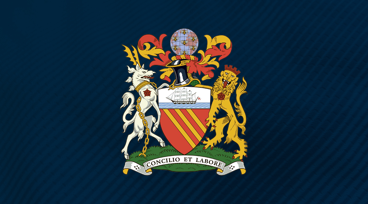
Some Manchester City fans were outraged when the club ditched their shield-and-eagle badge for a rounder, smoother effort that could be copied across the City Football Group’s portfolio of feeder clubs. Here at FourFourTwo, we’re still seething that the 1970s coat of arms got replaced.
Seriously, look at it. A knight’s helmet, a ship, a globe, seven bees and heraldic animals all sit upon the grass in perfect harmony - there’s so much going up and yet the elegance of the design is beautiful. Not exactly easy to translate onto New York City FC but it’s still our favourite City logo.
59. Manchester United (1970-73)
The only problem with being one of the most famous clubs in the world is that you’re pretty much wedded to your very 90s badge in big 2021. Sorry Manchester United - we much prefer the 70s effort and we’ve never understood why that Red Devil is grinning like a loon.
The 1970 United badge that brought yellow into the mix is a work of its time, with diagonal lines similar to City badges of days gone by. We love it though: pure Manchester.
60. Minnesota United
We’re not exactly what kind of bird that’s supposed to be on the Minnesota United badge. You know what? We don’t care.
It’s magnificent. The wingspan is impressive, the shield behind is beautiful and the six-pointed star at the top just completes the look. This club were founded five years ago - it’s downhill from here as far as badges go, when they eventually rebrand.
61. New England Revolution
When the MLS came along in 1996 - yes, that long ago - most of the new clubs’ logos looked so crap that even PES would laugh. Columbus Crew and Sporting Kansas were particularly awful but 25 seasons on, only one design remains relatively untouched.
OK, so the New England Revolution badge is basically the USA 1994 World Cup logo, with the Champions League ball integrated into it… drawn in crayon. So? It still looks pretty classy. The fact it’s stood the test of time in a league in which Bradley Wright-Phillips is a legend is testament to its strange and beautiful pull. Ironic that the Revolution never changed, really.
62. Newcastle United (1983-88)

Newcastle United used the city’s Coat of Arms until 1976, before opting for a magpie in front of a castle for their badge. It was in 1983, however, that the Toon Army brought in their nicest ever crest.
The NUFC was a precursor to Windows WordArt, keeping the magpie under the upturned “C” of the design. The cult classic was a bold, simple and easy to fit onto a circular badge. The one gripe we have? One magpie is supposed to be bad luck.
63. Newell's Old Boys
We could be childish about this one but let’s try and rise above it. Yes it says “NOB” across the middle of a shield but it’s not actually spelt like that so grow up! Really, this crest is so basic it’s bordering on the mundane, but there is something about its simplicity that we love, actually.
Black and red with white font, just three letters, and nothing more. Perhaps, deep down, it’s the knowledge that both Maradona and a (very!) young Lionel Messi played for the Argentine club that makes this crest so appealing.
64. Notts County
“One for sorrow, two for joy,” the saying goes, referring to magpies in pairs. This is why Notts County have two on their badge, on top of a football, with some stripes below - sometimes on an amber shield. It always goes some way to explain Newcastle United’s woes.
County’s badge is one for the ages. It feels like it could have been designed in the 60s, yesterday, or any time between. It’s fitting for such a club of tradition and history.
65. OL Reign
Washington-based women’s team, OL Reign, are owned by the same group who take care of Lyon’s men and women’s teams. Arguably though, the Reign have the greatest logo of the bunch.
In the typical Lyon colours, the lion’s head is front and centre, with swirling, flame-like embellishments. It looks genuinely regal - it’s far more low-key than the existing Lyon badge, too.
66. Oldham Athletic
HOW TERRIFYING IS THAT OWL?!
67. Olympique Marseille (1972-86)
Olympique Marseille’s badge is pretty cool these days - it’s a nice, big M in sky blue - but take a look how nice it was back in the day. This is the ultimate baseball cap logo badge.
Club founder René Dufaure de Montmirail apparently wanted the badge to look like a personal seal. This particular iteration of the design omits the club motto - “Droit au but”, or “straight to goal”, in English - which René’s wife came up with.
68. Olympiacos
Olympiacos were formed from two clubs and given a name that reflected the Ancient Olympic Games - how very Greek. Of course, a laurel-crowned chap had to appear on the front.
Red and white were chosen for passion and purity respectively.
69. Palmeiras
Founded by Italian immigrants in 1914, an earlier version of the Palmeiras badge featured the acronym “PI”, for “Palestro Italia”. After dropping the Italian connection during World War Two, Palmeiras settled on their current crest design in 1959. It’s one of our favourites, with a striking green and white design, lettering which balloons at the centre of the badge and stars shooting towards the viewer.
70. Paris FC
While Paris Saint-Germain opted for a geometric styling of France's most famous (and arguably only) landmark, their tiny neighbours went for something a little more casual: a scribbled version of the old Tour Eiffel. Dare we say it has more je ne sais quoi?
71. Paris Saint-Germain (1992-96)
The 90s were a mental time. England wore grey, Britpop was bigger than actual pop music and Paris Saint-Germain didn’t have the Eiffel Tower in their official badge. Sacre bleu.
The PSG logo between 1992 and 1996 features the three initials in white on jagged rectangles - naturally, the middle one is red, to reflect the “Hechter shirt” design of the red stripe on blue. It’s not as polished as the new logo but then neither were PSG back then. They won a Cup Winners’ Cup, and signed the likes of Jay-Jay Okocha. Things were fun. Things were a bit bonkers.
As a club, they’re younger than Noel Gallagher and this unusual and daring icon summed them up a club once upon a time. Imagine Neymar wearing this.
72. Pescara
Not many teams take on a dolphin for their team’s icon. They’re clever, sure. But not exactly brave, courageous or in any way related to the beautiful game.
Pescara have a claim for the most famous dolphin in football. Not only did it adorn one of the most iconic kits of recent seasons - the rainbow one designed by a six-year-old to “give a kick to COVID-19” - it has its place as a pretty badge in Italian football with two tones of blue and soft curves.
73. Portland Thorns
Many top women’s teams around the world share a name, crest and facilities with men’s teams, but Portland Thorns buck the trend. They’re a team in their own right and this has its advantages, including maintaining carte blanche over their own identity. Their badge features a wreath of thorns which protects a central rose: delicate and beautiful at its centre, yet powerful and aggressive on the surface. The colour scheme and lettering are also ten out of ten.
74. Porto
FFT loves it when a player designs his club’s crest and this is exactly what happened with Porto back in 1922. Augusto Baptiste Ferreira, a midfielder and part-time graphic designer, took the old crest - a blue football with simple white lettering - and gave it a makeover. The crest of the city was added to the top of the ball, with the white lettering moving down to the base. The design has been in use ever since.
75. PSV Eindhoven
Oval crests are always a welcome change from the status quo and PSV take things one step further by flipping the oval on its side. The red and white stripes on the crest run horizontally, which is unusual considering PSV’s shirt stripes have only ever run vertically. The gold border tops it all off and gives it a regal vibe. It’s just a stellar crest all round.
76. Pumas

Pumas have had some terrible badges - and some terrible kits, while we’re at it. The current iteration, however, is glorious.
The puma within a triangle is iconic; the rounded shapes don’t make it look any less intimidating either. It’s a great example of how you can create something fantastic from barely anything and it stands as one of the most recognisable badges outside of the European game.
77. Pyramids FC (2018-20)
It has a sphynx on it…
We were tempted to stop there, but it is worth pointing out that the Cairo-based club (founded as recently as 2008), decided to scrap this weird and wonderful crest for a minimalist design which looks like a Bob Ross painting. Admittedly, the new one does have pyramids on it...
78. Raja Casablanca
Raja Casablanca are the Real Madrid of Morocco. Their badge, fittingly, looks like an eagle with his wings spread wide to show his medals.
The design of the eagle itself is fantastic, with the bird perched upon a ball. With green ribbon poking out the top and bottom of the badge itself too, the entire thing looks like one big medal. Great work.
79. Real Madrid
Real Madrid originally had swirly initials as their club logo. This all changed in 1908 with a more art deco effect of marrying the M C and F into a circular design; from there it’s evolved.
The blue sash is iconic - despite Real not playing in a kit like this - though it used to be more of a mulberry purple before the 2000s. Still, the crown is where it’s at. With the dissolution of the monarchy in 1931, it took a 10-year hiatus but it’s one of the best looking crowns on any club in the world game - fitting, for Real, really.
80. Real Sociedad
King Alfonso XIII gave Real Sociedad its patronage. Real means “royal” in Spanish and unlike their Madridista namesakes, La Real are referred to simply by their regal prefix, rather than the “Sociedad” bit.
Hence the great crown on the badge. The flag represents the colours of San Sebastian - where the club is based - and there’s an old, leather ball, just because, well, this is Spain, isn’t it? The truly great thing about La Real’s crest design is that these are all just embellishments on other badges. None of these bits are supposed to be the big focus, yet here they are, working in tandem together. Lovely.
81. River Plate
Why aren’t there more sashes in football? Peru were rocking the look with gusto at the 2018 World Cup, Southampton have given it a whirl this season, and here at FFT, we approve whole-heartedly. The daddies of the trend, though, will always be River Plate.
The Buenos Aires club have a sash across their shirts and also across their badge, which features stylised lettering of their acronym (Club Atletico River Plate) on a squeezed shield design. Few crests on Planet Football are as well-known and well-respected. Vamos!
82. Salford City

When the Class of ‘92 took over Salford City, they ditched the old lion rampant badge. What they replaced it with was something modern, cool and reminiscent of the league logo that they’d become synonymous with as players.
The current logo apparently replicates “the shape of the hull of the ships in Salford’s docks”. It’s a fairly recognisable shape though and even though it has no text adorning the crest, it’s one of the more iconic lower league logos.
83. Sampdoria
What, exactly, is that black splodge? One could stare for hours at the image and, like a cloud-gazer studying a spring sky, conjure-up a thousand different answers.
The truth is that the black part is the silhouette of a grizzled sailor smoking a pipe. The Italian club is located in Genoa, a sea port, which explains their association with the murky brine. He even has a name: Baciccia - a local dialect variation of John the Baptist, the patron saint of the city. Don’t let anybody tell you FFT don't teach you things.
84. San Lorenzo
Club Atletico San Lorenzo de Almagro are one of the “Big Five” in Argentina (alongside Boca, River, Racing and Independiente), Pope Francis is a diehard fan and their stadium is incredible. That’s not all that makes them cool though - we happen to love that crest with a passion. It’s ticking a lot of boxes: shield, stripes, stylish typeface and smart colours. Muy bonito!
85. Scunthorpe United
It’s a fist grabbing an iron girder. The iron girder has “iron” written on it. Can you get more bloody manly, eh?
This was designed by a graphic design student in the 90s as part of a competition. Our favourite part though has to be the swirly banner, on which the club’s name is written. Just an awesome piece of design all round. Top marks.
86. Sevilla (1918-21)

Sevilla’s current badge is almost impossible to draw properly, given that it has what’s almost a full-on photograph of what FFT is guessing are two bishops and another bloke in a chair. In 1918 though, Sevilla had a great badge.
The CFS of the current shield extends back as fair as 1908 and 10 years later, Sevilla got the perfect design of it. This is all you need in a badge - please replace your current one with this, lads.
87. Sheffield Wednesday
Latin phrase, animal, shield, unfurled scroll, heraldry in the form of the white rose of York and a cracking colour scheme. So many boxes does the Sheffield Wednesday crest tick that we feel it could be put in a museum just to showcase football badges at their most perfect. Just look at the owl’s eyes and tell us that’s not a work of art. Ten out of ten.
88. Sporting Gijon (1950-74)
It feels like a shield - like Celta Vigo or Real Betis’s crests - but Sporting Gijon’s 1950s crest is a G, stylised like the G from the old Gladiators TV show logo. Not that they copied the show.
These days, Gijon have dialled down the colour to make this badge more minimal. Personally though, we loved the crown, the stripes and the shape of that G. Even if it does remind us of John Fashanu.
89. Tijuana
Club Tijuana Xoloitzcuintles de Caliente, to give them their full name, are another Mexican club with a rarely-seen animal adorning their crest. The "Xoloitzcuintles" part of their name is actually the species of pooch depicted, that being a hairless breed native to Central America. They were considered sacred by the ancient Aztecs, and thought to accompany men on their journey to the afterlife.
90. Tottenham Hotspur
Between 1956 and 2006, Tottenham Hotspur had a shield featuring all kinds of landmarks and club associations. There was Bruce Castle, some red lions and some trees, all surrounding Harry Hotspur, the cockerel at the centre of the club’s identity.
The truth is though, the cockerel is the only aspect that mattered. When Spurs redesigned the badge, the bird came front and centre. It’s magnificent too: it works in any colour and it’s simple, yet strong.
91. TP Mazembe
There is so much about Congolese side TP Mazembe we love, we’ve been thinking of dedicating an entire magazine issue to them. They were founded by monks. They used to be called Englebert (not Englebert FC, just Englebert). Their nickname is ‘The Ravens’. They have a crocodile eating a football on their badge.
It’s this final point that ensures their spot on this list. Why not a raven, we hear you ask? We can only assume a football wouldn’t fit in a bird’s mouth so the monks had a rethink.
92. Valencia
Valencia’s badge has barely changed since 1921. And why should it?
It's simple without being too minimal and it’s instantly recognisable. The red and yellow come from Valencia’s official coat of arms, which also features a dragon. This dragon, however, is represented as a bat in various depictions around the community, such as this badge. The shape and the positioning of everything is perfect… unlike Valencia under Peter Lim’s ownership, according to fans.
93. Vasco Da Gama
The Brazilian top-flight club, named after a Rio district which in turn is named after the 15th Century Portugese explorer, pays homage to the famous seafarer with its gorgeous crest. A black shield sporting a ship with white sails, which are adorned with the cross associated with the Iberian country, sails proudly on a calm sea. It’s a powerful image, steeped in history, and FFT love a dash of historical context with our crests.
94. Werder Bremen
Yes, it might look quite a bit like Scooby Doo’s collar, but we like it. Diamond crests are more popular in Germany than elsewhere (see Gladbach, who are also on this list) and the funky green shade makes Werder Bremen’s stand out from the crowd. The shape has been in use since 1929, when it replaced an oval design. In a league filled with forgettable football crests, Werder boast a design which is both simple and memorable.
95. West Bromwich Albion (1900-2006)
The West Bromwich Albion badge used to be a song thrush on a crossbar. Presumably because West Brom strikers may hit the bird, it was moved onto a Hawthorn branch in 1900.
The West Brom badge has majesty. It feels like something you’d see on John Lewis wrapping paper; the kind of badge your mum would approve of on a football shirt. The new shield with the cartoon bird and sans-serif text is fine but sometimes, you can’t beat the old hits.
96. Wydad Casablanca
Despite not knowing what it says on Wydad Casablanca’s crest, FFT can’t help but think the swirly Arabic text looks beautiful within that round badge - a little like those gap-year back-packers who get tattoos in a foreign tongue without knowing what they mean.
The crest has gone through iterations but stayed true to the original design since 1937.
97. Yokohama F. Marinos
Yes, this is branding from a club in the City Football Group. Yokohama F Marinos are part-owned by Manchester City’s owners, part-owned by Nissan and yet their badge still has a Fray Bentos vibe.
The anchor is fantastic but just the overall late-90s desktop computer feel of the whole composition makes you long for a time before everyone had Pro Evo-like badges. The rework of Man City’s crest was slick, sure, but it lacked the personality of the Marinos, with their slightly weird font and… is that seagulls?
98. Young Boys
A badge which wouldn’t look out of place on the kick drum of some 1970s heavy metal band or bottle of Swiss beer. Young Boys are one of the most popular and successful clubs in Switzerland and, like Borussia Dortmund in Germany, play at home in yellow and black. The colour scheme is bold and their crest is so soulful you can almost hear it.
99. Zamalek
The Cairo-based club's crest was updated in 1952. Before, it had simply been the emblem of the Kingdom of Egypt and Sudan. While regal and glorious, it wasn't original, and the club decided to adopt its own design.
An Egyptian firing an arrow was the popular choice, and we couldn't agree more. A symbol of war on a football kit? Sure, why not!
100. Zenit Saint Petersburg
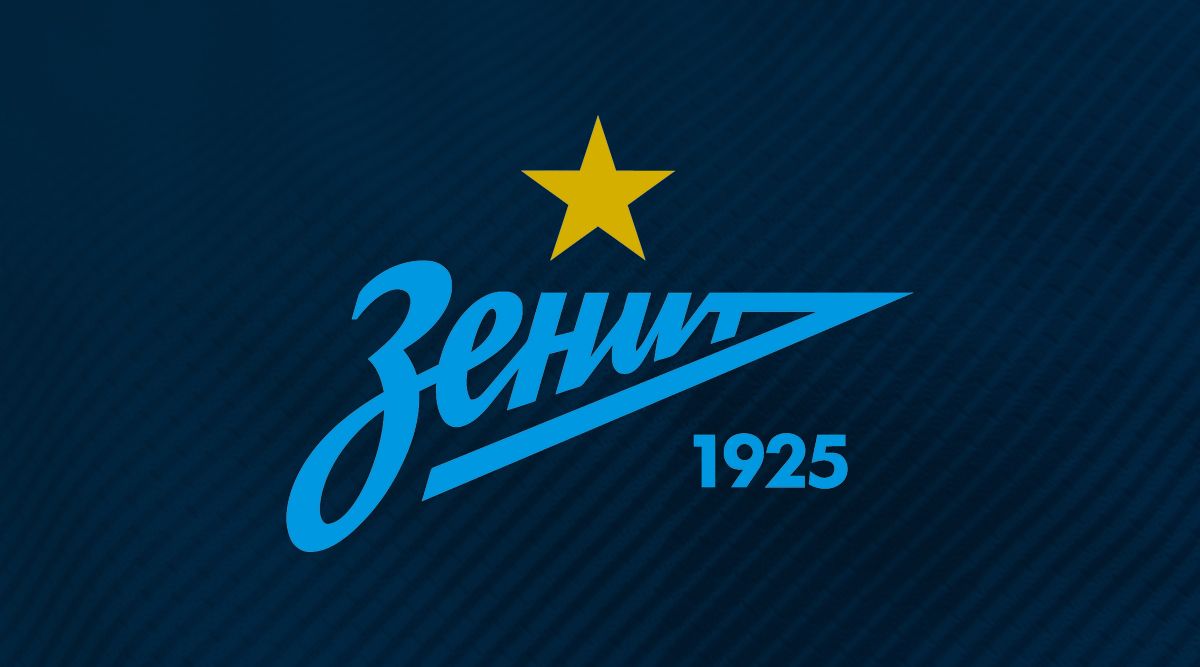
You read it and look for the word "Zenit" but it never comes. Is that a '3'? An 'H'? It took FFT far too long to realise that this wasn't written in the alphabet we know and love - but by jove, do we know good design when we see it.

Ed is a staff writer at FourFourTwo, working across the magazine and website. A German speaker, he’s been working as a football reporter in Berlin since 2015, predominantly covering the Bundesliga and Germany's national team. Favourite FFT features include an exclusive interview with Jude Bellingham following the youngster’s move to Borussia Dortmund in 2020, a history of the Berlin Derby since the fall of the Wall and a celebration of Kevin Keegan’s playing career.
- Mark WhiteContent Editor
- Chris FlanaganSenior Staff Writer
- Joe Brewin
- Conor PopeOnline Editor
 Join The Club


