New Premier League kits 2019/20: EVERY released home and away shirt
From Arsenal's classy '90s adidas throwback to Chelsea's let-loose-with-a-permanent-marker look, FourFourTwo takes a look at every Premier League side's new kits for 2019/20
It's that most weirdly anticipated time of the year: what your beloved club will be wearing for the new campaign.
No matter how Against Modern Football you are ("What's next, a fifth shirt?"), it's hard not to feel a twinge of excitement for these new Premier League kits going into 2019/20. New threads mean the new season is almost upon us – and these are the top-flight clubs that have released their gear so far.
We'll be updating this page as and when new ones are added. If you're inclined to buy them, we've listed the best price for each below as well...
Article continues belowArsenal
Brand - Adidas
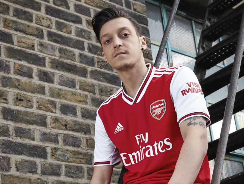
Home
Just look at this kit. Cool sleeves, cool neckline, cool redesign, and then Adidas went and released one of the coolest promo videos from recent memory to top it off. After several years with Puma, the Gooners have reverted back to their Adidas '90s roots – and we can all agree it was a good decision.
The best features, fun and footballing quizzes, straight to your inbox every week.
Away
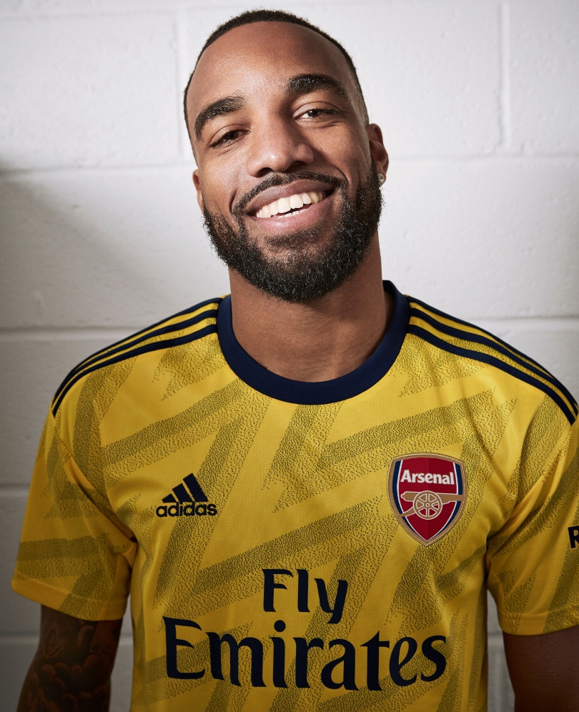
The kind of kit that makes you wish everything was retro. The early 1990s original was given the derisive nickname 'bruised banana', but nothing can detract from its lasting place in football fans' hearts. Toned down and updated, Adidas have created an attractive tribute.
Third
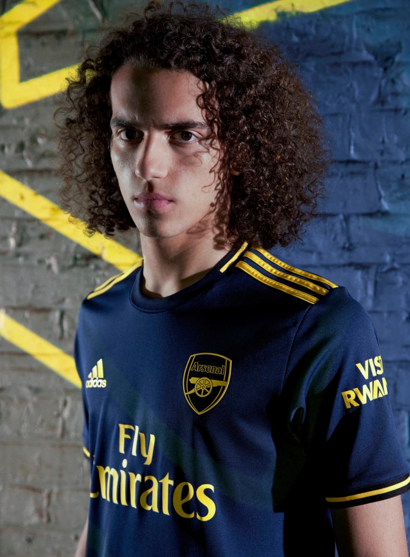
Oh Adidas, you’ve smashed it out of the park again. This third kit isn’t as unexpectedly brilliant as the home and away numbers, but it remains a very solid entry into the class of 2019/20. The dark navy and yellow go tremendously together, and frankly we’ve never wanted to visit Rwanda more.
Aston Villa
Brand - Kappa
Home
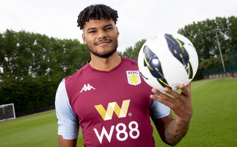
Aston VIlla used the big-money signing of defender Tyrone Mings to simultaneously reveal their new kit - and a clean effort it is. The stripes from last season have been dropped, the sky blue sleeves are back after a season away and the collar is pretty sharp.
A big issue, however, is that sponsor logo. The only explanation we can think of is that the designer is a Wolves fan.
Away
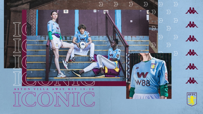
An assured bow for Villa’s new manufacturers Kappa, even if their jazzy reveal video, which featured pouting models wearing the shirt tucked into their shorts - as we all do - was a bit much.
It’s probably not quite worthy of the self-anointed ‘iconic’ motif either. We’ll be the judge of that, thanks.
Bournemouth
Brand - Umbro
Home
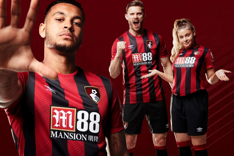
This will be Bournemouth’s fifth season in the top flight, and to celebrate, Umbro have knocked together essentially the same kit as every other season. But wait: this year they’ve added more stripes! The eagle-eyed among you will have seen that there are in fact darker red stripes within the red stripes; commonly known as stripeception. It's a nice kit in fairness, and if it ain’t broke, don’t fix it…
Away
A complete reversal of last season’s white number, this time replete with a funky pattern inspired by the “pizza graphic” of the Cherries’ 1992-1994 alternative shirt.
It’s offensive, but with a touch of flair - a bit like Bournemouth, really.
Third
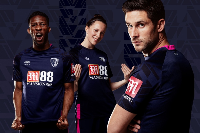
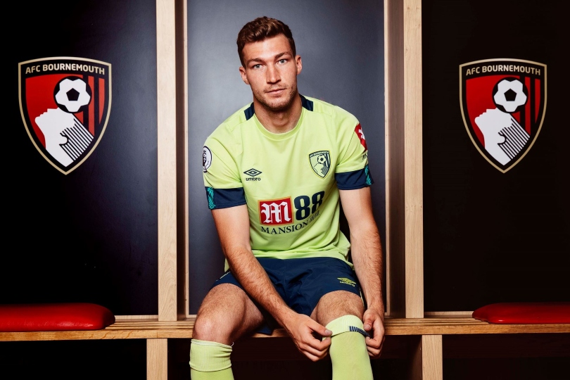
Umbro have gone bold with some of their colouring on secondary kits this summer, not without some success too, but unfortunately this is more garish than stylish.
Any potential fashion cred is completely undermined by the massive Mansion sponsorship, which really doesn’t go with the ‘Sharp Green’ background. The finishing on the crest looks a tad odd, too.
Brighton
Brand - Nike
Home
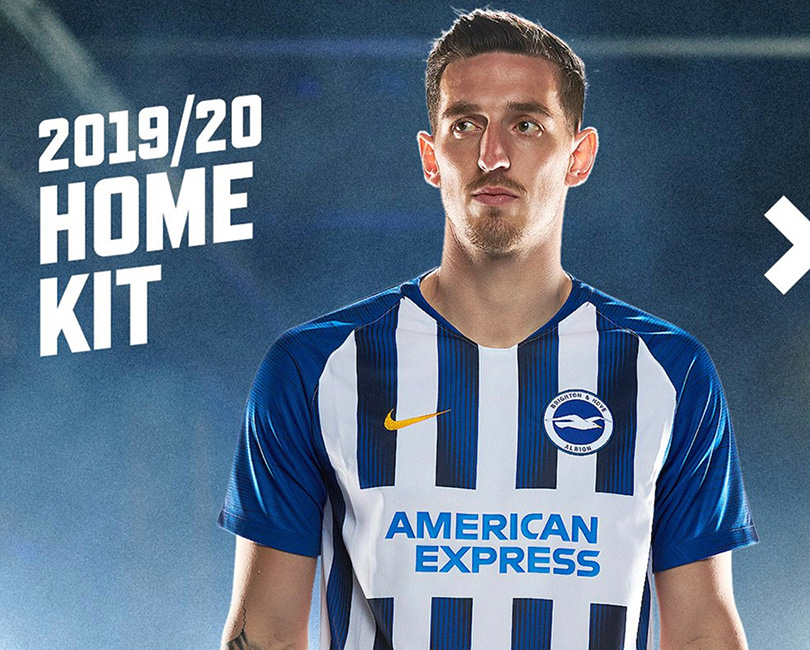
The Seagulls have reverted to a more classic, slightly wider stripe that should appease traditionalists within the club’s fanbase. The lines have also been given an update; a splash of navy has been added, and the shirt has become the latest Nike kit to feature the new neckline which we’re still not 100% on.
Away
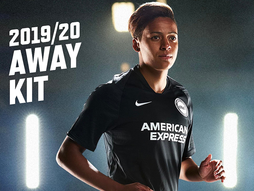
An all-black number for Brighton's away shirt this time, with white detailing on the sponsor, Nike logo and badge. If you like black kits, you’ll love this.
Burnley
Brand - Umbro
Home
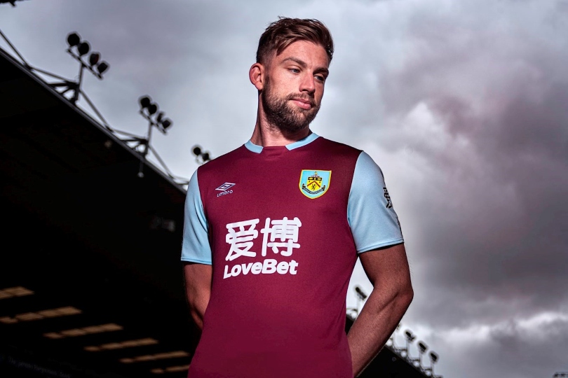
Burnley have partnered with Umbro for the first time since 1980/81 for their new strip – and it looks smart indeed. The round collar has been ditched for a polo and the sleeves have the traditional ‘vest’ look - although the new betting sponsor (yawn) is too big and garish.
Away
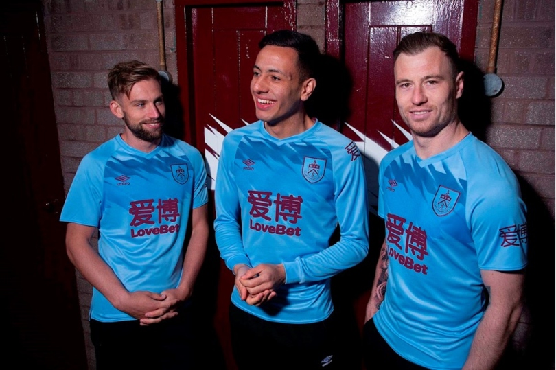
Well this isn’t very Burnley at all! Between the sponsor’s huge lettering on both the centre and sleeve, and the contrasting shades of blue, there’s a lot going on here... but it kind of works?
It has a sort of retro feel to it, despite the LoveBet ubiquity.
Chelsea
Brand - Nike
Home
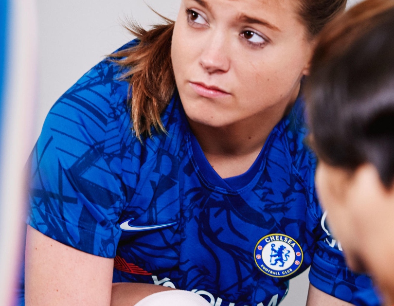
Nike have created a bold new design for Chelsea this season which is sure to divide opinion. The new strip features an all-over design which looks like Keith Haring has been let loose with a sharpie on a plain blue shirt.
It is, in fact, Stamford Bridge – the inspiration for this bold look with its beams, supports and architecture used to create this unique effect.
Away
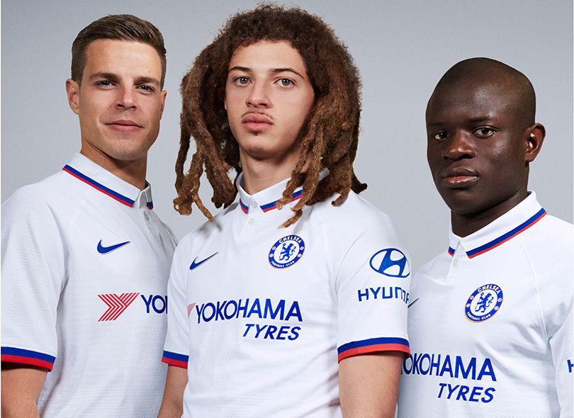
A Mod-inspired look for Chelsea in 2019/20, celebrating a time when the King's Road was "an endless frieze of mini-skirted, booted, fair-haired angular angels" according to one magazine. Now there's Ethan Ampadu, at least.
A cracking collar – well done Nike.
Crystal Palace
Brand - Puma
Home
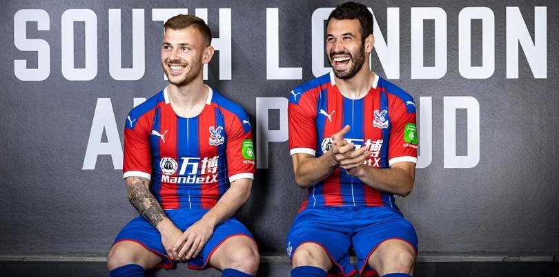
Crystal Palace have ditched last season’s yellow trim in favour of a clean white to finish off the sleeves, collar and Puma logo. The thicker stripes and blue fade have been dropped, leaving Palace with a more traditional look. In short: it’s a Crystal Palace kit.
Away
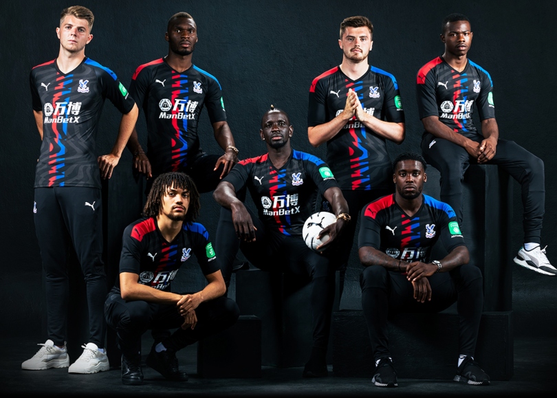
Are they... tiger stripes? This two-tone black number incorporates the blue and red of the home shirt, with what we'll call wavy jolts across it. Accompanied by black shorts and socks, the shirts look a little bit skintight to wear down the pub.
Third
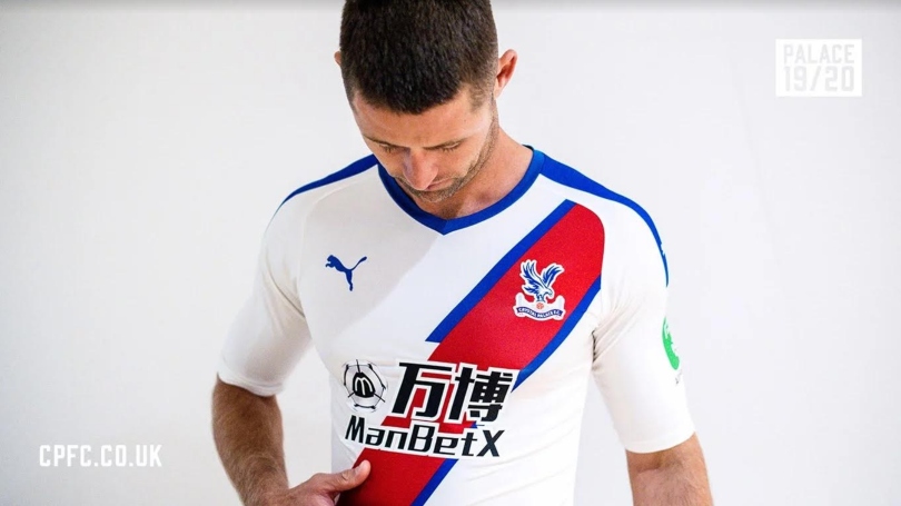
Oh come on, Palace. It’s a decent number, but it’s also near-identical to last season’s away kit. Much like their transfer activity, the Eagles have mostly just stuck with what they know. It does at least bring back fond memories of Peru’s excellent 2018 World Cup kit, which feels like it revived off a sash trend, even if Palace have had them for decades.
Everton
Brand - Umbro
Home
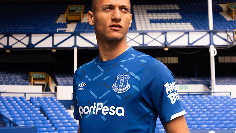
Everton have released this eye-catching number for the new campaign, inspired by the distinctive criss-crossed steelwork from the upper tier of Goodison Park's Bullens Road stand. The design theme makes for some nice detail on the sleeves too, while the Toffees have added a logo to the neck similar to that carried from 1991-93.
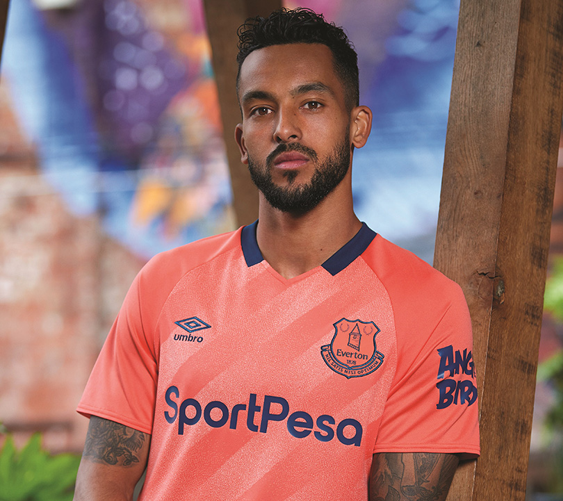
Away
Living Coral, says the press release, like that's a thing. Somebody pass us a Dulux colour chart. The Toffees' inspiration here is the kit worn by their first league title-winning team of 1890/91 – a full 11 years before Everton swapped salmon pink for royal blue in 1901/02.
Leicester
Brand - Adidas
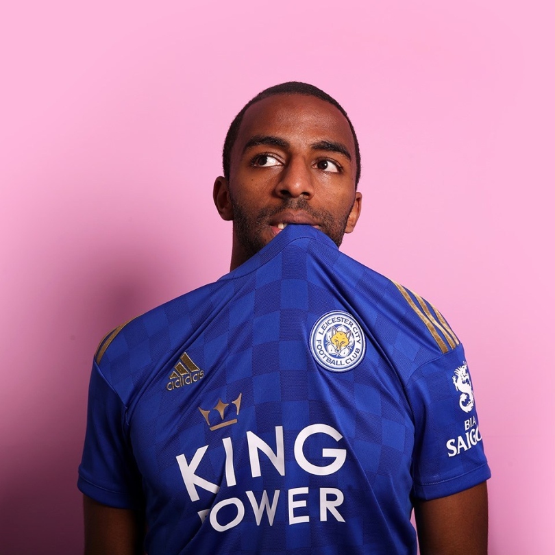
Home
Blue checkerboard design across the body with a rose gold finish on the logo and across the shoulders. Absolutely gorgeous.
Away
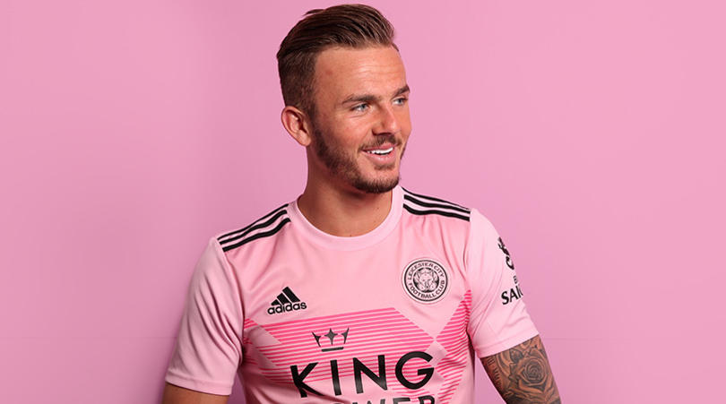
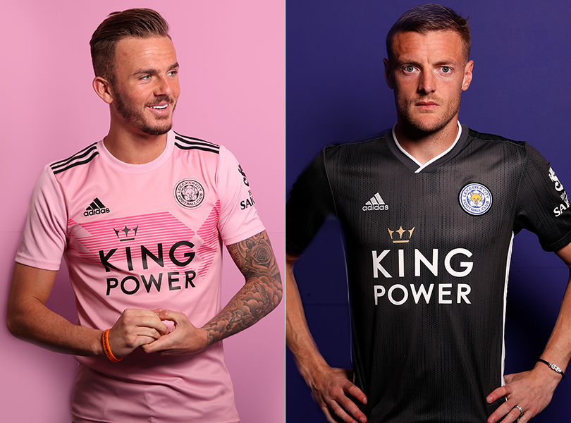
“I haven’t bought a Leicester kit for at least 10 years, but I actually might this season” - so said FourFourTwo Digital Editor and Leicester fan, Joe Brewin - which tells you all you need to know about the Foxes' pink change jersey.
Brendan Rodgers' side have decided on two away shirts for 2019/20 - that daring pink number and a sharp jet-black effort.
Liverpool
Brand - New Balance
Home
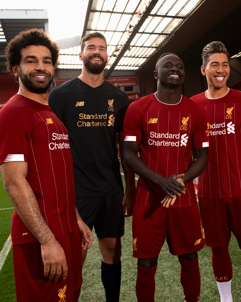
New Balance don’t make kits for many teams, but they should consider making more if Liverpool are anything to go by. The great thing for Reds fans is that their kit manages to evolve for the better each year, which is a rarity.
This year's effort ditches the collar and reintroduces their yellow trim of two seasons ago. It’s clean, elegant and the goalkeeper kit is just downright sexy. Or maybe that's just Alisson...
Away
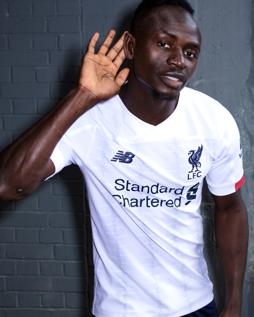
Liverpool have switched it up with their away kit this year, opting for an all-white number with some tasty New Balance detailing on the sleeves. And lovely it is.
Third
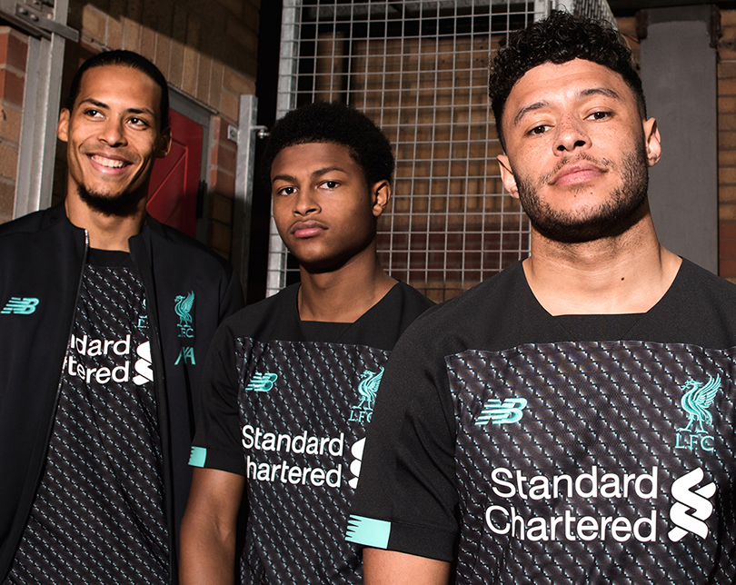
There's trying to protect your players from injury, and then there's covering them up in a kit that looks as though it's been plastered with bubble-wrap. We know Alex Oxlade-Chamberlain has just come back from a lengthy spell on the sidelines, but this is too much, New Balance.
Manchester City
Brand - Puma
Home
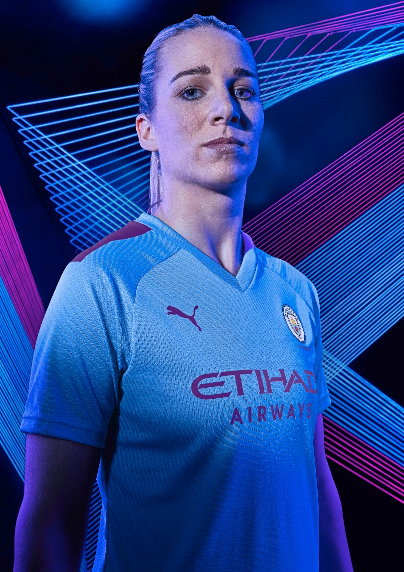
City have swapped Nike for Puma this year, and the German manufacturer have kicked off their partnership with the Premier League champions with this. The standard sky blue has a splash of purple this time - used in City kits in years gone by - slapped onto the shoulders.
Away
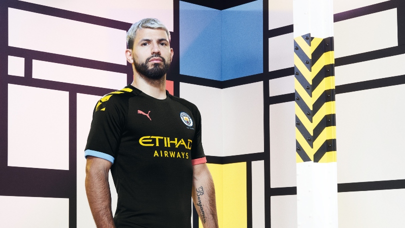
The champions’ away kit this year pays tribute to the city’s 'Madchester' era of the late '80s and early '90s - a time when music and culture was beginning to boom in the north-west.
The bold, black strip features yellow stripes on the shoulder and peach trim to finish - and Pep Guardiola’s side will surely be playing some sweet music in this this season. Look: Sergio Aguero's about to appear on Top of the Pops.
Third
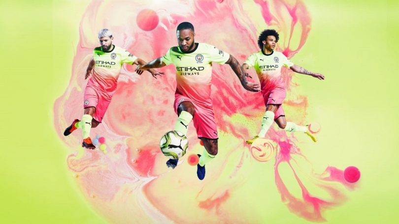
It seems as though the printer at Puma was running out of ink as they finalised the designs on City's third kit, and you know what? They just went with it.
A hi-vis yellow fading to a millenial pink, it's very now.
Manchester United
Brand - Adidas
Home
Adidas have gone safe with the design of United's 1999 Treble-winning season tribute kit, after receiving backlash for their red-to-black fade effort last time out.
The main difference? The badge has received an update and the numbers '90+1' and '90+3' feature on the sleeves - referencing their famous comeback goals against Bayern Munich (you may have heard about that). Whether this guy is still around to wear it remains to be seen...
Away
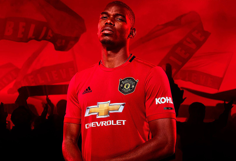
"You are gold," go the lyrics to Spandau Ballet's 1983 hit Gold. "Always believe in your soul / You've got the power to know / You're indestrucible".
This piece of pop-psychology seems to sum up Ole Gunnar Solskjaer's entire managerial philosophy at Manchester United, and so it's fitting that this is what is offered up as the Reds' away kit this year. A nice little nod to the colour medals Ole used to win as a player, too.
Third
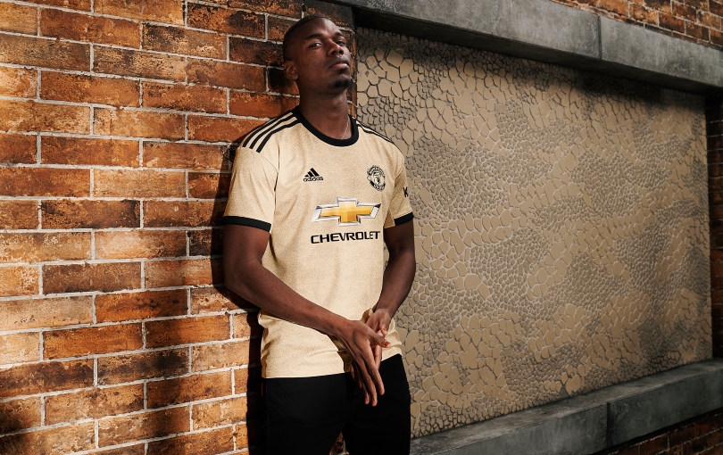
Another 7/10 kit for this season, and another nod to the past too. This one looks to 1909 rather than 1999 though, with the Lancashire red rose worn by that year’s FA Cup winners incorporated into the design of United’s third kit 110 years later.
A fitting tribute to matchwinner Sandy Turnbull, who died whilst serving in the First World War.
Newcastle United
Brand - Puma
Home
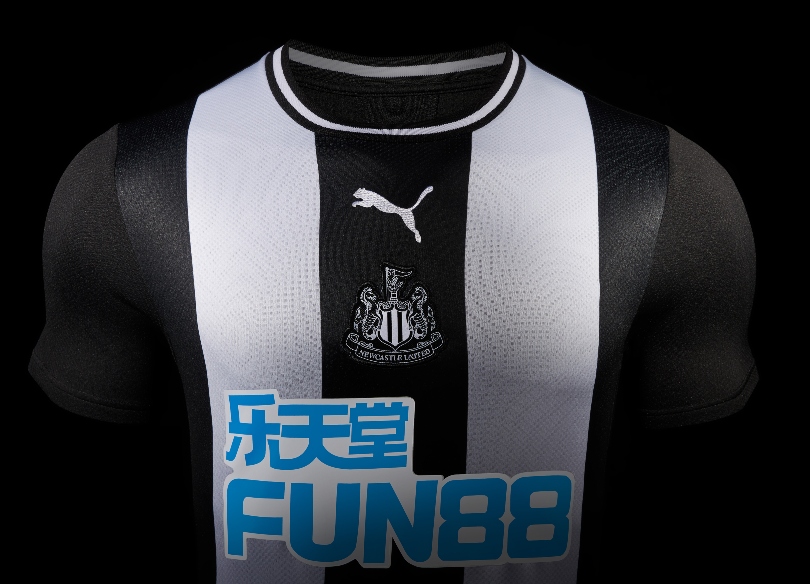
The only Geordie in the FourFourTwo office complained that there aren’t enough stripes on this shirt, but did concede that it was quite nice.
Newcastle's new home shirt takes inspiration from the club’s 1969 kit – it's the 50th anniversary of the Magpies’ Fairs Cup success – and features a central black stripe, tonal club badge in the centre, and round neck collar with white trim. Shame about that sponsor, though.
Away
A very smart effort from Puma, which would surely prove to be a popular purchase if not for the extortionate price and unpopularity of one Mike Ashley. Even the central sponsor looks much better as white on black.
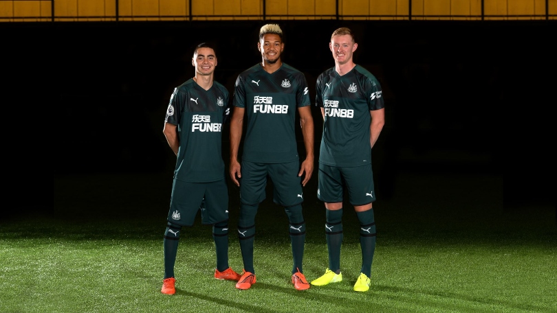
Third
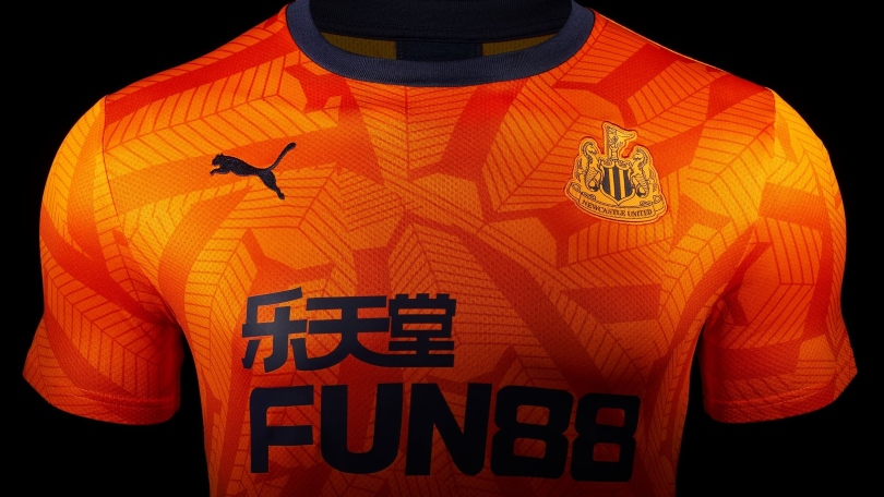
Oof – now this will prove divisive. Many will instantly recoil at the lurid orange and peculiar patterning (inspired by the roof of St James’ Park), but once again FFT’s resident Newcastle fan approves. It does look much better on the players than on a screen, although it also looks a lot like a Wolves kit.
Norwich City
Brand - Errea
Home
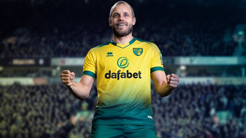
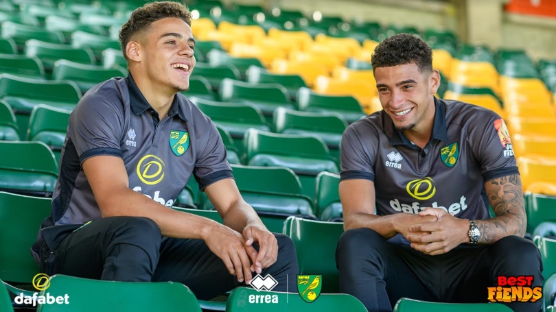
The Canaries return to the top flight after three years away, and their new kit is definitely one that can mix it with the big boys. The home strip features a smart green-to-yellow 'fade' from the shorts on the front and back of the jersey - a lot better than last season's Manchester United and Tottenham's efforts.
As with many junior Premier League kits, betting sponsor Dafabet will be replaced by a child-friendly sponsor - in Norwich's case, a trampoline park - on all kids' home shirts.
Away
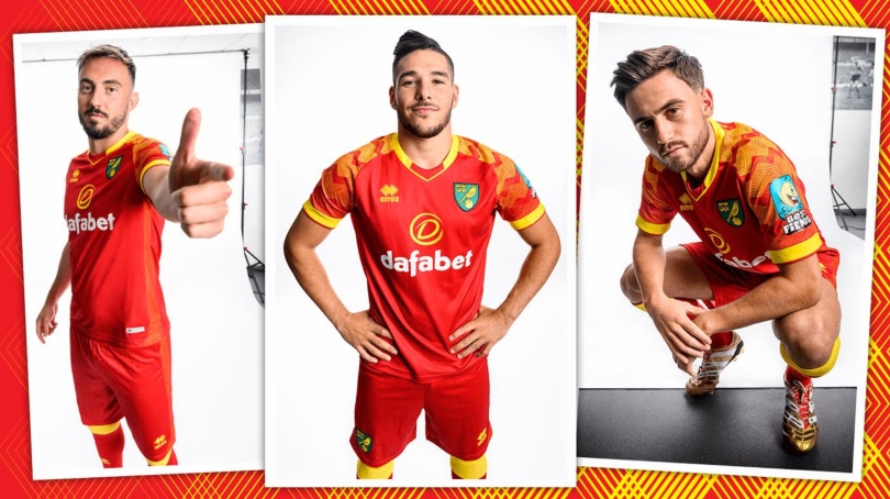
Norwich’s first red kit in over 10 years doesn’t quite work - the combination of three bright colours is just too glaring - but full marks to Errea for trying. The geometric sleeve pattern is a very welcome addition.
Third
The Canaries have three really distinct, bespoke kits this season, and this might be the pick of the bunch. Were it not for the truly awful Best Fiends sleeve sponsor, which makes Angry Birds look distinguished, this could be an absolute classic. It’s sleek, smart and the darker collar and sleeve trim is lovely. A resounding success.
Sheffield United
Brand - Adidas
Home
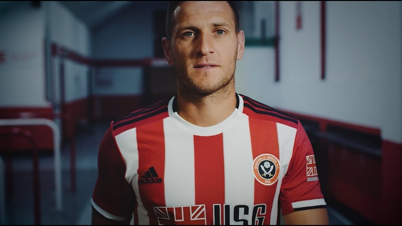
Is it a Stoke kit? How about a Sunderland one? Nope. Brentford? Not quite. The Blades’ new home strip for their first Premier League season in 12 years - featuring wider stripes and a rounded white collar - has divided opinion in the FourFourTwo office. Classic or unoriginal - we’ll let you decide.
Kids’ kits will feature energy company Utilita – a prominent supporter of grassroots football – as the sponsor instead of Forex broker USG. A nice touch.
Away
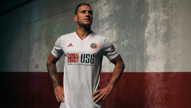
United's away kit is a crisp all-white effort complete with silver trim and a classy-looking thin red collar. A clean jersey all around - no complaints with this one.
Southampton
Brand - Under Armour
Home
Some kit providers like to play it safe. The same design each year, nothing too daring, trying not to ruffle too many feathers – but not Under Armour. The American sportswear colossus has steamed in with a Southampton home kit that looks like it's been dipped in tar.
The collar has been stripped right back to a simple round neck, with a single button completing the look. We’re not sure if we like it, but it’s good to see a kit provider willing to take a risk.

Away
The same template has been used throughout the Saints' new kit range, and their away shirt bears a fluorescent upper that's broken up nicely with horizontal lines.
Striking shorts have been paired with the jersey to create an effective, smart look.
Third
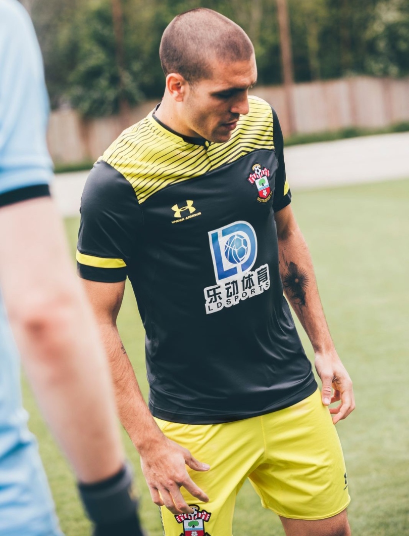
A decent result. The unappealing black panel is still there, but the colour contrast is less grating than on the predominantly red home strip. The horizontal red lining makes the dark box much more easy on the eye too. Insert GIF of Ralph Hasenhüttl celebrating the third kit then remembering the home kit here.

Tottenham Hotspur
Brand - Nike
Home
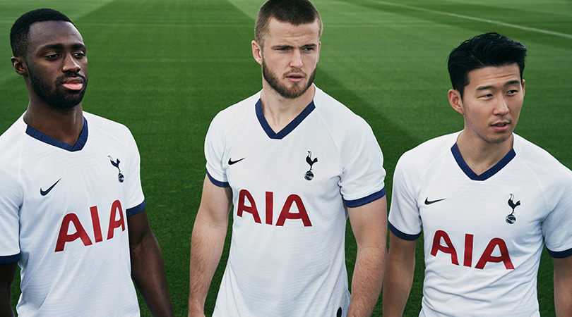
Well it's... white? Clean. Nice trim. Sometimes simplicity is hard to knock, but it's difficult to get too excited about Tottenham's home effort for 2019/20.
Away
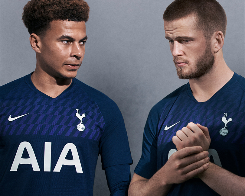
Now this is better. We're still looking at one of the more stripped-back kits of the new Premier League campaign, but the deep colour is gorgeous and there's a lovely design touch in the upper section.
See that zig-zag pattern? Look closely and you'll note the word 'Spurs' forming each of them. Nice.
Watford
Brand - Adidas
Home
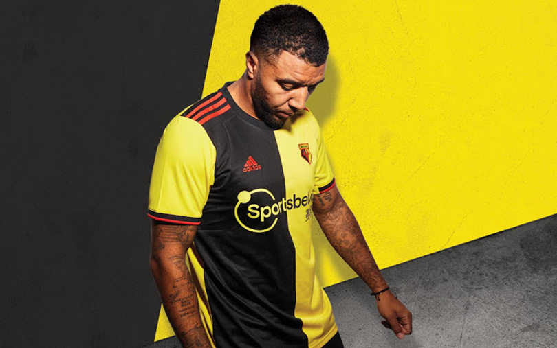
Half and half for the Hornets, who also splash new sponsor Sportsbet.io across the chest. The red-stripe Adidas shoulder trim is nice, but it's hard to know where to look first with this one.
Away
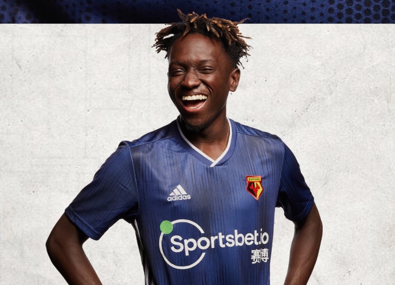
Adidas have delivered overall for Watford this year, even if their identikit template is used for a number of clubs. The white trim looks classy, and the whole thing is attractive, in a minimalist sort of way.
West Ham
Brand - Umbro
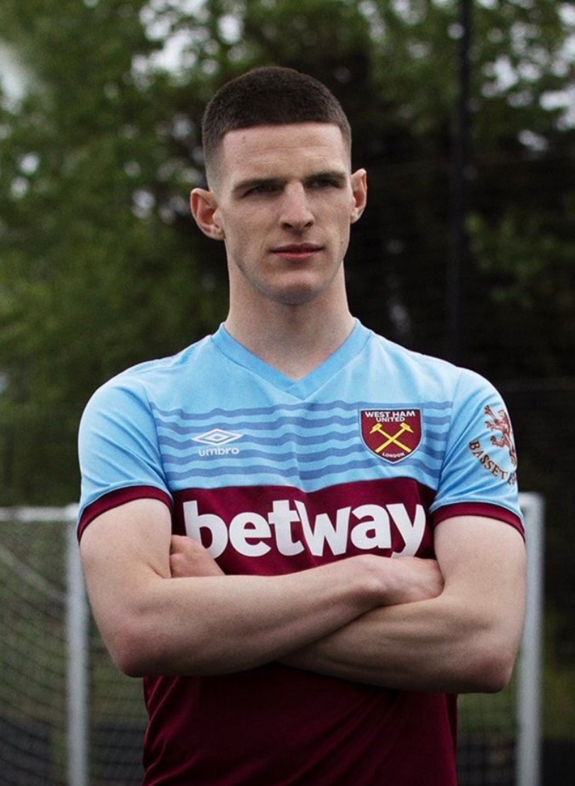
Home
Umbro have really upped their game this season, and have given the Hammers’ classic colours a radical reinvention. Blue features more heavily on the home kit.
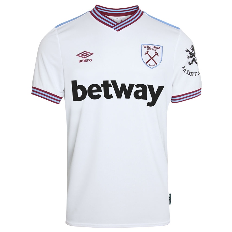
Away
This might just be the away kit of the season – and not just in the Premier League.
The Hammers' travel jersey is a throwback to the West Ham side of the 1980s, and features a striped blue and claret collar on this simplified jersey. Lush.
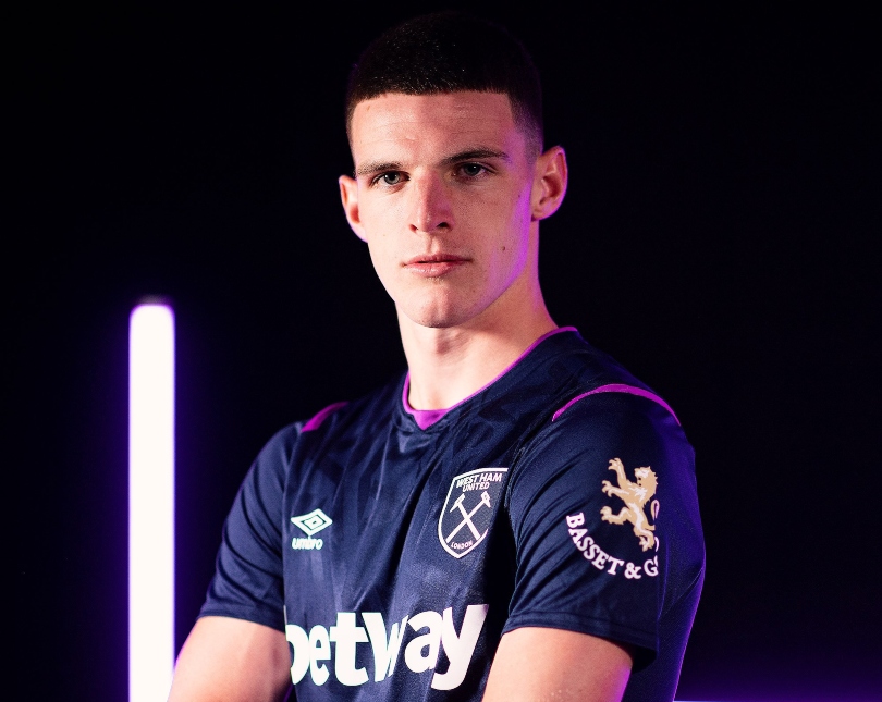
Third
An outstanding trio of Hammers jerseys concludes with a neat third kit. The Basset and Gold sleeve sponsor looks a little Brexit-y, but that’s not completely off brand anyway - West Ham had the Union Jack on their sleeves a few years ago. Even a kit as sharp as this can’t make Declan Rice’s dance moves palatable though.
Wolves
Brand - Adidas
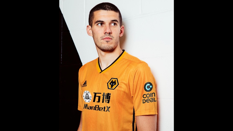
Home
Nuno Espirito Santo's side are back in Europe for the first time in 38 years in 2019/20 - and their new kit is certainly a class above.
Wolves' latest home jersey has a similar template to Sheffield United's away shirt - a thin collar, subtle dark orange trim, and a colour that's certainly a lot more Wolves-looking than last season. Very tidy.
Away
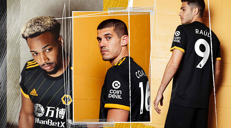
Wolves gold and black? Delightful. Diagonal pinstripes? Talk to us. Two ugly sponsors ruining it for the rest of us? You bet. We'll let the West Midlanders off to an extent – everyone's at it – and instead applaud the efforts of Adidas in designing this suave effort.
While you're here, why not take advantage of our brilliant subscribers' offer? Get 5 issues of the world's greatest football magazine for £5 – the game's greatest stories and finest journalism direct to your door for less than a pint in London. Cheers!
NOW READ...
Premier League live stream 2019/20: how to watch every game from anywhere in the world
27 essential Fantasy Premier League tips from old winners and experts

 Join The Club


